The best law firm websites are not brochures, but intake machines. They are built to do one thing: turn a person with a problem into a scheduled consultation. Most law firms’ sites fail at this, losing clients to competitors who meet users where they are and provide simple options to connect instantly.
This is a no-fluff blueprint for building trust quickly and turning your website into your best source of new cases.
Apply these five fixes today:
- Put a tap-to-call number and a “Schedule consultation” button in your mobile header
- Cut your form to five fields with practice area + urgency
- Publish fee ranges and next-step expectations
- Add bar numbers/jurisdictions at the top of every bio
- Create a public firm data sheet and validate your schema

The brutal truth: why most firm sites fail
Most firm sites underperform not because they’re ugly, but because they’re built for lawyers, not clients.
The parent searching for an attorney at 11 PM after their kid just got arrested isn’t admiring your parallax scrolling. They’re panicking, and they need to know three things immediately:
- Can you handle their specific problem?
- Can they afford you?
- How do they talk to you right now?
According to Google, 96% of people seeking legal advice use a search engine. Most law firm websites bury the answers under layers of “aggressive representation” and gavel stock photos. Meanwhile, that person just called your competitor because their site was purpose-built to answer the customer’s questions and drive them to take action.
What’s actually killing your conversions
After working with dozens of law firms on their websites, here’s what destroys conversion rates:
The phone number treasure hunt. It’s buried in the header, microscopic on mobile, and not clickable. Your customer is literally holding their phone, ready to call the first firm that makes it easy.
Generic CTAs that say nothing. “Learn more” and “Contact us” aren’t calls to action. Your competitor’s site says “Get your free case review in 10 minutes” with their phone number next to it.
Writing for the bar exam. Nobody searching for a divorce attorney cares about your “comprehensive approach to matrimonial law.” They want to know if you can help them keep their kids.
Your site loads like dial-up. According to Google, 53% of mobile users abandon sites that take over 3 seconds to load. Video backgrounds and unoptimized images push you past the patience threshold before visitors even see your name.
Zero proof that matters. Where are the reviews from actual clients? Where are the case results that they can relate to?
What “best” actually means now
The best law firm websites are measured by what actually matters:
- Qualified lead rate: How many visitors are actually potential clients?
- Booked consultation rate: How many qualified visitors schedule consultations?
- Show rate: How many bookings actually show up?
- Signed rate: How many consultations become clients?
Your click-through rate doesn’t pay bills. Your client acquisition rate does. According to research, 75% of lawyers consider their website to be their most effective marketing tool, but that’s true only if it actually converts visitors.

The intake engine blueprint
Every element should move qualified prospects toward becoming clients. Not eventually, now.
69% of users looking for legal services use both smartphones and PCs for research. They’re not at their desk researching, they’re on their phone, often in crisis, needing immediate help.
Your mobile header (where most of your traffic lives)
Someone’s on their phone, searching for help. You have seconds to make an impression. According to the American Bar Association, 77% of law firms report having mobile-friendly websites, but that means nearly a quarter still don’t.
Your mobile header needs these elements:
Click-to-call phone number – The actual number, big enough for someone to tap easily on the first try
“Schedule a consultation” button – Not “contact us” – tell them exactly what they’re getting
Note: If your jurisdiction restricts “free,” clarify scope/time limits (e.g., “Free 30-minute consultation”).
One short line – “Houston divorce attorney. Family first, fixed fees available.”
Language toggle – Only if you have staff who actually speak other languages
De-prioritize search in the mobile header; keep it in the menu if your site is large. Focus on the elements that generate leads.
Primary CTAs that consistently convert
Repetition isn’t redundancy when someone’s in crisis.
Your primary calls-to-action:
- Call [actual phone number]: Not “call now,” not a phone icon
- Schedule a consultation: Direct to scheduling
- Text us: Because many people text before they call
These CTAs should appear:
- In your header (always visible)
- After your intro paragraph
- After each practice area section
- In your footer
- As an exit-intent popup (can recover abandoners if limited to one per session)
Some people might say this is “too aggressive,” but these are the design elements that drive action by putting as few barriers as possible between your customers and how they want to interact with you.
SMS/Chat compliance note: If offering texting or chat, display a brief confidentiality notice about unencrypted channels and obtain informed consent.
The qualification form that respects everyone’s time
Five fields. That’s it.
- Name and phone (email optional)
- Practice area (dropdown with clear options)
- City, State (for jurisdiction)
- When do you need help? (Today / This week / This month / Just researching)
- What happened? (one text box, three lines max)
Longer forms lose you money.
Include a brief confidentiality statement near your form: “Information submitted is confidential and creates no attorney-client relationship until we confirm representation.”


Operational reality
Your website can be perfect, but if your operations fail, you lose cases.
Who answers when someone calls? Voicemail during business hours means you’ve lost. Someone who can’t answer basic questions means you’ve lost.
Speed to lead wins. Firms that respond to leads within an hour are significantly more likely to qualify the lead than those who respond later. Aim to respond within an hour; same-day beats next-day every time.
After-hours isn’t optional. Answering service, immediate text confirmation, calendar booking that works at 2 AM. Something that proves you understand urgency. According to FindLaw research, 87% of people who contact an attorney go on to hire an attorney, and 72% only contact one attorney – the first to respond meaningfully often wins.
The thank-you page everyone forgets
Someone filled out your form. Don’t just show “Thanks, we’ll be in touch.”
Your thank-you page should:
- Confirm exactly what happens next
- Provide a calendar link for immediate booking
- List what to bring to consultation
- Show your phone number again
- Include a brief video from the attorney they’ll meet
Make them feel the process has started. The moment after they submit a form is your first chance to prove your firm is organized and responsive. A generic ‘thank you’ page is a failed first impression. An optimized thank-you page starts the client relationship.
The seven trust triggers that actually matter {#trust-triggers}
Trust is built with specific, verifiable information that proves you’re legitimate.
1. Bar admissions front and center
Every attorney bio needs bar number and jurisdictions at the top.
“Licensed in Texas since 2010. Bar #12345678. Federal District Court admission 2011.”
That’s more trustworthy than your entire awards section.
2. Money talk
If you work on contingency, say it in the hero section. If you require a $5,000 retainer, say it. If you offer payment plans, say it.
“Typical divorce: $3,500-$7,500. Payment plans available. First consultation $250, applied to retainer if hired.”
Compliance note: Advertising and fee-disclosure rules vary by state. Verify language with your jurisdiction and bar counsel before publishing.
3. Real attorney bios
Good bio: “Sarah handles high-asset divorces in Houston. Last year, she resolved 47 cases, most within 9 months. She’s particularly experienced with business owner divorces and custody disputes involving relocation.”
Bad bio: “Sarah graduated magna cum laude from Northwestern…”
One tells me if Sarah can help. The other tells me about school 20 years ago.
4. Reviews that tell stories
Prospective clients routinely read reviews for law firms. Five stars mean nothing without context.
Good review: “Jennifer helped me through a brutal custody battle. She knew exactly which judge tendencies to prepare for and got me 50/50 custody when my ex was pushing for supervised visits only. – Mike K., Houston”
Include your review policy: “We ask every client for feedback after case completion. Reviews are unedited except for privacy protection.”
5. Media and associations
Focus on verifiable credibility:
- Local news quotes about cases (with links)
- Speaking at real events (with dates)
- Pro bono work
- Board positions that matter locally
If someone can’t verify it with Google, it doesn’t build trust.
6. Case results
Share outcomes within ethical bounds. Be specific about situation, vague about identity.
“Recently secured full custody for father after proving mother’s relocation would disrupt child’s education and medical care. Case resolved in 6 months.”
Compliance note: Case results and testimonials must comply with your state’s advertising rules. Some jurisdictions require disclaimers about past results not guaranteeing future outcomes.
7. Actual photos
Real photos of your actual office, team, and neighborhood build more trust than stock photos of fake boardrooms. Skip stock gavels; use real photos.

How to show up when someone asks ChatGPT for a lawyer {#ai-visibility}
AI increasingly determines how people find professional services. You’re either in the AI response or invisible.
According to recent research, 77% of consumers start their search for an attorney online. More Americans are using ChatGPT and similar AI tools, and that number is growing monthly. When someone types “I need a divorce lawyer in Houston who handles high-asset cases,” AI is increasingly where they start.
Understanding how AI recommends lawyers
Here’s what actually happens when someone asks AI for a lawyer recommendation. The AI system scans millions of web pages, looking for clear, verifiable information about law firms. It prioritizes:
- Clear service descriptions – Not “comprehensive legal solutions” but “Houston divorce attorney handling custody and property division”
- Verifiable credentials – Bar numbers, court admissions, case types
- Consistent information – Same firm name, address, phone across all mentions
- Recent, relevant content – Current information about your practice areas
- Local specificity – Which courts you practice in, which counties you serve
The firms that show up in AI responses aren’t gaming the system. They’re just being extremely clear about who they are and what they do.
Why most law firms are invisible to AI
Your competitor just got recommended by ChatGPT while you didn’t. Here’s why:
Your information is scattered. Your website says one thing, your Avvo profile says another, your Google Business profile is outdated. AI sees this inconsistency and doesn’t trust you enough to recommend.
You’re using lawyer language. AI is trying to match human questions (“help with custody”) to your content (“matrimonial litigation regarding minor children”). The language gap makes you invisible.
No structured data. Your website might look great to humans, but to AI it’s just a wall of text with no clear organization. AI can’t efficiently extract what you do, where you do it, and how to contact you.
Buried specifics. Your bar number is in the footer. Your practice areas are described in paragraphs. Your location is “serving the greater Houston area.” AI needs specifics, not generalities.
Make your information machine-readable
Think of this as creating a “fact sheet” for robots. You’re not trying to trick AI – you’re making it easy for AI to understand and recommend you.
Essential schema markup:
- LegalService schema: Each practice area clearly defined
- LocalBusiness schema: Exact service areas
- Person schema: Every attorney with specialties
- FAQPage schema: Common questions with direct answers
Ask your web developer to implement proper schema markup for each of these areas. It’s how search engines and AI systems understand your firm’s information.
Don’t worry about the technical details. Just know that schema is like putting labels on everything so AI knows what it’s looking at. Without it, AI has to guess what information means. With it, AI knows exactly what you offer.


Connecting the dots for AI: Your entity graph
Every legitimate mention of your firm online is a signal that you’re real and credible. AI systems understand relationships and use them to verify legitimacy.
Think of it like professional references, but for AI:
- Bar association profiles (with consistent NAP)
- Legal directories (Avvo, Justia, Martindale)
- Local news mentions
- Court filing records
- Speaking engagements
- Published articles
Here’s the critical part: consistency matters more than volume. If your firm name is “Smith & Associates” on your website but “Smith and Associates” on Avvo and “The Smith Law Firm” on LinkedIn, AI gets confused. Pick one name format and use it everywhere.
Same with your address. Don’t use “Suite 500” on your website and “Ste 500” on Google. Don’t use different phone numbers on different sites. AI looks for perfect matches to verify you’re legitimate.
Choose one canonical firm name, one phone number, one address format, and one abbreviation style, then propagate via GBP, Avvo, Justia, Martindale, state bar, LinkedIn. Suggest a quarterly NAP audit.
Write for AI extraction
AI systems pull quotes from content to answer questions. Structure your content to be quotable.
Instead of: “Our firm provides comprehensive legal services across multiple practice areas with a focus on achieving optimal outcomes for our clients.”
Write: “We handle divorce, custody, and child support cases in Houston, Harris County, and surrounding areas. Most cases resolve in 6-12 months.”
The difference? The second version directly answers what someone might ask: “What do they handle? Where? How long does it take?”
Here’s a simple test: Read your content and ask “Could AI quote this to answer a specific question?” If not, rewrite it to be more direct.
The firm data sheet (your AI resume)
LLM optimization tip: Create a public “Firm data sheet” page with facts, jurisdictions, fees, languages. Update quarterly. Link in your footer for AI systems to reference.
This is your most important page for AI visibility. It’s not for humans – it’s for machines. Include:
Firm basics:
- Official firm name (exactly as registered)
- Year established
- Physical address(es)
- Main phone number
- Website URL
- Email contact
Every attorney:
- Full legal name
- Bar number(s)
- Jurisdictions admitted
- Years of experience
- Practice focus areas
- Languages spoken
Services and coverage:
- Each practice area with one-sentence description
- Counties you serve (list them all)
- Courts you practice in (be specific)
- Types of cases you do NOT handle
Practical information:
- Fee structures accepted (contingency, flat, hourly)
- Payment plans available (yes/no)
- Schedule consultation (yes/no, any limitations)
- Hours of operation
- After-hours availability
- Languages spoken by staff
Update this quarterly. When AI systems crawl your site, this becomes their primary source of truth about your firm.

Testing your AI visibility
Want to know if your AI optimization is working? Here’s how to test it:
- Ask AI about your firm directly: “Tell me about [Your Firm Name] in [Your City]”
- Ask for recommendations: “Who are the best [practice area] attorneys in [your city]?”
- Ask specific scenario questions: “I need a lawyer in [city] who speaks [language] and handles [case type]”
If you don’t appear in these responses, you have work to do. If you do appear but the information is wrong or outdated, you know exactly what to fix.
The firms dominating AI recommendations right now aren’t doing anything complex. They’re just being incredibly clear and consistent with their information. You can do the same.
Practice area pages that convert {#practice-areas}
Personal injury: the contingency conversation {#personal-injury}
What to show:
- “No fee unless we win” prominently displayed
- Free same-day consultation availability
- Track record with specific injury types
Must-answer FAQs:
- How much is my case worth? (Give ranges by injury type)
- How long will this take? (8-12 months typical, 18-24 for trial)
- What if I already talked to insurance? (Stop immediately and call)
Estate planning: the procrastination problem {#estate-planning}
What to show:
- Transparent pricing ($750 basic will, $2,500-5,000 trust)
- Simple process timeline (Two meetings, three weeks, done)
- Asset threshold guidance
Must-answer FAQs:
- Do I need a trust or just a will? (Clear by asset level)
- What happens without a will? (State intestacy basics)
- How often to update? (Major life events trigger)
Immigration: urgency meets complexity {#immigration}
What to show:
- Languages spoken (actually translated pages)
- Visa type timelines in plain language
- Deadline tracking systems
Must-answer FAQs:
- How long does the process take? (By visa type)
- Can I work while waiting? (By status)
- What if denied? (Appeal and alternative options)
Employment law: picking sides clearly {#employment-law}
What to show:
- Who you represent (employees OR employers)
- Offer a consultation for discrimination claims
- EEOC timeline requirements
Must-answer FAQs:
- Do I have a case? (Basic criteria)
- Should I quit? (Legal implications)
- Timeline expectations? (6-18 months typical)
Criminal defense: the 3 AM website {#criminal-defense}
What to show:
- 24/7 availability with actual attorney cell
- Payment plan options
- Specific courthouse experience
Must-answer FAQs:
- What to do if arrested? (Immediate steps)
- Chances of dismissal? (Factors considered)
- Public defender vs. private? (Honest comparison)


Family law: emotional intelligence required {#family-law}
What to show:
- Cost ranges ($1,500 uncontested, $5,000-15,000 contested)
- Process timeline with phases
- Mediation vs. litigation approach
Must-answer FAQs:
- Total divorce cost? (Honest ranges)
- Timeline? (3-12 months typical)
- Custody likelihood? (Factors courts consider)
Business law: speed and specificity {#business-law}
What to show:
- Service menu with prices
- Turnaround times (24-hour contract review)
- Industry expertise (specific sectors)
Must-answer FAQs:
- LLC vs. corporation? (Quick comparison)
- Contract review speed? (Same-day available)
- Retainer coverage? (What’s included)
Bankruptcy: the shame factor {#bankruptcy}
What to show:
- Empathy-first messaging
- Immediate creditor relief explanation
- Chapter 7 vs. 13 calculator
Must-answer FAQs:
- Will I lose my house/car? (Exemption basics)
- Which chapter qualifies? (Income thresholds)
- Stop garnishment when? (Automatic stay timing)
Content that actually helps (and ranks) {#content-strategy}
Service page anatomy
The problem – Start with their pain: “Creditors calling?” beats “Our bankruptcy practice…”
The pathway – Simple numbered steps of their experience, not your internal process
The proof – Specific examples: “Last month: Stopped foreclosure for Houston teacher”
The price – “Chapter 7: typically $1,500-$2,500 plus filing fees”
The next step – One clear action: “Call [number] to schedule your consultation”
FAQ strategy for snippets
Every practice area needs 5-10 direct Q&As. Structure them for featured snippets:
Question as H3 heading Answer in 40-60 words immediately following Additional detail in subsequent paragraph if needed
This format maximizes snippet capture and LLM extraction.
City pages that provide value
Real city pages include:
- Courthouse address and parking
- Local filing fees
- Typical timeline in that jurisdiction
- Local resources
- Which courts typically hear these matters
- Where to park and file
“We proudly serve Houston” isn’t a city page.
Resources that demonstrate expertise
Give away valuable information:
- Document checklists for consultations
- Timeline guides with actual courthouse data
- Cost calculators using real formulas
- Process maps showing what happens when
Transparency builds trust faster than promises.
Essential footer links: Include an Accessibility Statement explaining your ADA compliance efforts and a Privacy Policy covering data collection, SMS consent if applicable, and confidentiality practices. These aren’t just compliance – they build trust.


Performance and accessibility that actually matter {#performance}
Your site must work for stressed people on cheap phones with bad connections.
Speed metrics that impact conversion
Focus on what matters:
- Time to clickable phone number: Under 1 second
- Time to readable text: Under 2 seconds
- Time to form submission: Aim for under 3 seconds
That parallax scrolling adds precious seconds on mobile. Video backgrounds can add several more. You risk losing visitors before they read a word.
Accessibility for crisis
Typography for stress: 16px minimum, high contrast, no light gray on white
Touch targets for shaking hands: 44×44 pixel buttons minimum with adequate spacing
Language for stressed brains: 8th-grade reading level, short sentences, common words
Video captions always: People watch on mute in waiting rooms
Descriptive alt text: “Attorney Sarah Johnson reviewing divorce documents” not “Photo of attorney”
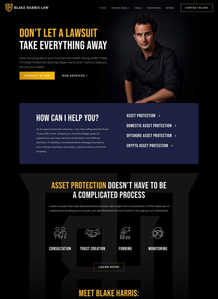
Blake Harris Law
Make primary actions obvious and repeated so visitors can call, schedule, or start a short form without hunting.
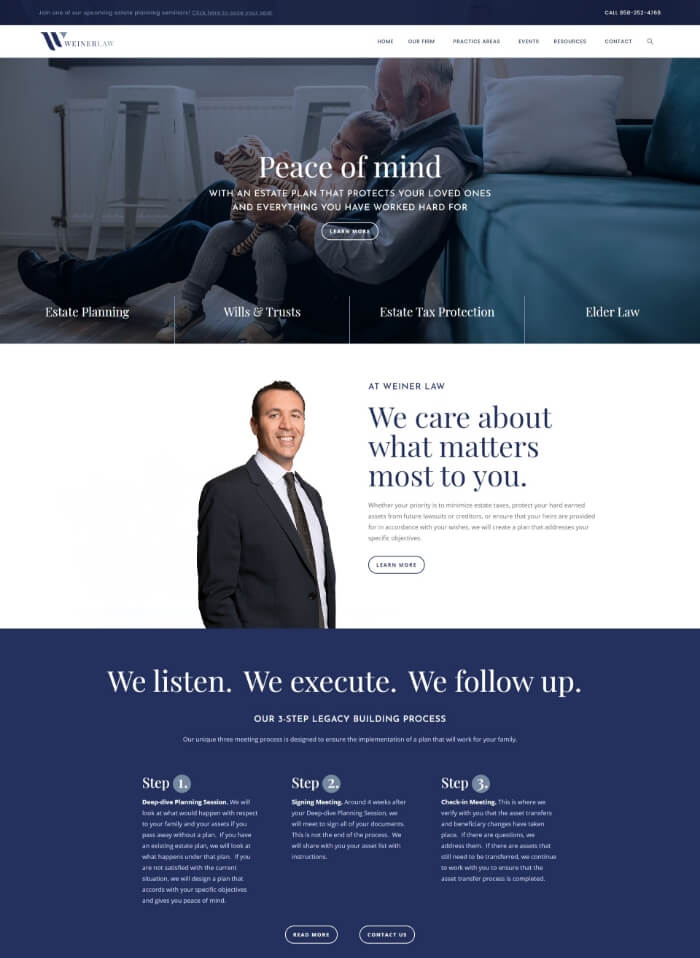
Weiner Law
Lead with trust signals and a clear schedule option so visitors can act without scrolling.
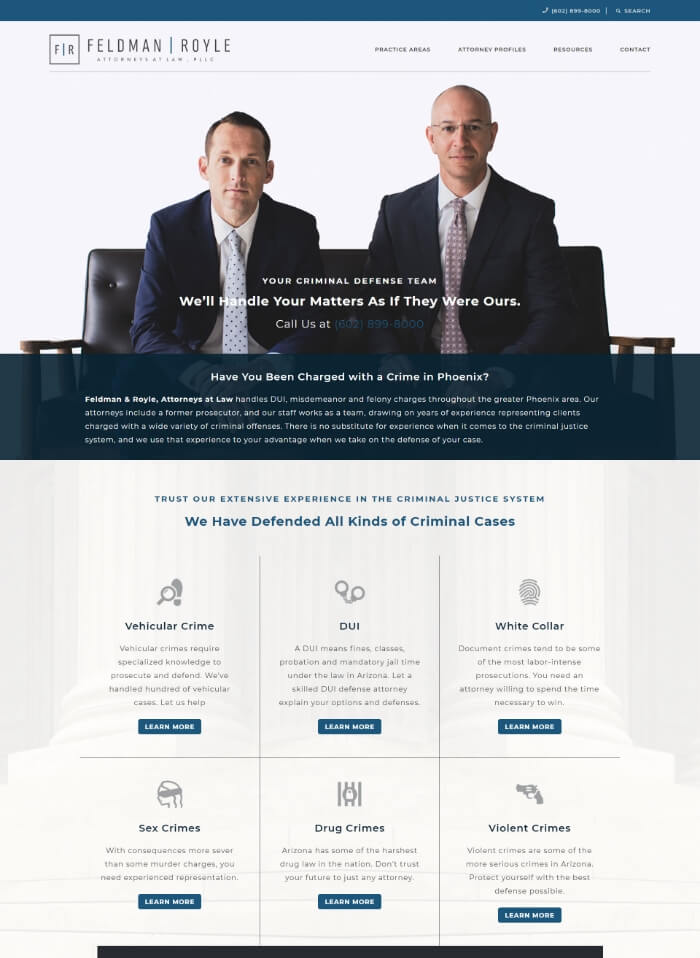
Feldman Royle
Include a persistent tap-to-call on mobile and a scannable list of practice areas to speed decisions.
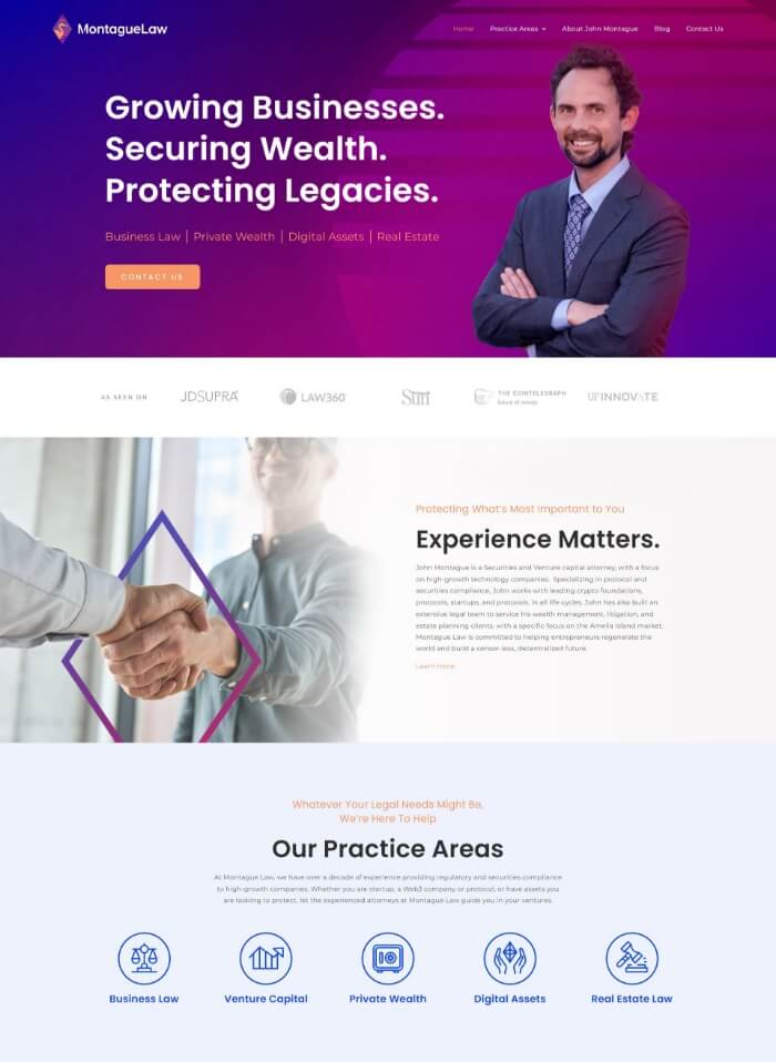
Montague Law
State the niche in the first sentence and place one primary call to action beside it.
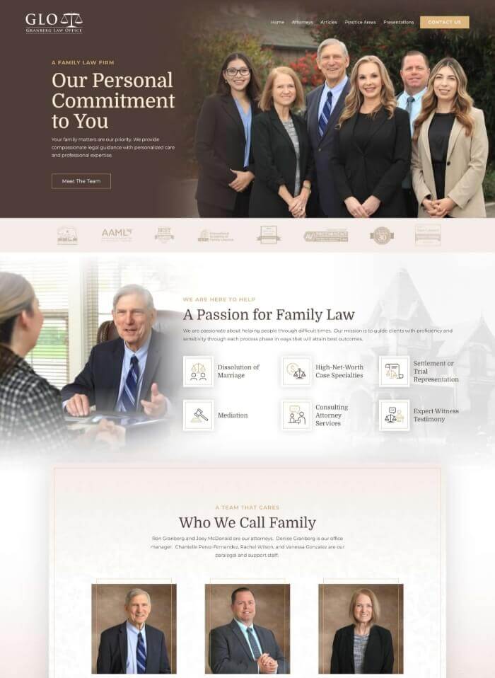
Granberg Law Office
Repeat contact options in the header and near key sections so the next step is always visible.
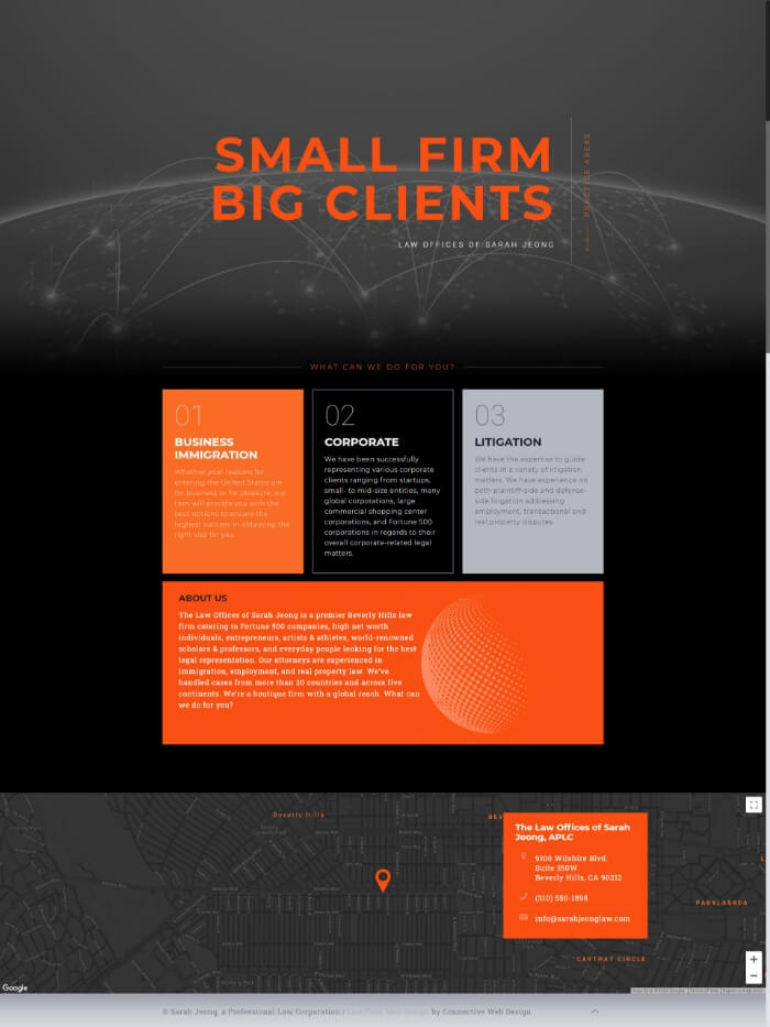
Law Offices of Sarah Jeong
Highlight specialization and show a short, low-friction contact form above the fold.
The 20-point audit that actually matters {#audit}
Run this on your phone, not desktop. Check every box honestly.
Mobile experience
- Can you tap the phone number from homepage? □
- Does page load quickly on 4G? □
- Are buttons big enough for stressed thumbs? □
- Can you read text without zooming? □
- Does contact form work without frustration? □
Intake optimization
- Is phone number visible immediately? □
- Is “Schedule consultation” button above fold? □
- Does form have 5 fields or fewer? □
- Do you confirm next steps after submission? □
- Can people text you directly? □
Trust builders
- Are bar numbers visible on attorney pages? □
- Do you show reviews from last 12 months? □
- Are fees mentioned anywhere? □
- Do you use real photos, not stock? □
- Can credentials be verified easily? □
Content clarity
- Would stressed person understand homepage? □
- Do you answer “How much?” and “How long?” □
- Are practice areas defined clearly? □
- Do you explain next steps? □
- Is contact info on every page? □
Scoring:
- 18-20: Your site is an intake machine
- 15-17: You’re leaving money on the table
- 12-14: You’re losing half your potential clients
- Under 12: Your competitors thank you
Fix these today:
- Add clickable phone to header (5 minutes)
- Change “Contact” to “Case Review” (2 minutes)
- Add text option (1 hour)
- Write fee ranges (30 minutes)
- Get 5 client reviews (2 hours)

Frequently asked questions {#faqs}
Should I show my fees on my law firm website?
Yes, in most cases. Transparency about fees or fee ranges helps qualify leads and builds trust. Prospects who can’t afford you won’t waste your time, and those who can will appreciate the clarity. Even stating “contingency basis” or “payment plans available” is better than silence. Check your state bar rules for any restrictions on fee advertising.
How much should a law firm website cost?
A basic template site might cost $2,000-5,000. A custom-designed, conversion-optimized site typically runs $10,000-35,000. Enterprise law firm sites can exceed $50,000. But here’s the reality: a $5,000 site that converts at 3% beats a $50,000 site that converts at 0.5%. Focus on conversion elements, not price tags.
Do I need a custom design or can I use a template?
Templates can work if they’re mobile-responsive, fast-loading, and you customize them for your firm. The danger is looking exactly like every other law firm using the same template. If you go template, invest in custom content, photos, and conversion optimization. Those matter more than custom design.
Should I do my own SEO or hire someone?
Unless you have 10+ hours per week to dedicate to SEO, hire someone. SEO requires ongoing content creation, technical optimization, and link building. Most attorneys who try DIY SEO give up after a few months. That said, understand the basics so you can evaluate whether your SEO provider is delivering value.
How do I comply with my state bar’s advertising rules?
Every state has different rules about client testimonials, case results, and advertising language. Review your state bar’s advertising guidelines before publishing. Common requirements include disclaimers about past results, avoiding terms like “expert” or “specialist” without certification, and maintaining client confidentiality in reviews. When in doubt, run it by your bar’s ethics committee.
Should my law firm be on social media?
It depends on your practice area and target clients. Personal injury and family law often benefit from Facebook presence. Business law firms typically see better results on LinkedIn. Criminal defense might avoid social media entirely. Don’t be everywhere – be where your clients are, and be consistent.
How often should I update my law firm website?
Blog monthly at minimum for SEO value. Update attorney bios when anything changes. Refresh practice area pages annually. Check all contact info quarterly. But the real answer: update whenever something would impact a client’s decision to hire you. New verdict? Add it. New attorney? Update immediately. Moved offices? Fix it today.
What’s more important: beautiful design or fast loading?
Speed wins every time. A beautiful site that takes 8 seconds to load will have a 70% bounce rate. An ugly site that loads in 2 seconds will get calls. Obviously, aim for both. But if you must choose, remember this: a beautiful site that never loads doesn’t exist. A fast, clear site gets the call.
The bottom line
Your law firm website isn’t about impressing other lawyers or winning design awards.
It’s about being findable, trustworthy, and reachable for people who need legal help right now.
The best law firm websites make it stupidly easy for qualified clients to become actual clients. They load fast on terrible phones. They answer real questions immediately. They build trust with specifics. They make contact effortless.
The firms with “ugly” websites that nail these fundamentals are crushing the firms with gorgeous sites that miss the point.
While you’re debating color schemes, your competitor is answering the phone. While you’re writing about your “comprehensive approach,” they’re telling people what things cost. While you’re hiding behind “contact us for more information,” they’re booking consultations at 2 AM.
Your website should be an intake engine, not a brochure.
Your move.


