


Law firm web design study
100 Top-Ranked Personal Injury Web Designs Analyzed
This is an in-depth study of the top 100 personal injury law firm web designs in the United States.
Ever wonder what makes the top law firm web designs tick? How do these page one attorneys across the US spend their money on landing pages and web design? What are these lawyers, with the big budgets, doing differently than you? What are you doing the same?
In this article, I’m going to give you the data that could help answer these questions and more. Read on!
Introduction
Go right to the research results? Skip the Intro.
Background
Early 2019, I started the spreadsheet that would eventually turn into this article. I Googled “Personal injury attorney Los Angeles” knowing that the law firms residing on page one for this particular keyword would have had to have put serious effort into their marketing and landing pages in order to be there.
That particular keyword ranges in cost from $75 to $225 per click for those running Adwords to get that placement depending on the city you search within.
Every. Single. Click.
The cost is telling about just how valuable it is to be on page one for that term for a personal injury attorney. To rank on page one, the law firm would have had to have fought through one of the most competitive verticals in organic search. It is also likely that the law firm’s marketing team has put significant effort into their landing page design or else they risk squandering the precious visit.
To get to the bottom of it all I started taking notes about the web designs. I analyzed their SEO and brainstormed about other questions that I could answer based on studying these sites.
Ultimately, I just thought it was interesting to uncover similarities and note differences in all of these law firm sites. My goal was to see what makes the top-ranked personal injury attorney web designs in the United States tick.
WEB DESIGNERS, PLEASE DON’T MURDER ME!
I am not suggesting that frankensteining together a website with this information should be done. Doing this would likely result in a super dull web design that lacks individuality or personality for the law firm. Just because X% of these sites have a logo on the left does not mean yours should have one too. In fact, it may be more useful to do the opposite. There is so much more that goes into a successful law firm website design than what this document covers. These questions asked were just easily identifiable attributes that I could measure and compare. I do think the data is useful though and you can do with it what you will!
The (Abridged) steps taken to analyze 100 lawyer websites
- Noted the top 18 most populated cities in the US.
- Performed a localized search for “personal injury attorney CITYNAME” for each using Google’s Ad Preview Tool which allowed me to “localize” my search as if I am searching from within the corresponding city. Don’t worry; I clicked no ads in this test!
- Removed directory sites (Yelp, Avvo, Super Lawyers, etc.) and paid advertisements to only be left with actual law firm websites that hold organic page one visibility.
- Answered 50 questions about every single one of the law firm websites. If you count 48 below it’s because I removed two questions for being too subjective.
- Compiled the data. Here is an eagle-eye view of the resulting spreadsheet:

6. Worked with a graphic designer to make visuals.
7. Wrote this post 🙂
** There were several browser extensions, websites, and tools used in this study to help answer these questions about law firm web design. I have listed them all out in a separate article.
Chapter 1: Basic website info

Chapter 1
Basic website info
Content management systems
What CMS’ do most attorneys use?
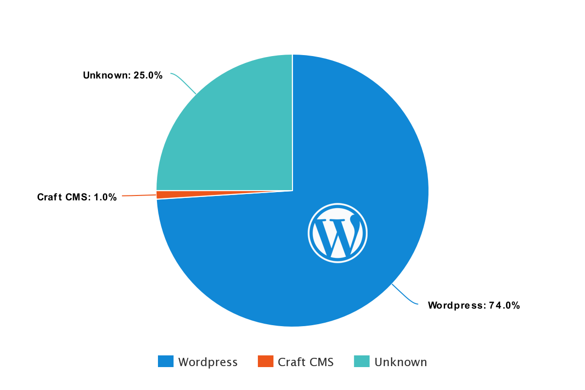
It is no surprise that WordPress is the clear winner here. 74% of these sites use WordPress as their content management system. Most of the remainder were set to “Unknown” as I could not tell from viewing the source code or running through tools. It is very possible that some of those websites were also WordPress sites.
Law firm websites are a perfect fit for WordPress development. WordPress allows for custom designs, plugins for things such as testimonials, shortcodes for buttons and an easy to use blogging system. WordPress developers are easy to find, and WordPress is also a very intuitive CMS to work with if you are wanting to update your site yourself without having to pay a developer.
HTTPS vs HTTP
What percentage of law firm websites have a security certificate installed?
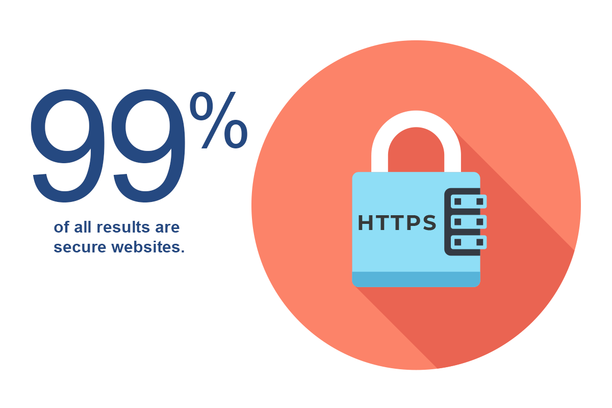
Just one lonely attorney had a website without a security certificate.
Back in 2014, Google released an article on their official Google Webmaster Central Blog stating:
“Over the past few months, we’ve been running tests taking into account whether sites use secure, encrypted connections as a signal in our search ranking algorithms. We’ve seen positive results, so we’re starting to use HTTPS as a ranking signal.”
Beyond the obvious security benefits of using an SSL certificate, it became a must-have for any website that cares about its positioning on Google. Google has essentially forced the entire internet’s hand into adopting security certificates.
If you have an attorney website that is not secure and currently shows “not secure” in Chrome, then you are missing the boat.
Responsive / mobile friendly
How many personal injury sites are using a responsive web design?
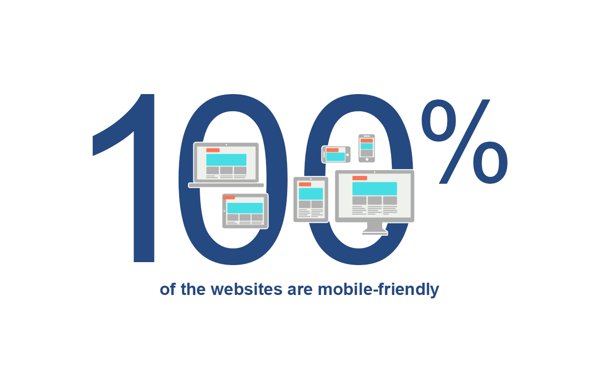
Every website in this study was mobile friendly.
Responsive web design can be described as a web design that dynamically responds to the width of the window it resides in. Items that, for instance, are side-by-side on a widescreen monitor become stacked when viewed on a skinny window width like a phone, allowing for more comfortable viewing and better usability.
In 2018 the share of mobile phone website visits grew to an astonishing 52.2%, topping desktop viewers.
Not being mobile friendly in 2019 likely means giving half of your visitors a terrible user experience and Google is certainly holding back your rankings (at least for mobile search).
Multilingual
How many law firm websites can be read in multiple languages?
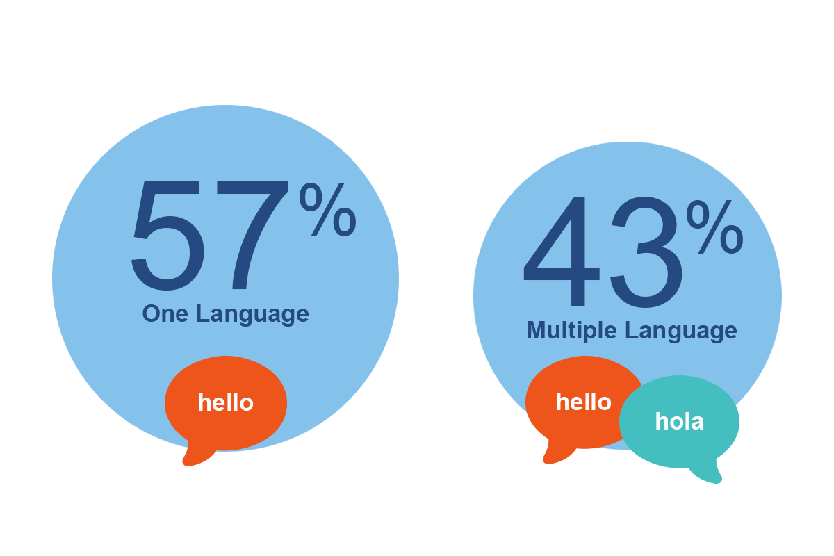
With roughly 20% of the US being multilingual, it makes more and more business sense to have language selections for web visitors.
43% of all top personal injury attorney web designs have options that allow people to read the site in either English or a second language. The second language in almost all cases was Spanish.
It may not, of course, be possible for all attorneys to offer their services in multiple languages, but I do think if it is remotely feasible, you would be opening up more opportunity.
Domain age
How old are the domain names of these law firms?
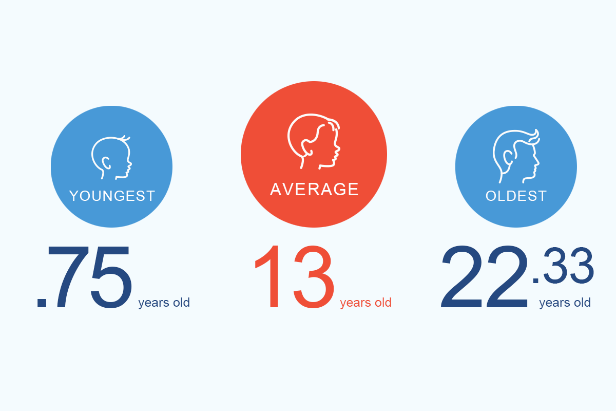
The top 100 page one attorneys have an average domain name age of 13 years. The oldest website is 22 years old and the youngest is not even a year old yet (that’s impressive!).
Google has stated that the ranking power the ranking power between a 6-month-old domain and a one-year-old domain is marginal.
I think the takeaway is that these firms have been at it for a long time. To be able to rank as a PI attorney in this super competitive vertical requires significant time and cost investment.
Domain name length
How long are the attorney’s domain names?
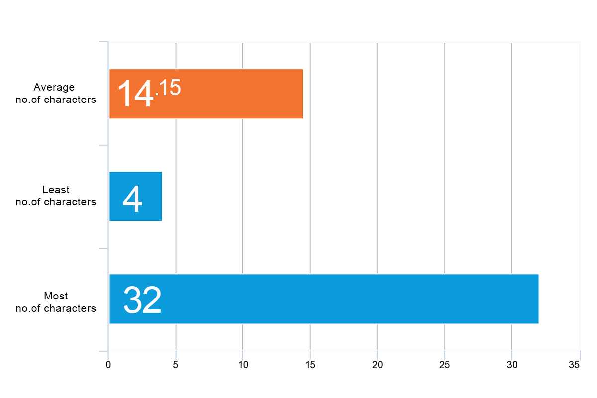
The average domain length for all attorney websites was 14.15 characters long.
For this observation, I only counted the “meat” of the URL.
For instance, this URL:
https://www.google.com
… would be counted as six characters in length.
The number of characters in a domain name appears to be immaterial from an SEO perspective. It is very likely more of a click-through factor though. A shorter name could “feel” more like a real brand to a searcher.
Your entire URL is also less likely to be truncated in a SERP the shorter it is. BUT having keywords in your domain, as you can see from the next section, can help in search as well as in giving people a clue as to the nature of the website they are clicking. Thus, longer domains may be better.
I was a little surprised there were not more short domain names in this list given the age of most of these sites. It was vastly easier 13 years ago to find an available concise domain name than it is now.
Keyword in domain
Do these law firms use keyword stuffed domain names?
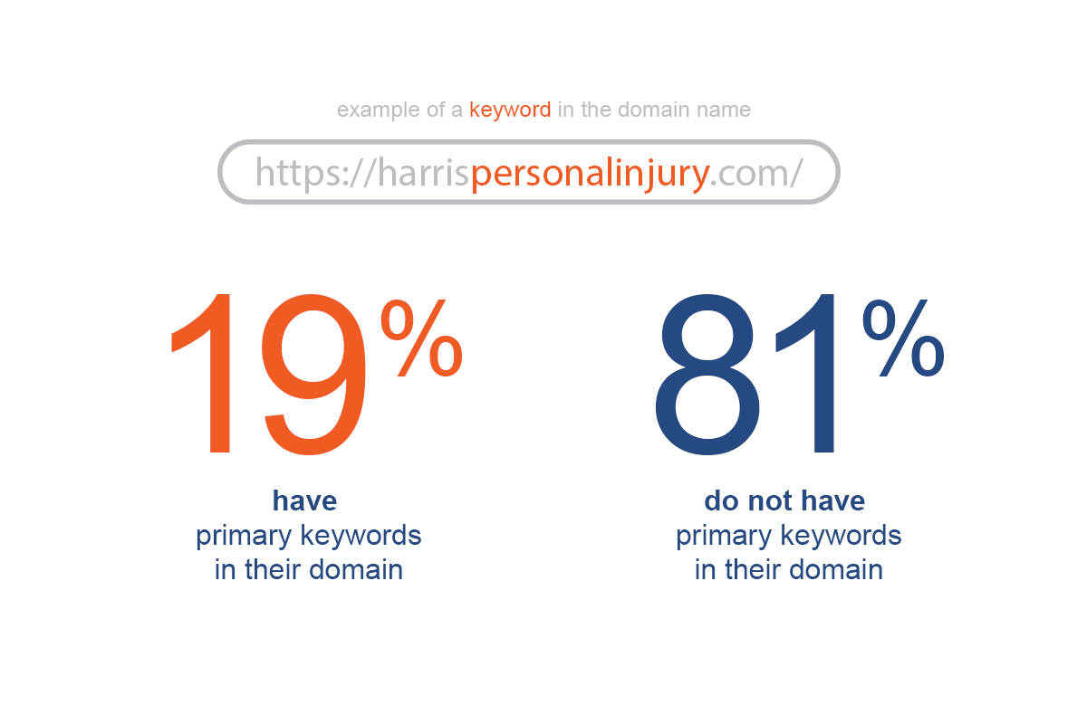
According to MOZ “If you can include a keyword that helps make it obvious what your business does while keeping your domain name catchy, unique, and brand-friendly, go for it.”
From both a click-through perspective and an SEO point of view, keywords in a domain do play a role in your law firm’s potential visibility. It is not the golden egg some marketers make it out to be, but it does indeed matter.
When analyzing these law sites, I was concerned with seeing if the domain names had any iterations of “personal injury” or “car accident” and DID NOT count domains that only had “law firm” and the like. Given that our seed keyword was “Personal Injury Attorney XXX” I wanted to stick to only counting the domains that very closely matched the original search term’s intent.
As an aside: I did not see any instance of a lawyer’s domain having hyphens.
Pingdom performance grade
What Pingdom grade do the law websites have?
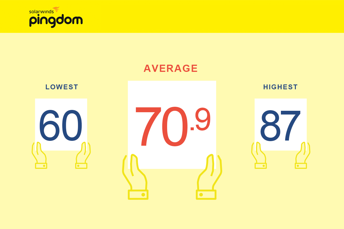
Pingdom’s Performance Grade is on a 1 to 100 scale and is calculated using the YSlow method that you can read about here. It is essentially a collection of rules in a scoring system that Yahoo came up with years ago to help measure the performance of a web page.
Bigger numbers = better!
When running this test (and the next two), I selected the data center that was closest to the attorney’s actual location.
The average law site had a grade of 71, with the lowest score being 60 and the highest coming in at 87.
Total page weight
How many megabytes are the lawyer’s landing pages?
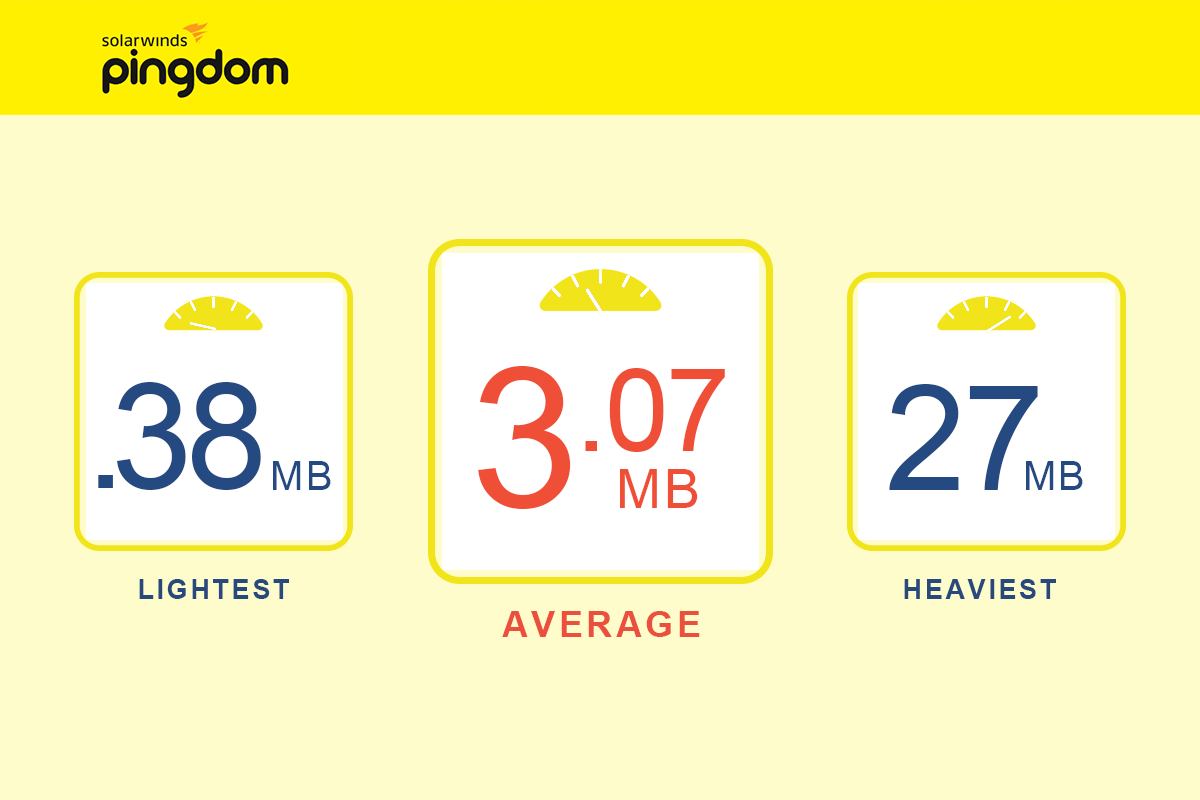
Considering how much design has gone into some of these law firm websites, it is amazing to see how light in weight the pages are in general. The lightest website was under 1 megabyte, and the average site was 3.07 mb.
It is always a balancing act to have a fantastic web design while not creating so much bloat that it creates a slow site and thus, a terrible user experience.
Educating yourself about image compression is one of the easiest things you cahttps://www.shopify.com/blog/7412852-10-must-know-image-optimization-tipsn do to keep your file sizes down to a minimum.
Obviously, do not overdo it. Seeing an image with compression artifacts will quickly detract from your overall look and feel. It will feel like a boom arm has fallen into the frame and it will ultimately take away the user’s attention.
Seconds to load landing page
How fast do the top legal websites load?
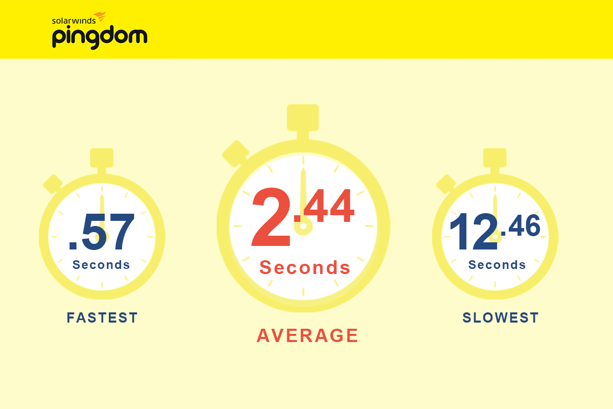
2.44 seconds was the average loading time for all 100 personal injury websites.
Measuring the speed of these law sites is a somewhat arbitrary exercise in that you could measure the same site a little later in the day and see drastic differences. The state of the server, current traffic situation and caching can all affect your load time in significant ways.
That being said, the test I ran would not be much different from a real-life user experience. A user would not give a slow site a second chance before moving away from the site. If I visited the slowest site on this list at a 12.46 seconds load time, I would likely never visit that site again strictly because of the lack of speed.
The speed of most of these websites felt very snappy to me. Seeing that most attorney sites fell just under the 3-second mark, I feel that aiming for that as a benchmark would be a legitimate number to keep your eye on for your own site goals.
Page speed is also now a verified ranking factor with Google. It’s also one of the first things you can look at to keep users from bouncing.
Check out the study Pingdom did below comparing page speed to bounce rate:
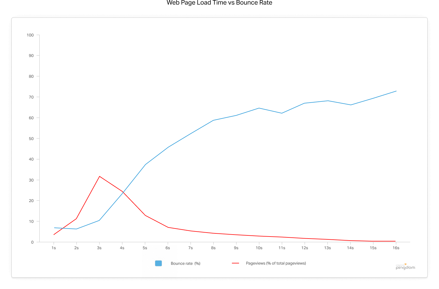
Looking at the above graph, you can see that once a page load time eclipses 3 seconds, the bounce rate soars to 38% by the time it hits 5 seconds! – source
Chapter 2: SEO data

Chapter 2
SEO data
Domain rating (Ahrefs)
What domain rating does Ahrefs give the websites?
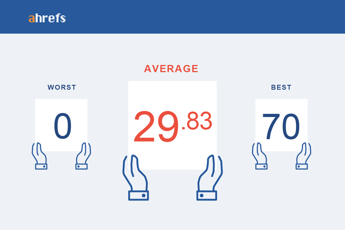
Ahref’s domain rating is a 100 point scale that measures the quality and quantity of the links pointed at a particular domain. It correlates highly with a website’s ability to rank in the search engines, and link builders use it as a metric to decide how much value a link may pass.
Bigger = Better!
The fact that the average DA for organically ranked law firm listings is at 30 gives you an idea of the link building work that was done to get there. Put your own URL into Ahrefs, compare your score and then get to work on more link building.
![]()
Linking domains (Ahrefs)
How many different websites link to the attorneys on page one?
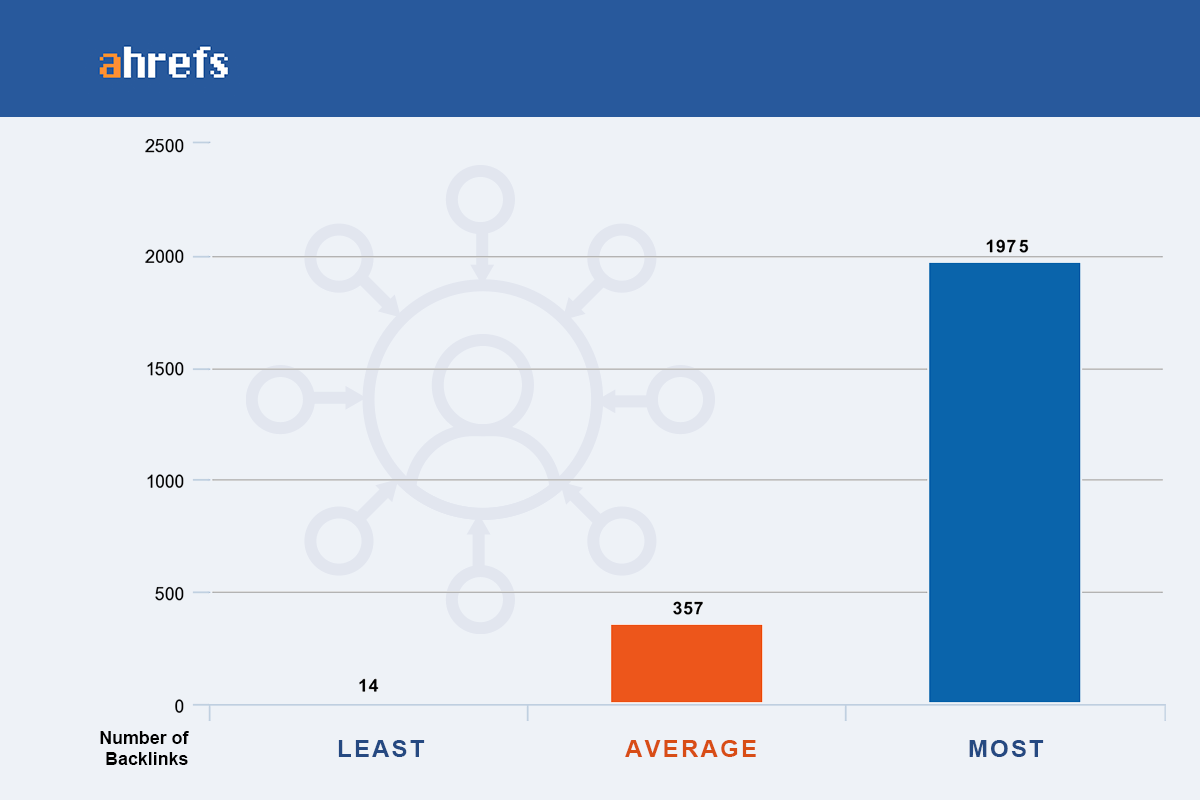
The total number of unique linking domains is still one of the most powerful signals to Google to indicate that your website is an authoritative property.
A mentor of mine liked to say: “If ten people are sitting at a conference table and 9 of them are all pointing at one person, then it’s safe to say there is something special about that one person.”
The same is true with Google’s algorithm. Google looks at a link as a vote that the linking domain trusts the website to which it is linking.
In short, if your law firm has a large number of quality inbound links from topically relevant websites, then it will be very good for your search visibility. It does not play any role in PPC of course.
The average number of unique linking domains is 357 and that is very high compared to other verticals in which I have worked. If you are an attorney and are hoping to get onto page one for a competitive keyword like the one we are researching today, then you better have a solid link building game plan.
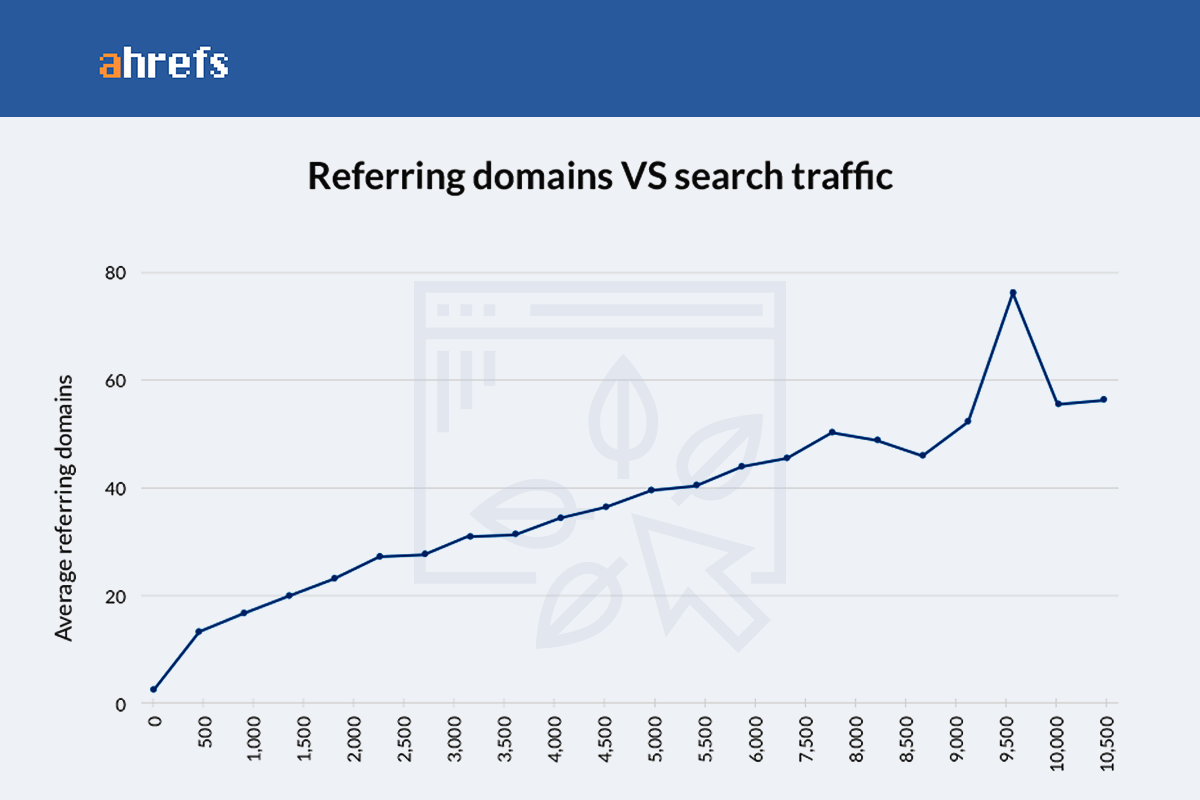
Here is a study showing the correlation between search traffic and linking domain count:
![]()
Total backlinks (Ahrefs)
How many total backlinks do high ranking lawyers have?
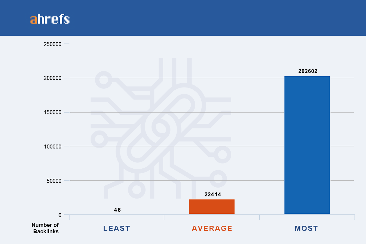
The total backlinks statistic is the count of ALL backlinks pointing at a website.
An interesting exercise is to look at the total backlinks that a law site has and compare it to the unique linking domains from the last section. If we take the average number of backlinks and divide it by the average number of linking domains we will see the following:
22,414 (total backlinks) / 357 (linking domains) = 63 links are coming from each domain. This is an average.
This tells us a little something about the linking practices of these top attorneys. They are getting a lot of site-wide links or “boilerplate links”. These footer, sidebar and navigational links are easy to manipulate and are sometimes associated with paid links and link schemes. It is a somewhat antiquated SEO technique in 2019, yet you still see it happening in some places.
Here’s a Matt Cutts quote from Wordstream:
“We’ve done a good job of ignoring boilerplate, site wide links. In the last few months, we’ve been trying to make the point that not only is link buying like that not doing any good, we’re turning the dial up to let people know that certain link spam techniques are a waste of money.”
Of course, there are very legitimate reasons to receive sitewide links, we just need to be aware that Google is actively trying to devalue the more manipulative types.
You can view your backlinks here:
![]()
Total keywords (Ahrefs)
How many unique keywords do the top law firm websites rank for?
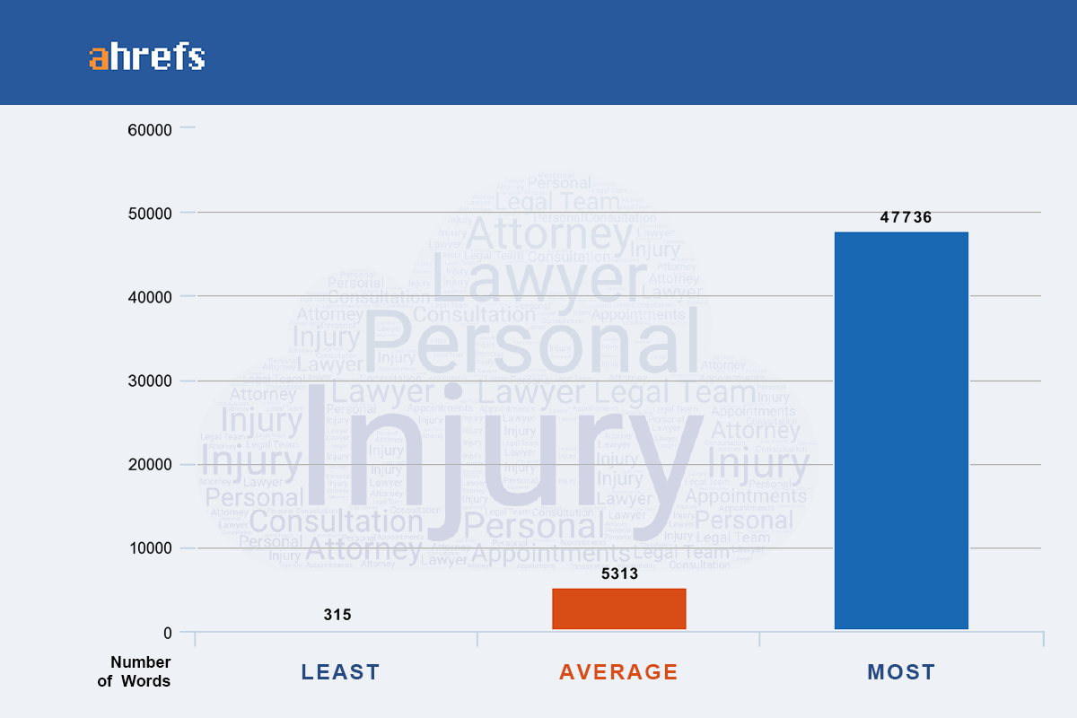
The total keywords metric is showing the number of keywords that a website has ranked in the top 100 of organic search. This is another Ahrefs metric.
On average, each of these 100 Top Lawyer web designs are ranking for 5313 keywords in the top 100 SERP positions. The more keywords a law site ranks for, the more traffic they get and, likely, the more clients they sign up through an organic search.
If your law firm wants to compete, this is a metric for you to follow. These law firms have had to build out a lot of high quality and in-depth content to be ranking for 5k+ keywords.
Total traffic (Ahrefs)
How many website visitors do top lawyers receive each month?
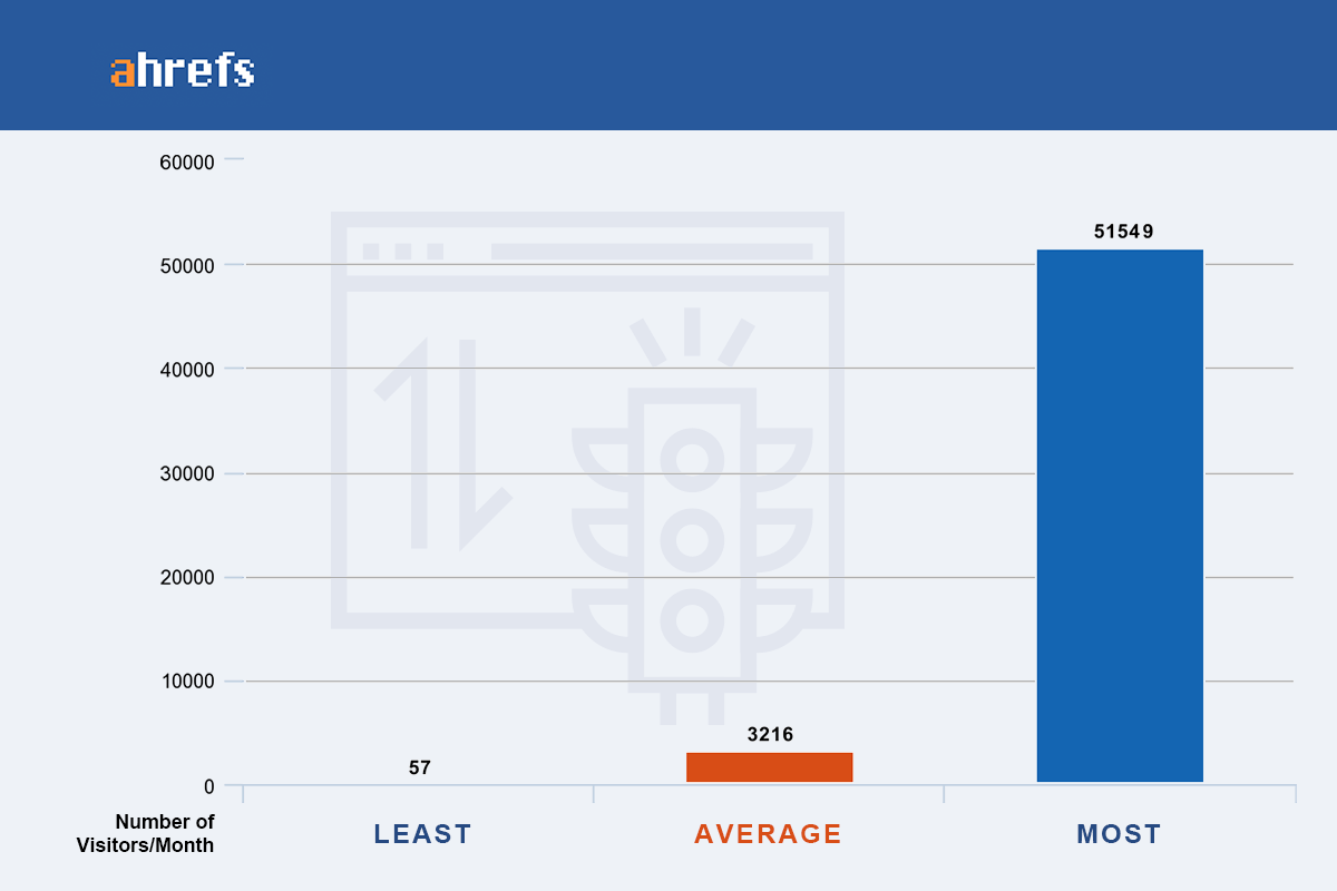
Total traffic is the estimated total monthly search traffic from the top 100 organic search results.
On average the top law firms are getting around 3,200 organic search visits per month.
I ran a few real-world comparisons of this tool vs. real analytics data to get a sense for accuracy. Here is what I found:
Website A: 2,000 estimated organic visits compared to 1,413 actual organic visits
Website B: 352 estimated organic visits compared to 729 actual organic visits
Website C: 1,700 estimated organic visits compared to 1,984 actual organic visits
The monthly visit count taken from Google Analytics was over a 6-month average. I’d say Ahrefs is pretty much in the ballpark.
Domain authority (Moz)
What is the average DA of the landing pages?
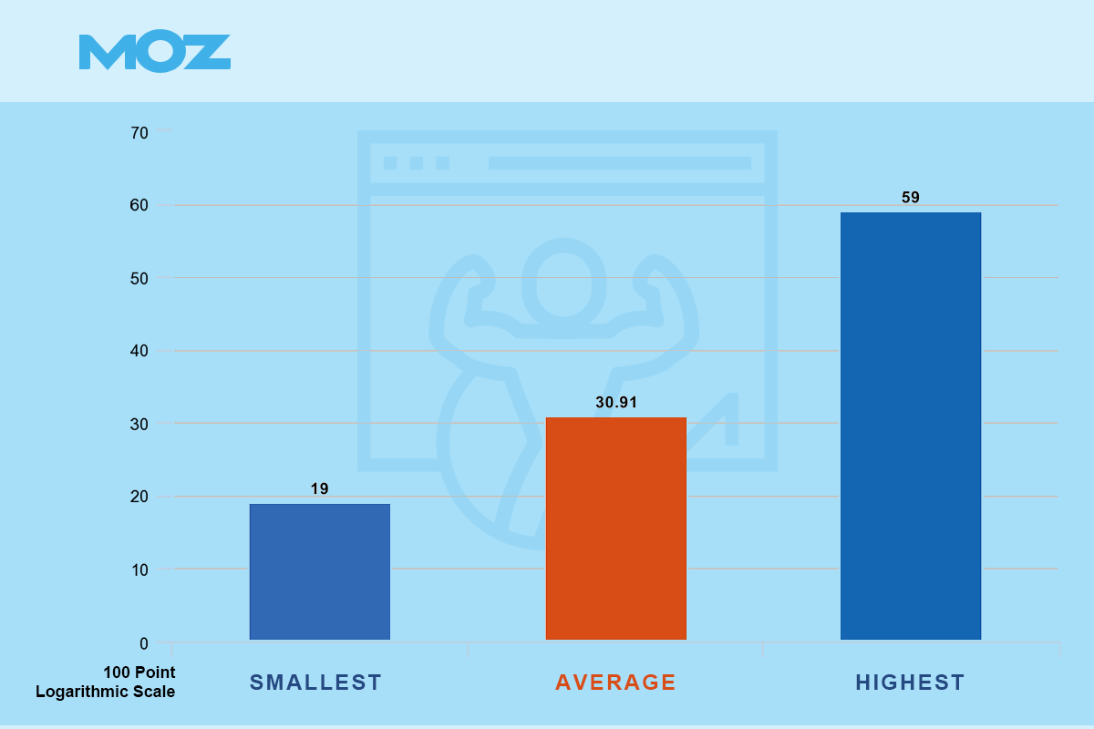
31 was the average Domain Authority across all 100 law firm websites.
Domain Authority (DA) is a 100 point logarithmic scale developed by Moz that predicts how a website will rank in search.
The higher the number = The easier to rank for whatever you want.
Get the Moz toolbar and you will be able to measure your own DA and then compare your number to the other law firms in your area. If your number is lower, I would suggest trying to gain some high-quality links. Others are going to have an easier time ranking their site than you will with higher DA.
Spam score (Moz)
What chance do these legal sites have of being in trouble with Google?
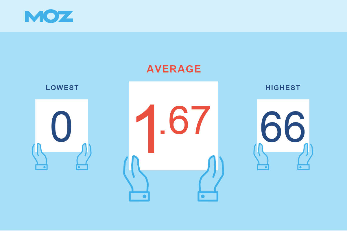
Spam Score is the percentage of websites with similar features Moz has found to be penalized or banned by Google. There are about 27 different attributes they look at to come up with this percentage based score.
The average spam score was 1.67%. This indicates that there is very little similarity in the backlink profiles of these attorney websites compared to sites that have been banned by Google.
If you find that your spam score is high enough to be concerned you may want to analyze your backlink profile and start disavowing the spammy links in Google Search Console. Google has made the process relatively simple and it can help out a ton.
Word count
How many words are used on a top personal injury landing page?
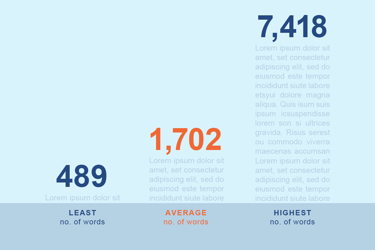
As you can see from the numbers above, long-form content is ruling the personal injury attorney space. There are over 1,700 words on average for each piece for all of these websites! That is a ton of content as an average across 100 websites. It’s apparent that law firm websites have a lot to say and their copywriters know the importance of being topically complete in the eyes of Google.
The challenge a law firm web designer will typically have is how to make a page with this many words easy to look at, simple to follow and digestible while still giving the Google gods what they want.
Think of the designer who worked on the home page design with 7,418 words!! Wow!
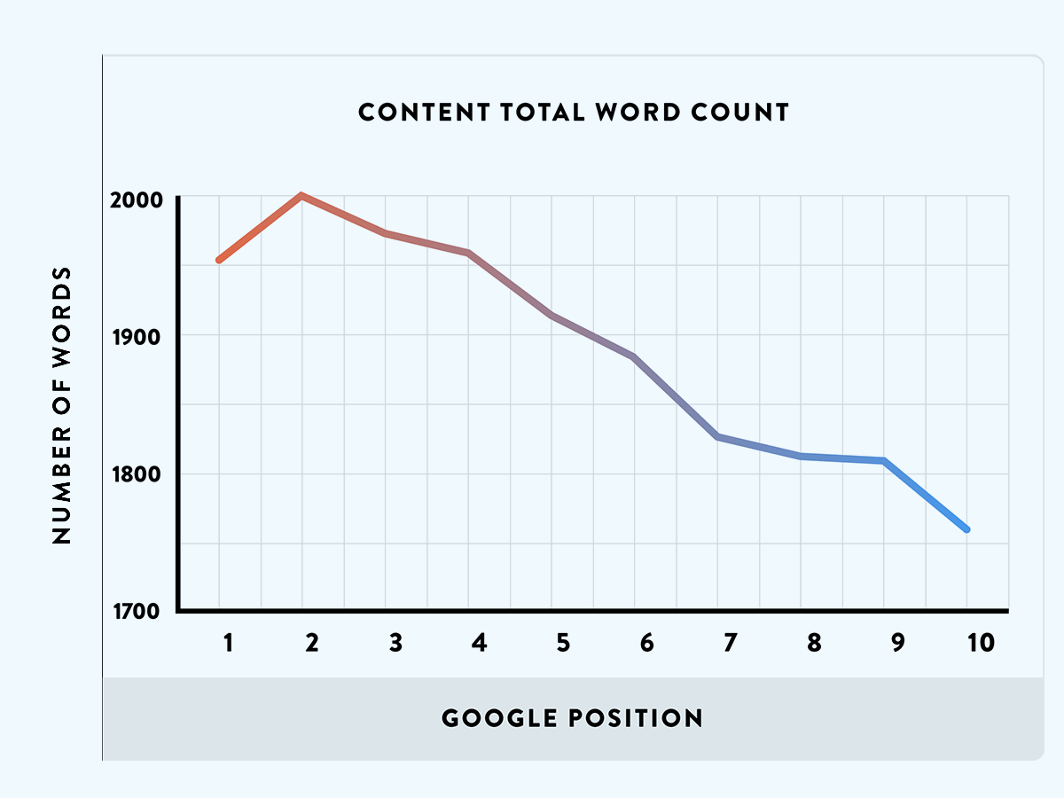
Brian Dean from Backlinko did a study on content length and how it correlates to higher rankings. He found that around 1,900 TOPICALLY RELEVANT words is a nice number to aim for. Here is a graph from his study:
![]()
Reading level (gunning fog index)
How hard is the content to read?
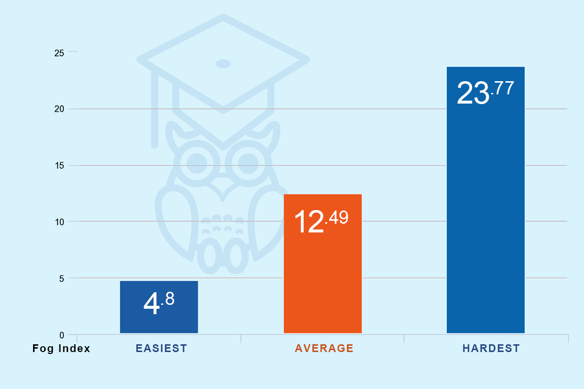
Gunning fog index is a readability test that estimates the years of formal education a person needs to understand the text on a web page. As an example, a score of 12 will require the reading level of a senior in high school.
The reading level of almost all of these law firm websites come in around a 12th-grade reading level. These law firms are clearly trying to strike a balance between sounding like experts while not talking over their target audience’s head.
Here is an interesting table that explains the scores:
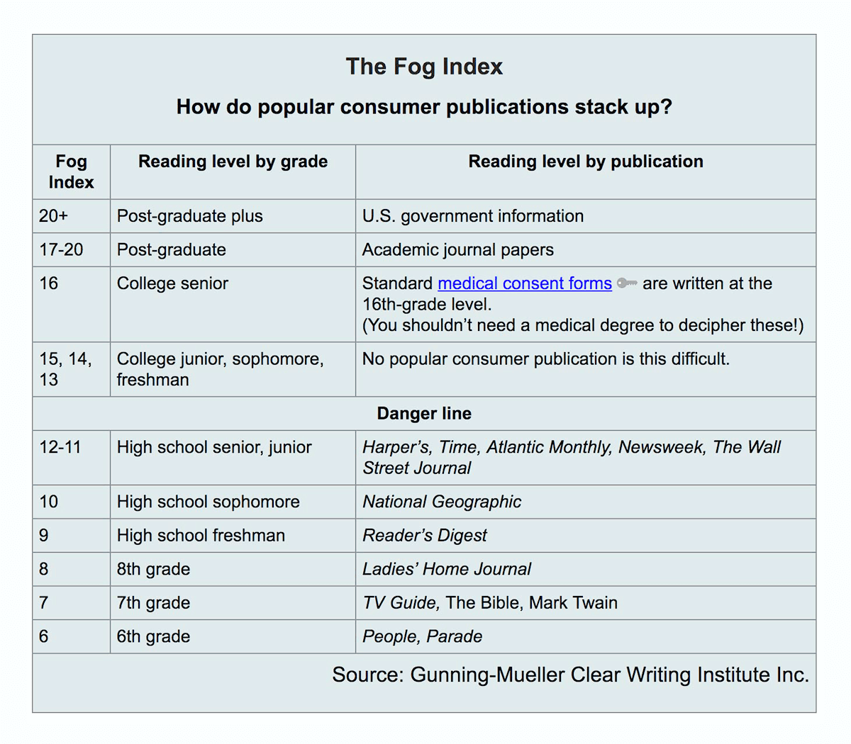
– Source
Chapter 3: Landing page observations

Chapter 3
Landing page observations
Overall design width
How much of the monitor width does the design use?
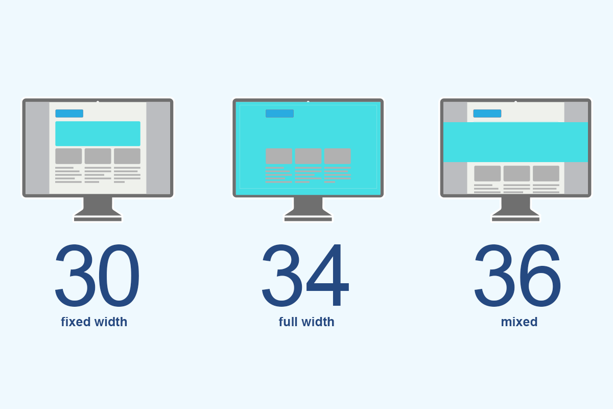
There were three possible answers for this question relating to how much of the horizontal space is utilized in the design:
- Fixed width: The majority of the web page sticks to a fixed-width container that is less than the width of the browser.
- Full screen: The majority of the web page flexibly adjusts to utilize the full width of the browser window.
- Mixed: The web page uses a relatively equal mix of full screen and fixed width content.
In general, I saw that there were slightly more sites that were mixing fixed and full-width design elements. It was a pretty even count though for all datasets. Good design can be obtained with any of these layouts, and I saw stellar examples from all three categories.
The websites that used a mix of these elements felt a bit more modern to me, and if you study current web design trends, you tend to see the width of the monitor being used in varying ways to provide interest.
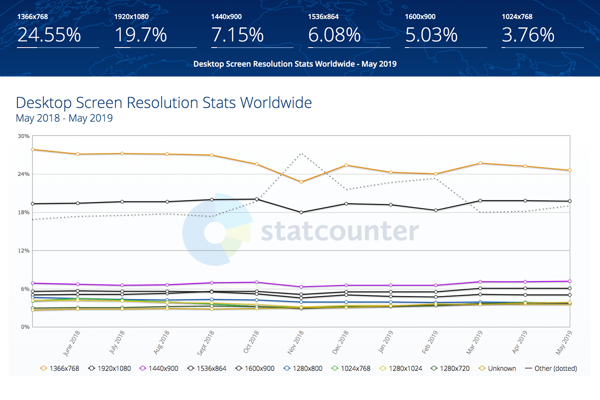
If your web designer will be designing in a fixed width, here are the most common screen widths to pay attention to: https://gs.statcounter.com/screen-resolution-stats/desktop/worldwide
Logo location
Was the logo placed on the left, center or right?
![]()
One of the primary goals of an effective attorney web design is to make it super easy for the end user to navigate the site. The user interface should feel familiar to someone who needs an attorney because of an injury.
Being credible and having your own identity is important for sure, but I did not see a ton of deviation from the norm in regards to interface layouts. Having the logo in the tried and true location on the left-hand side of the screen seems to be the way to go for the majority of these sites, as only two of them were not in that location.
Logo contains keyword / descriptor?
Do the attorneys put a keyword or descriptive text directly in their logo?
![]()
36% of all law firm logos have a descriptor attached to it such as “Injury Lawyer” or “Accident Attorneys”.
This could simply be that the law firm’s name actually includes the keyword or it could be to help end users identify that they are on the right type of attorney site before hitting their back button.
My opinion is that the descriptors are not necessary if the rest of the web design is doing its job correctly. They do have their obvious benefits though!
Navigation type
What style navigations are popular among the top lawyer designs?
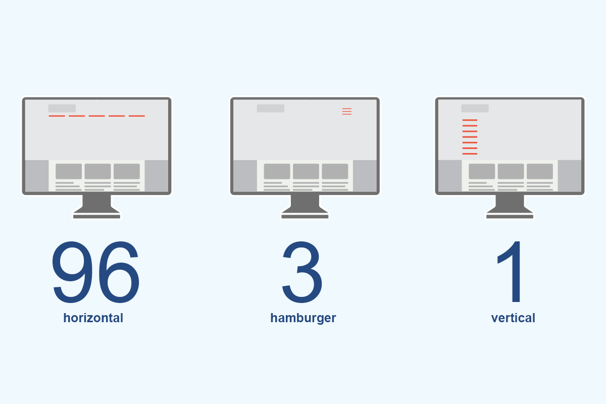
In other industries, we are seeing a lot more variety in navigational choices with the desktop adoption of the “Hamburger Navigation”, vertically oriented navs or even other more creative solutions. .
In law sites, we are seeing firms stick to horizontal navigations that are situated across the top of the website. People know it and there is no creative thinking required to work it.
Attorneys have little need to be on the leading edge of tech when it comes to UX / UI. I do think we will start to see more and more hamburger navs in the coming years. For now, the PI attorneys holding page one real estate are not adopting it.
Phone number location?
Do the legal web designers place the phone number prominently and above the fold?
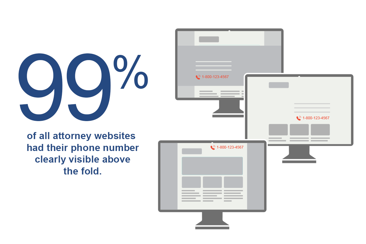
Make it as easy as possible for potential clients to get in touch with you. There is nothing worse than finding what you are looking for, like an attorney who you would not mind starting a dialog with, but then having to hunt for a phone number.
99% of these websites have the law firm’s phone number proudly displayed above the fold.
A perfect visit for any attorney would be for a potential client with a real case picking up the phone and calling or filling out a contact form. Making it as easy as possible to find the lawyer’s phone number is just good sense in the web layout.
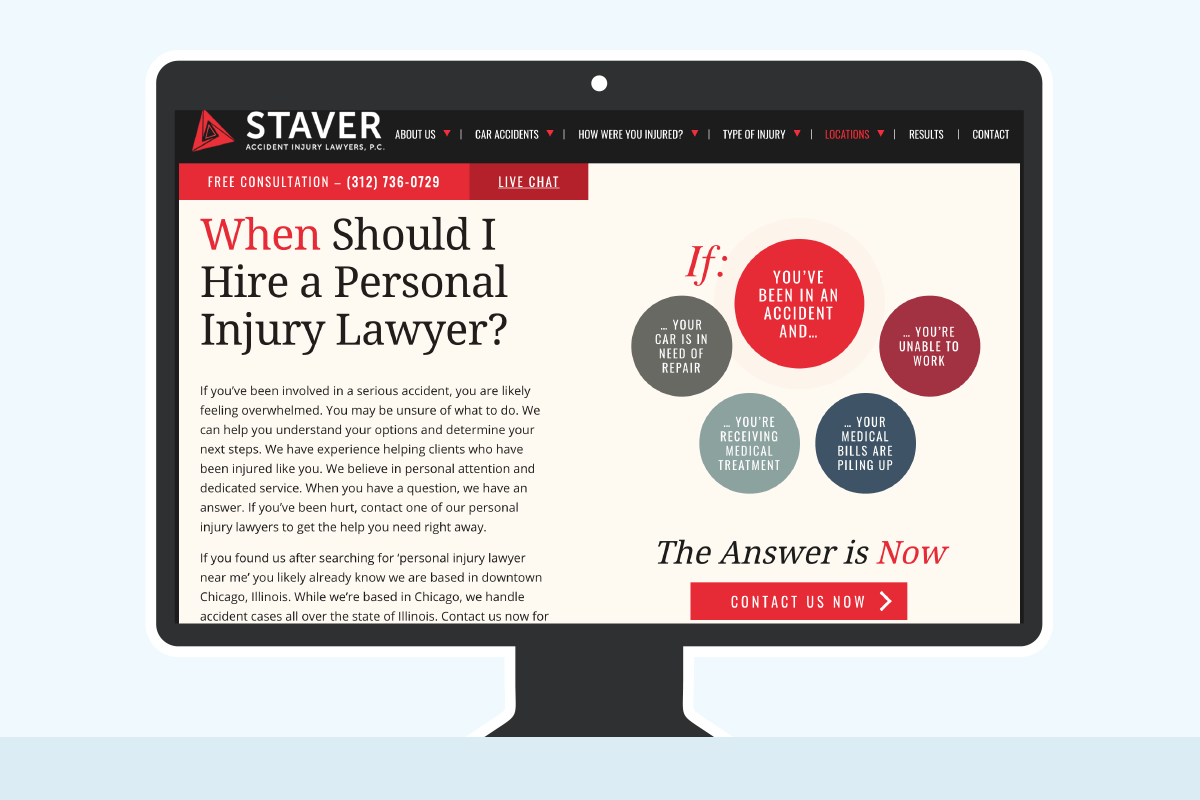
Hero image area type
What do the attorney designers do with the tops of the web design?
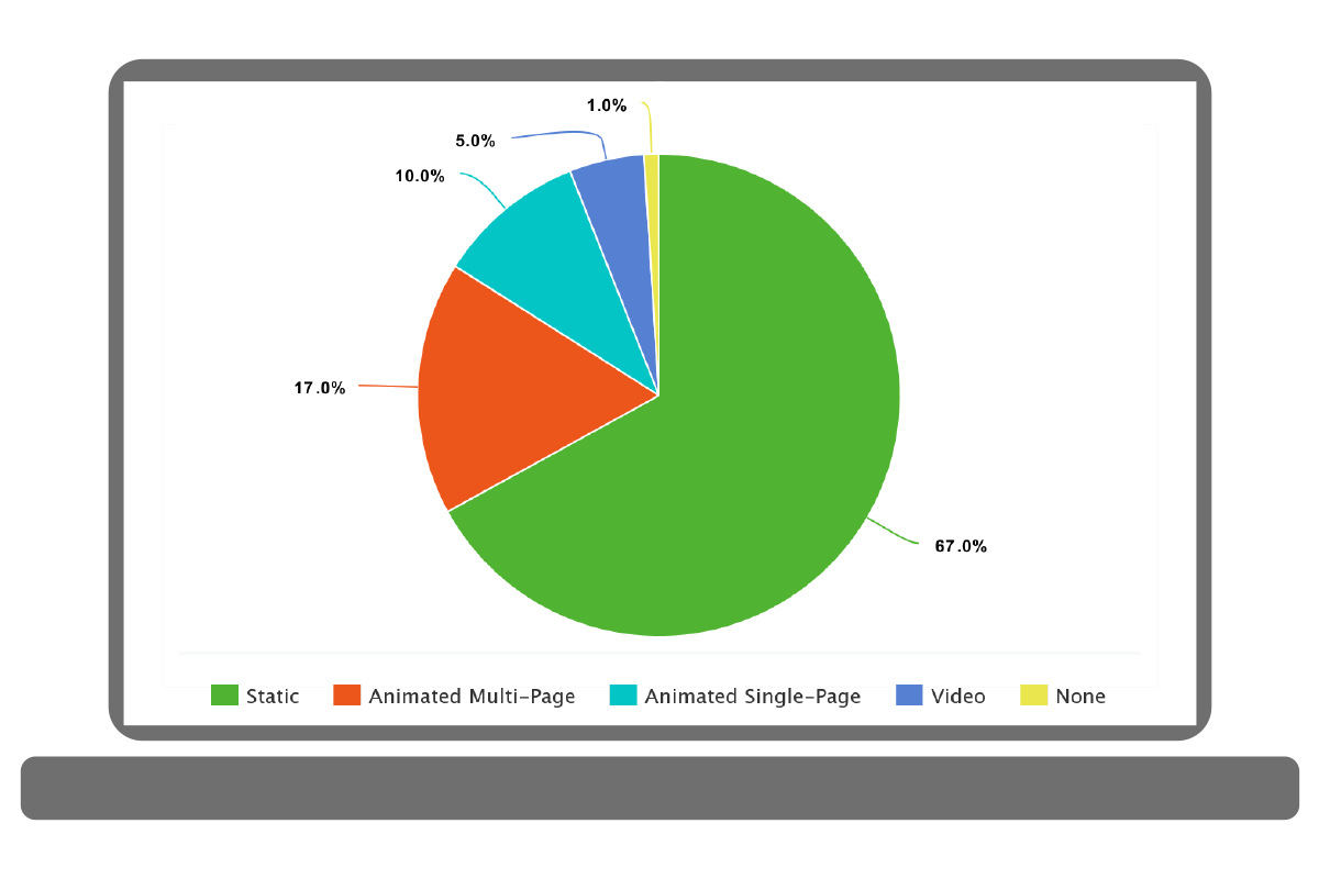
The hero image area is the large area sitting front and center on the website when you first visit. It is the eye draw and first impression for the website. It is huge in determining whether a website visitor stays or goes.
I devised a way to categorize the various ways attorney web designers are using the “hero image” area and placed them into one of five categories:
- Video background: There is a video playing in the area a background image would typically be located.
- Animated single page / Single message: The image and text is the only image and text displayed, but it animates into place for visual interest.
- Static: There is a static image and text displayed.
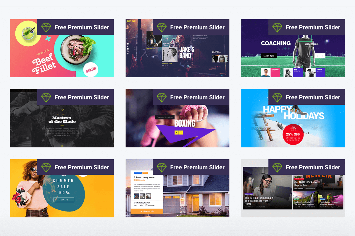
- Animated multi page / Multi-topic: This “slider” would change images and text through multiple messages. Very common with WordPress sites that bundle revolution slider.
- No image: These could technically be classified under “static”, but I felt that the lack of any image at all in that prime real estate area of the attorney’s home page should be noted separately.
I was surprised by the outcome. The vast majority of these websites (~70%) used just a static image and text for the main area of the home page. I appreciated the approach though, as these can be very impactful while not having the bloat of a fancier solution.
I feel that multi-page sliders and the fancier slides that you see in modern WordPress design are sometimes wasted as people tend to not sit through them. They would already be moving towards what they want to do before slide #2 happens.
Most WordPress sites come with Revolution Slider. Slider Revolution (Revolution Slider) is an innovative, responsive WordPress Slider Plugin that displays your content the beautiful way. Here are some examples:
![]()
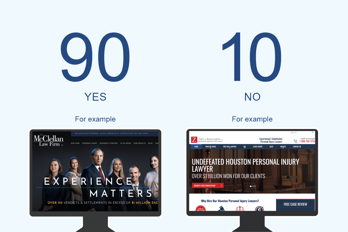
Attorney image above the fold
Do most legal websites have an image of the lawyer at the top of the website?
80 out of all 100 personal injury attorney websites have an image of the attorney or the law team above the fold.
Working with an attorney can be a profoundly personal experience and letting potential clients get a glimpse of the firm’s personality and culture could help them feel more comfortable with hiring them.
Real imagery exudes authenticity. An actual photograph can help people get over any stigma they may have. If visitors can put a real face to the firm, it can help increase confidence.
There was one particularly good example from the study of excellent attorney portrait photography. Notice the impressive depth of field and excellent post processing on this site: https://www.habbaslaw.com/
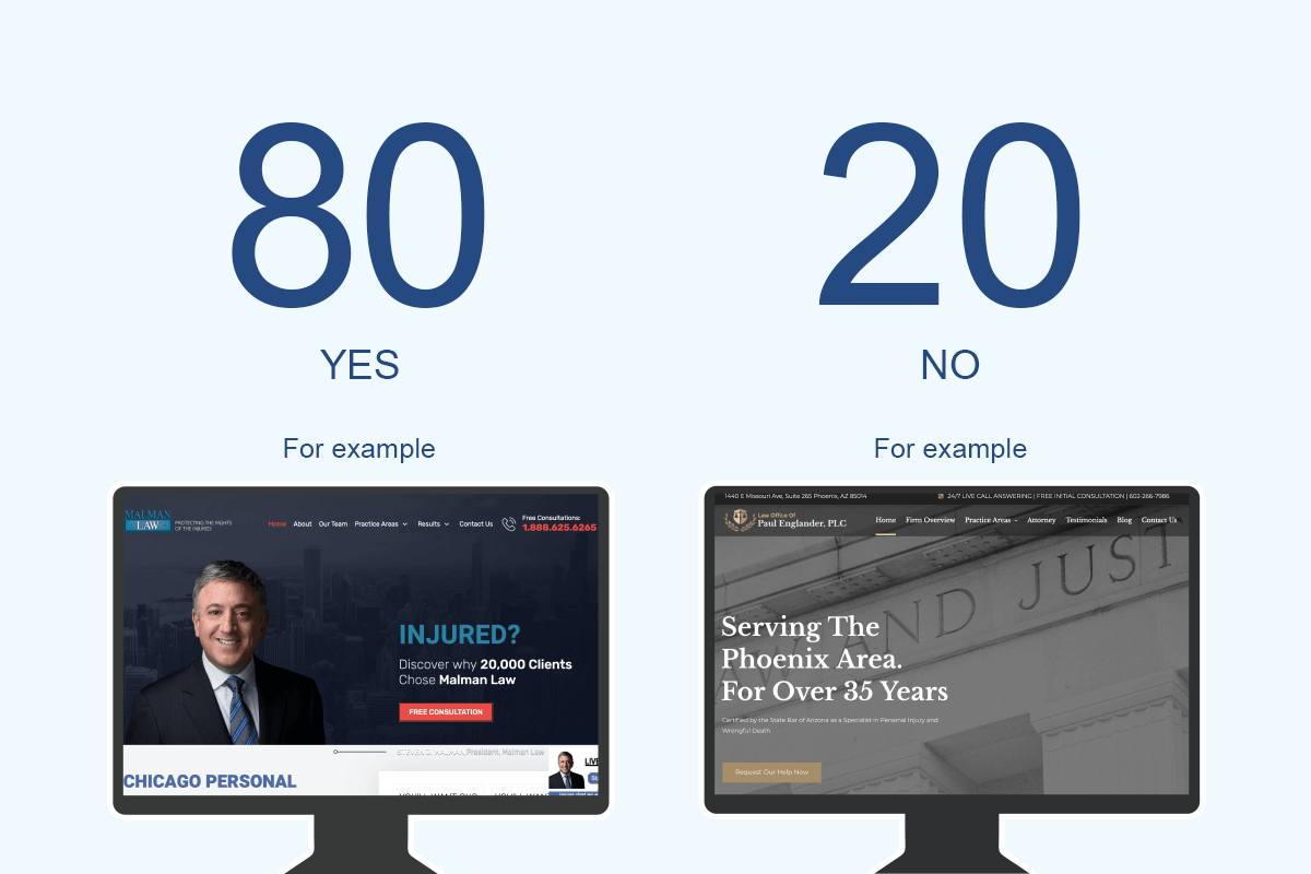
Custom photography above fold
Does it seem like the law firm hired a professional photographer for the website design?
What I mean by “Custom” photography?
Basically, I was guessing as to whether a photographer was hired to make purpose-built imagery for the website or not. If it seemed like that was the case, then I would mark it as “yes”.
Seeing a scale of justice or gavel as the primary focus of the hero image area would be marked as “no,” as an example.
At times, I had to take a guess as to whether a stock photograph is indeed a real photograph. Because of that, it was difficult to judge sometimes.
90% of all websites had the attorney(s) in the shot and featured the actual office space they work in or an image of the city in which they are located.
City visually represented in main image
Is there imagery of the law firm’s city in the hero image?
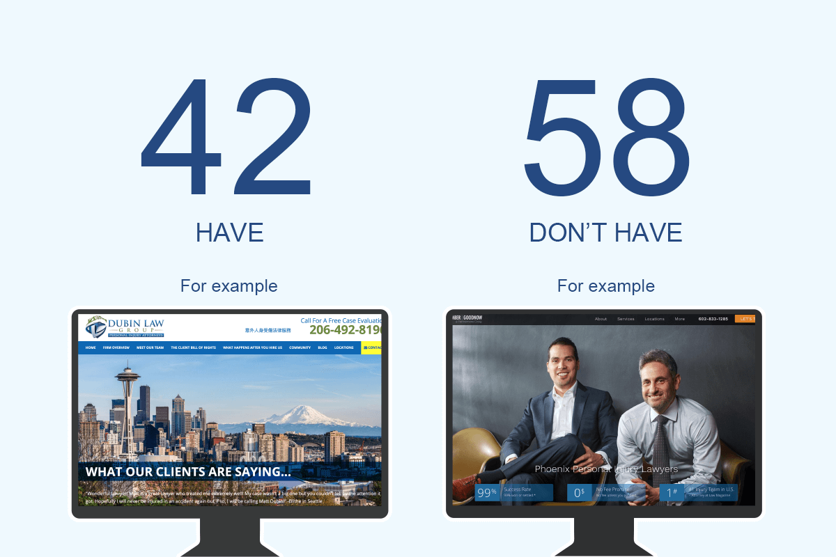
42% of all websites had a visual representation of the city that the attorney practices in placed into the hero image area of the site. These could be very obvious city skylines or recognizable landmarks, or even office buildings.
It is an excellent way to help a website visitor understand that they are on the website of an attorney that practices in the city where they need them. It helps with familiarity and may make people feel a bit more comfortable at first site.
It is clearly not a priority for all of these lawyers, but it happened enough across these 100 websites that I thought it worth mentioning.
Chapter 4: Web design attributes

Chapter 4
Web design attributes
How many big images?
How image-heavy are the lawyer web designs?
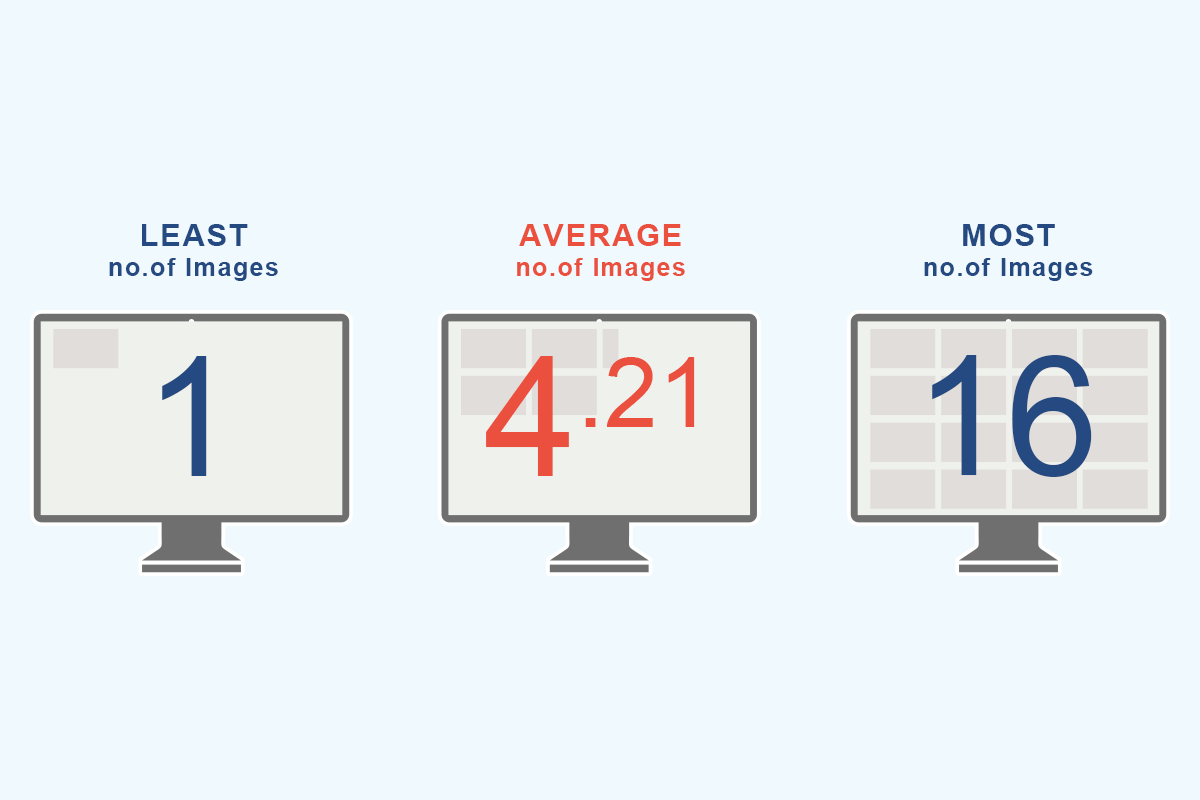
I defined a “big image” as an image that takes up at least one third the width of the main content area. This means that icons and other smaller images were ignored in the count.
The average number of large images across all law firm sites came in around four per landing page. There was a single instance of just one image and one firm that had 16 big images!
The relationship between how image-heavy your website is and its effect on the speed of your site needs to be continually observed. As is true in any industry, finding a balance between form and function is necessary. The imagery on a website can really shift a users perspective, and a slow-loading website can be devastating for bounce rates.
Color scheme
Are the web designs light, neutral or dark in lightness?
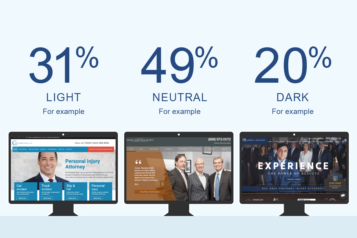
This was a relatively subjective question. I would quickly skim the page from top to bottom and cast my vote on it feeling light, dark or neutral. My impression of about half of them was that they were neutral.
I would attribute most sites being light or neutral to designers wanting the websites to be as readable as possible. A lighter background paired with dark typography creates the perfect contrast to keep content digestible.
Some darker websites, like this one, did a great job of setting a serious tone and professionalism through its darker color scheme.
How many main colors?
How many colors are in the law firm web designs?
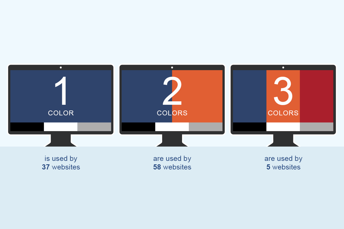
To answer this question, I counted the number of significant colors that the landing page had. I excluded black, white and grey from the count.
TThe average came in at 1.68 colors used per design. The majority had a base color and then a second color as a highlight used for callouts and eye draw. There were some outstanding one-color examples sitting proudly next to the two color majority.
I believe that the takeaway is keeping color schemes simple will add more impact, be easier to understand and result in a more cohesive web design.
Dominant color
What was the most dominant color used in top attorney web design?
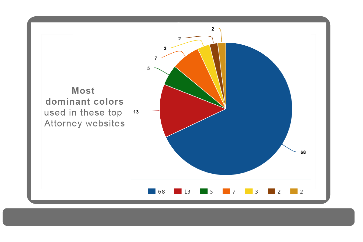
Based on looking at the above, it is pretty clear to see that lawyers like blue. The base (or dominant) color of 68% of these law sites used a shade of blue.
According to Smashing Magazine “Dark blues, like navy, are excellent for corporate sites or designs where strength and reliability are important.”
Color Wheel Pro explains that dark blue is associated with stability, expertise, and depth and that it is the color of corporate USA.
The second most used color at 13% was red. Red tends to be related to danger which has its obvious association with accident lawyers. It is also representative of power and passion.
Accent color
What was the most popular accent color used on these legal websites?
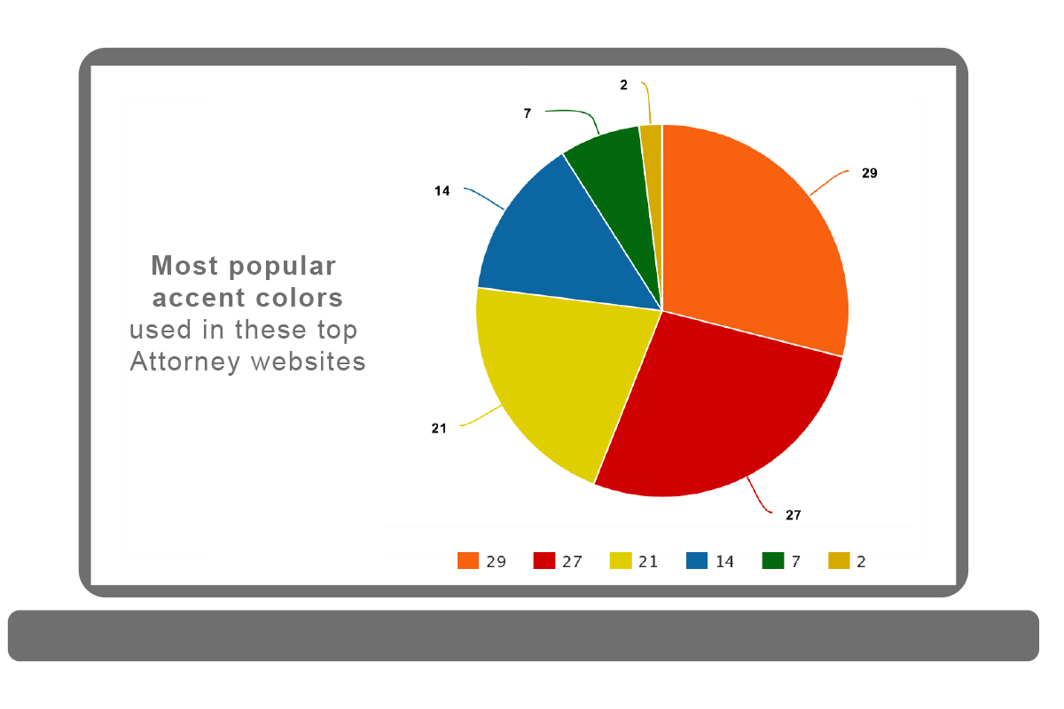
Analyzing just the accent color without taking into consideration the primary color is pretty pointless. Given that the vast majority of these websites used blue as their base color it’s easy to see why yellow, orange and red tended to be the secondary colors, as they are very contrasty and complementary with blues.
Finding an accent color that can stand out gives the web designer the power to control a visitors attention. If we want users to look at the “free case evaluation” call-to-action on a blue website then making that callout orange, yellow or red would be a great way to make it pop.
Top 4 color schemes
What were the most common color schemes used on the lawyer designs?
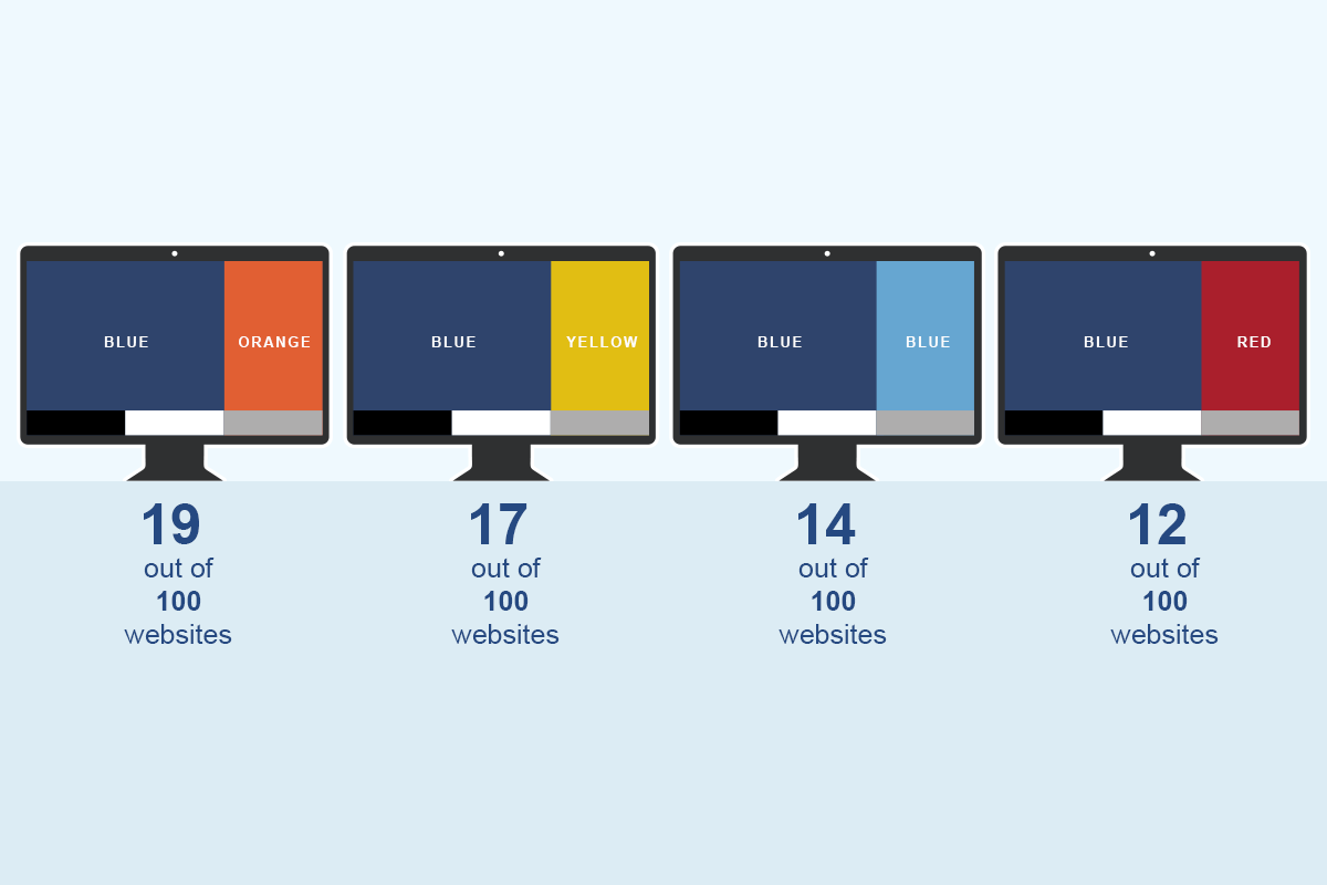
I compiled the primary and accent color data into color combinations and looked for combos that happened more than once. Above I am showing the top 4 color combinations used on these websites.
Blue and orange followed by blue and yellow are the two most used color combinations for lawyer sites in this study. The next most popular was just 14 instances of blue by itself and finally, the combination of blue and red had 12 occurrences.
A few really well done examples:
- Blue / Orange: https://www.fararlawgroup.com/
- Blue / Yellow: https://www.mcclellanlaw.com/
- Just blue: https://oregonaccidentattorney.com/
- Blue / Red: https://www.malmanlaw.com/
![]()
Serif or sans serif headings?
Were the headlines on the web designs using Serif or Sans Serif Typefaces?
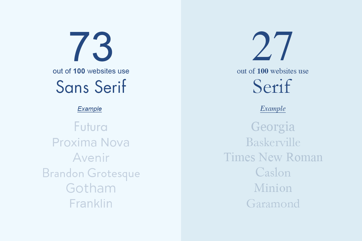
73% of all personal injury attorney sites employed a Sans Serif font for its headings.
Serif typefaces have “serifs”. These are the small lines or strokes regularly attached to the end of larger strokes in a letter or symbol. Serif fonts have a connotation of being traditional or classical.
The most common examples of serif fonts are Times New Roman, Georgia, and Baskerville. Here is a list of 10 more “modern” serif fonts being used in web design today.
Sans Serif fonts are typefaces that do not have…Serifs! They came into fashion because older computer monitors could not adequately render serif fonts at their lower resolutions. You would then see Sans Serif fonts being used to help with readability.
Here are 10 Sans Serif font examples being used in modern web design.
I was really drawn to some of the websites that used Serif fonts for headings and paired it with Sans Serif body text. Here is a good example of that combination: https://www.chicagolawyer.com/
![]()
Serif or sans serif body text?
Was the body text in the websites Serif or Sans Serif Typefaces?
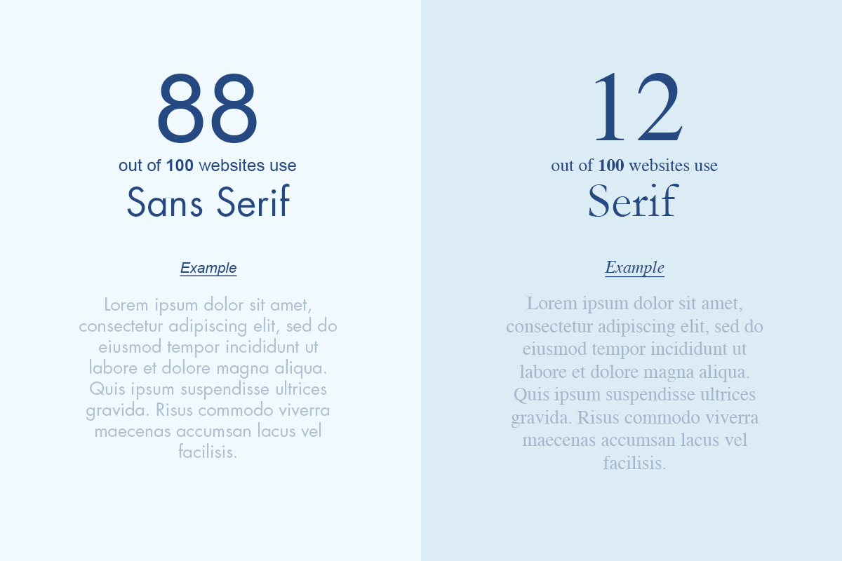
Sans serif fonts exude a more casual, informal and friendly tone than their serif counterparts. As stated above, typography that is meant for a screen tends to favor sans serif typography for readability reasons. Popular sans serif fonts include Arial, Helvetica, and Tahoma.
Being that 88% of all these attorney websites used a sans serif font, they clearly agree with the sentiment.
Although only 12 websites out of 100 had serif body fonts, I personally think we will start to see a shift towards serif body text in the coming years.
Here’s a law firm design that expertly uses a serif body type: https://www.coloradolaw.net/
Largest heading font size
How big are the headings on the legal sites?
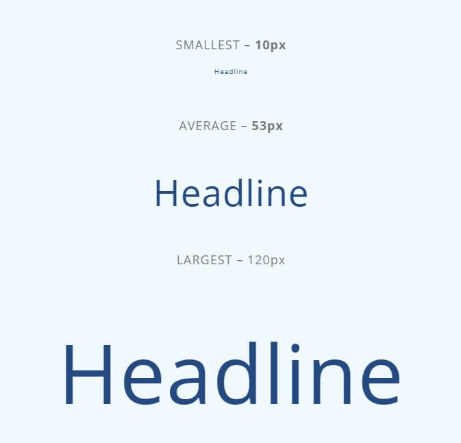
Taking a look at the largest font on the landing page, which was usually the H1 tag, I saw an average size of around 53 pixels.
This text is a super important part of law firm landing page design as it is usually the first content that a website visitor will read. The text typically reads like a newspaper headline summing up the law firm and is very clearly visible on the page.
Check out this example: https://www.florida-justice.com/
The heading text is large and its messaging does a great job at instantly conveying law firm’s messaging.
“Fighting for Justice.
FIGHTING FOR YOU.”
Simple and to the point.
Font size of paragraph text
What text size is used for attorney web design?
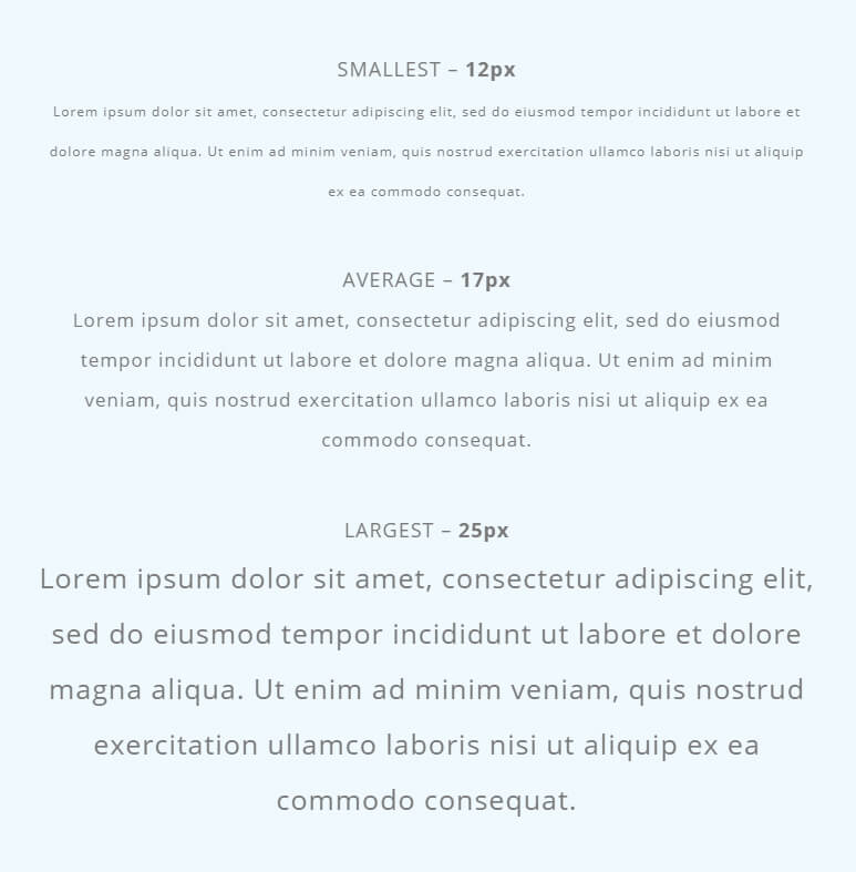
This question was particularly compelling to me as it has been a topic debated quite a bit over the years. It is interesting to see that the average font size of the body text on law firm sites was around 16 or 17px.
There were not any websites that had a body type size smaller than 12 pixels, and the website with the largest font came in at 25px.
Of course, much more goes into the readability of websites such as letter spacing, line height and how far the eye needs to track from left and right. Selecting your font size based on who your target audience is is one of the easiest things you can do to make sure that visitors can read your content without frustration
Chapter 5: Content features

Chapter 5
Content features
Contact form
Was there a contact form directly on the home page?
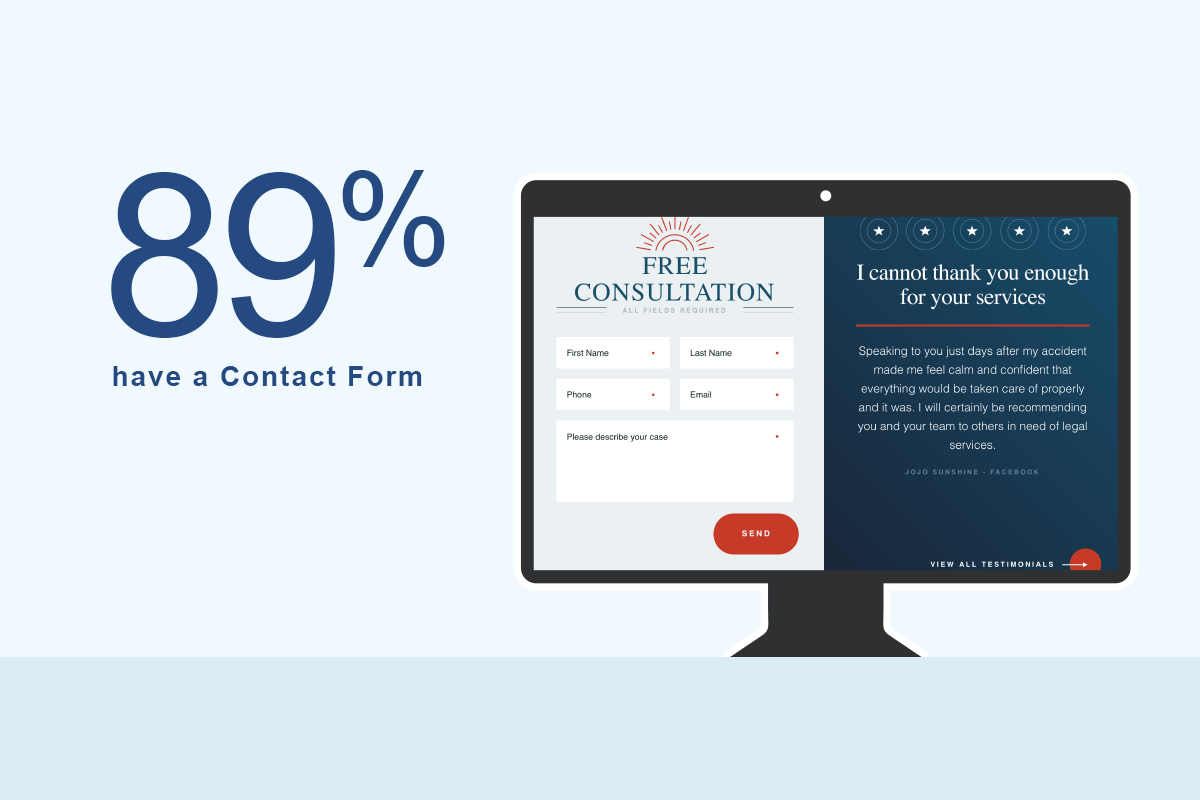
Making it as easy as possible for potential clients to get in touch through a home page contact form is clearly a primary focus for most of these sites. 89% of all attorney designs analyzed had a contact form directly on the landing page.
Having a conversion mechanism directly on the landing page means that visitors do not have to click through to another page to reach out to the law firm. It eliminates any chance of something going wrong with a page loading or a server hiccup wasting a lead.
Video content
Do attorneys utilize video content on their landing page?
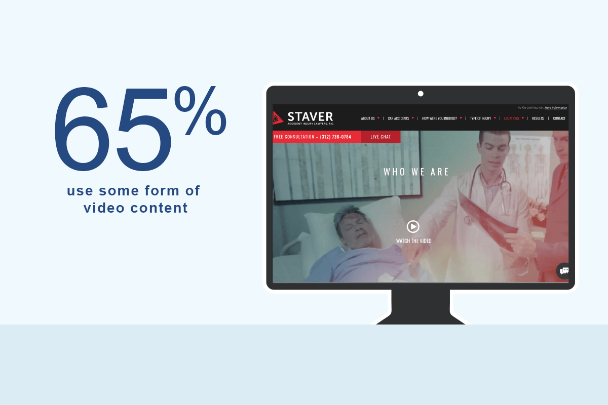
65% of all attorney websites had some form of video content directly on their homepage. The vast majority of the videos I sampled seemed professionally produced. They tended to introduce the attorney, show a bit of the law firm’s culture and cover their specializations (helping the injured).
According to Renderforest: In 2019 80% of all global Internet consumption will be video content.
They also state:
- Users spend 88% more time on a website with video.
- Marketers who use video content get 66% more qualified leads per year.
- Including a video on your homepage can increase conversion rates by 20% or more.
These statistics are not law specific, yet attorneys should pay attention. If your target clients prefer to research through a specific medium, then you should meet them there.
Has a blog?
Do the top personal injury attorneys use a blog?
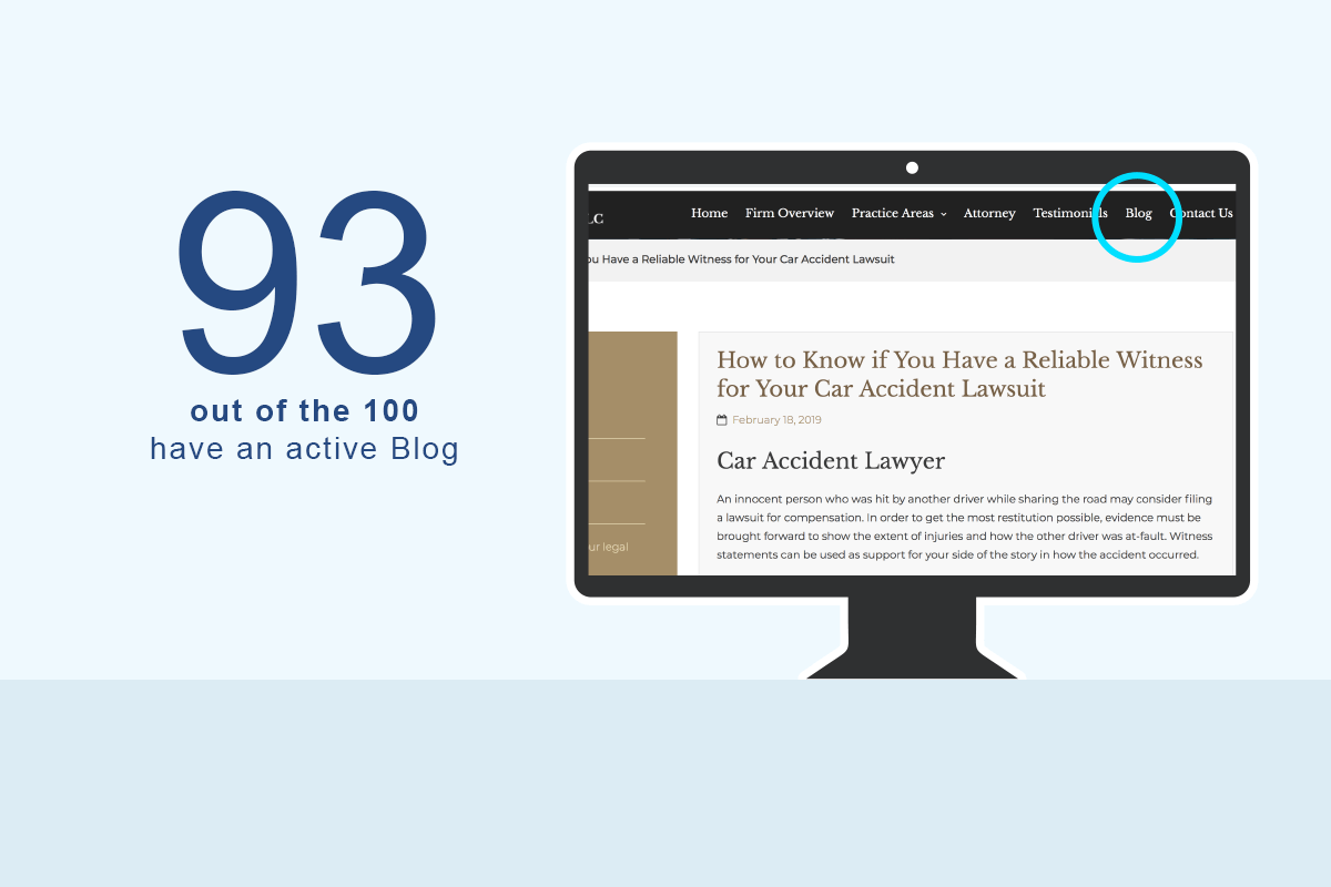
There are so many good reasons for law firms to have an active blog and 93% of the top PI sites in the country agree.
From an SEO perspective, it’s a great medium as it allows law marketers to post content targeting long tail keywords and go after less competitive terms.
Blog articles also tend to attract links far easier than a “sales” page would. Being that earning backlinks to your law firm website is such a huge factor in how strong Google will perceive your website, not having a blog is kind of shooting yourself in the foot.
If you are wondering what kind of content you should put on your blog Brian Dean did an interesting study showing the types of website content that earn the most backlinks. Check it out here:
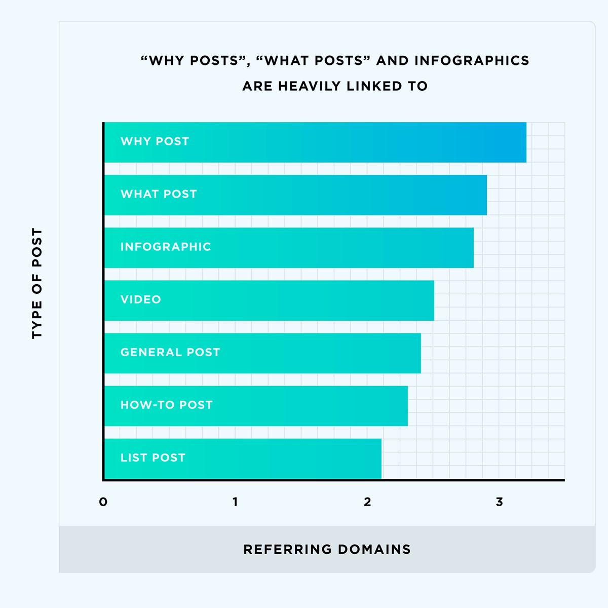
![]()
Number of trust badges
How many badges do attorneys need on their website?
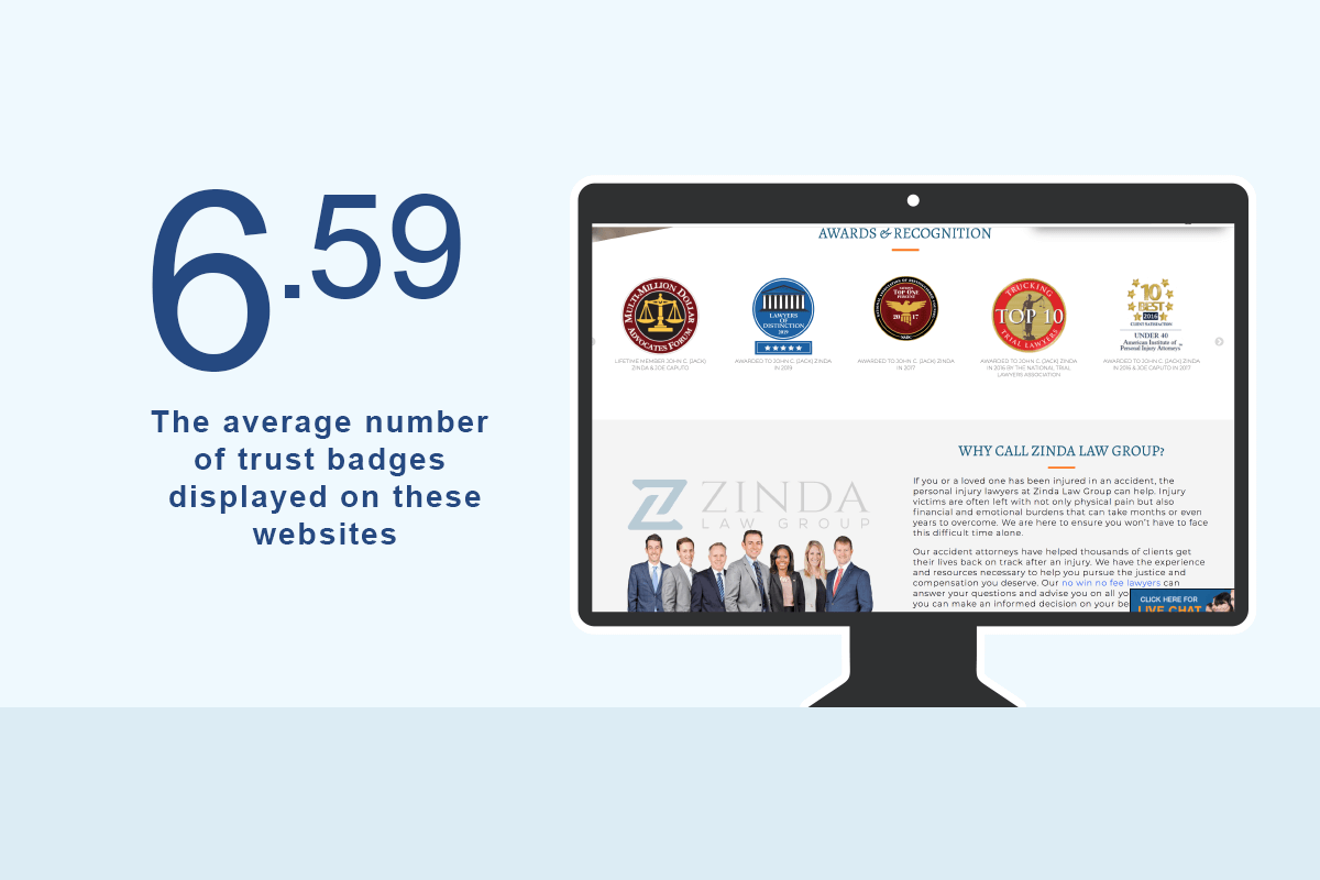
I defined a trust badge as a “badge” that is displayed on a law site for trust purposes. These could be rating oriented badges such as the very popular Avvo and Super Lawyers badges, award badges such as the top 100 Trial Lawyers or even badges showing the various associations to which the attorney belongs.
Essentially, these are all accolades incorporated into the attorney’s web design to help gain the trust of prospective clients.
The average number of badges across all sites was 7 with one site having 27 badges!
Has a live chat?
Do personal injury attorney websites use live chat?
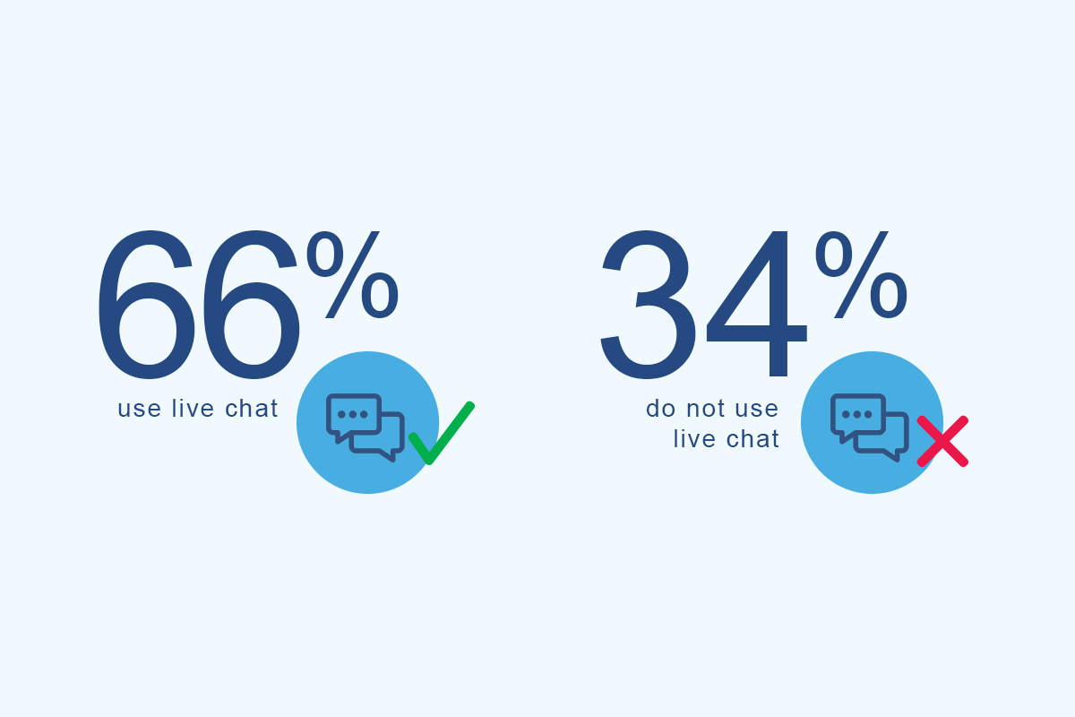
66% of the personal injury attorney websites in this study were using some form of live chat. It could be an even larger percentage given that some live chat programs hide themselves when an operator is not available.
The argument for a live chat is that it is a proactive mechanism to get the visitor engaged in a dialog with a firm representative.
People also do not need to wait for a callback or for someone to respond to a contact form. They can get instant feedback. If the visitor was not quite sure if they needed an attorney in the first place or not, a proactive live chat asking “Is there anything we can answer for you today?” could turn someone who would have left the page into a client.
Internet users are getting much more accustomed to live chat. Why wait for hours or days for an email response from a rep if they can get an answer immediately via live chat? The more that people get used to using this medium, the more it will be a mandatory communication channel a law firm needs to use
Number of practice area CTAs
What was the average number of practice area calls-to-actions the websites used?
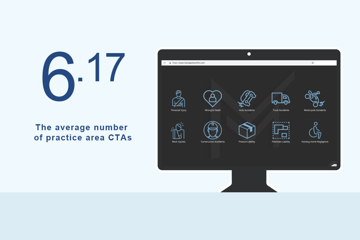
The number of practice area CTA’s averaged out to around 6 or 7 per attorney. These included call-outs to practice area pages such as car crash, slip fall, dog bites and so on and so forth.
I was defining a “call to action” as any design element more significant than a simple text link and not as part of the main navigation whose purpose is to guide a user to a practice area detail page.
Home pages tend to be purposed around guiding people towards the most important money pages of the website. As an example, getting a user who was in a bicycle accident onto the bike accident page in a very clear and noticeable way is the purpose of these CTA sections.
Settlement results
Do attorneys display the settlements of their previous cases?
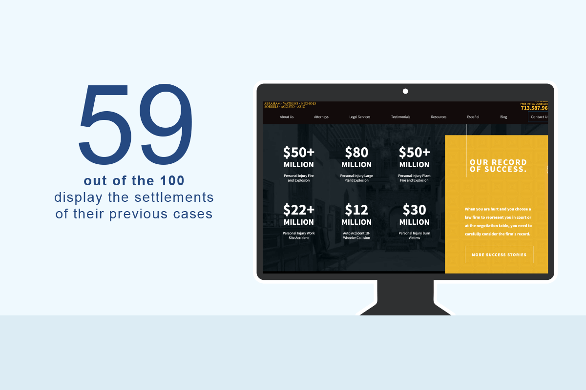
I counted roughly 59% of all PI attorney web designs displaying their settlement results on their home pages. Below is an example of the kind of results you would see:
$4,400,000 won – Motor vehicle accident
$3,000,000 won – Product liability case
$2,350,000 won – Dog bite settlement
This is a design element whose purpose is to show competency and experience with the hope that it will help gain the visitor’s trust. Although this is not precisely social proof, it holds the same purpose. People want to be smart shoppers and analyzing the previous results of an attorney is a way a potential client can feel more informed before making a decision.
Testimonials
Do lawyers show client testimonials on their home pages?
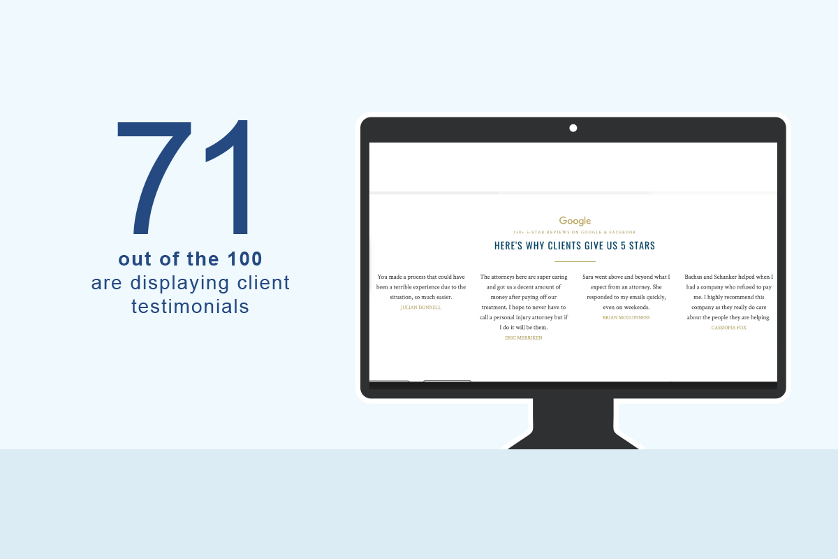
71% of all PI sites are displaying testimonials. Showing social proof through customer testimonials is one of the best ways a law firm can display how good they are at their jobs.
People want experience when it comes to hiring an attorney. Being able to back up your claims with testimonials from REAL past clients will help in winning over prospective clients.
According to eCommerce giant BigCommerce: 72% of consumers say positive reviews and testimonials make them trust a business more.
Personal injury clients are a different mindset than an online shopper, but the principals likely remain. People want to hire peer recommended organizations and showing a client testimonial is one way a law firm can help give them similar trust.
Number of social media accounts
How many social media accounts do personal injury attorneys promote?
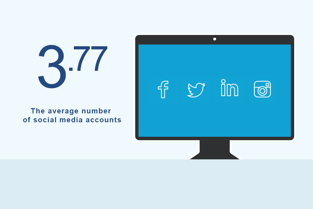
I counted the number of unique social media accounts law firms linked to from their website and saw an average of around four across all 100 sites.
Facebook, Twitter, LinkedIn, Instagram and YouTube icons were the most common to see.
The vast majority of these sites linked to their social media profiles via familiar icons placed in the footer of the website.
Organically ranked attorneys having around four per site is likely because the marketing teams behind them push content through their social media accounts.
Parallax
Is parallax used on these law firm sites?
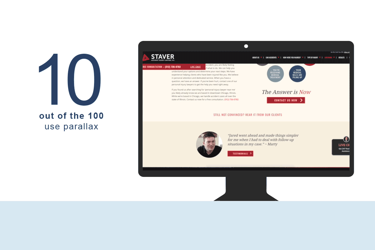
Parallax is a website feature that has come into popularity over the years that incorporates multiple layers that move at different speeds when you scroll past them. This gives that area of the website a 3-dimensional feel as it separates the foreground from background.
I was actually surprised to see this used so little when looking for it across these websites. Only ten attorney sites had a section using parallax.
Here are a few law firms that have parallax sections:
https://cprlaw.com/
https://www.zacharassociates.com/
https://munley.com/
Conclusion
This concludes our study of 100 Google page one personal injury attorney web designs! I hope you found it interesting.
As I said in my intro, I think it is important to not just follow the pack with the information you may glean from this article but instead use it as data that you can use to be more informed while making decisions about a law firm web design or seeing how you stack up compared to these.
I have included a list of my favorite attorney websites from the study here
Here are all of the law firm marketing tools that were used in this study.
Anything you found interesting? Were the results exactly what you thought they would be?
Leave a comment below. I’m curious to hear your take 🙂