


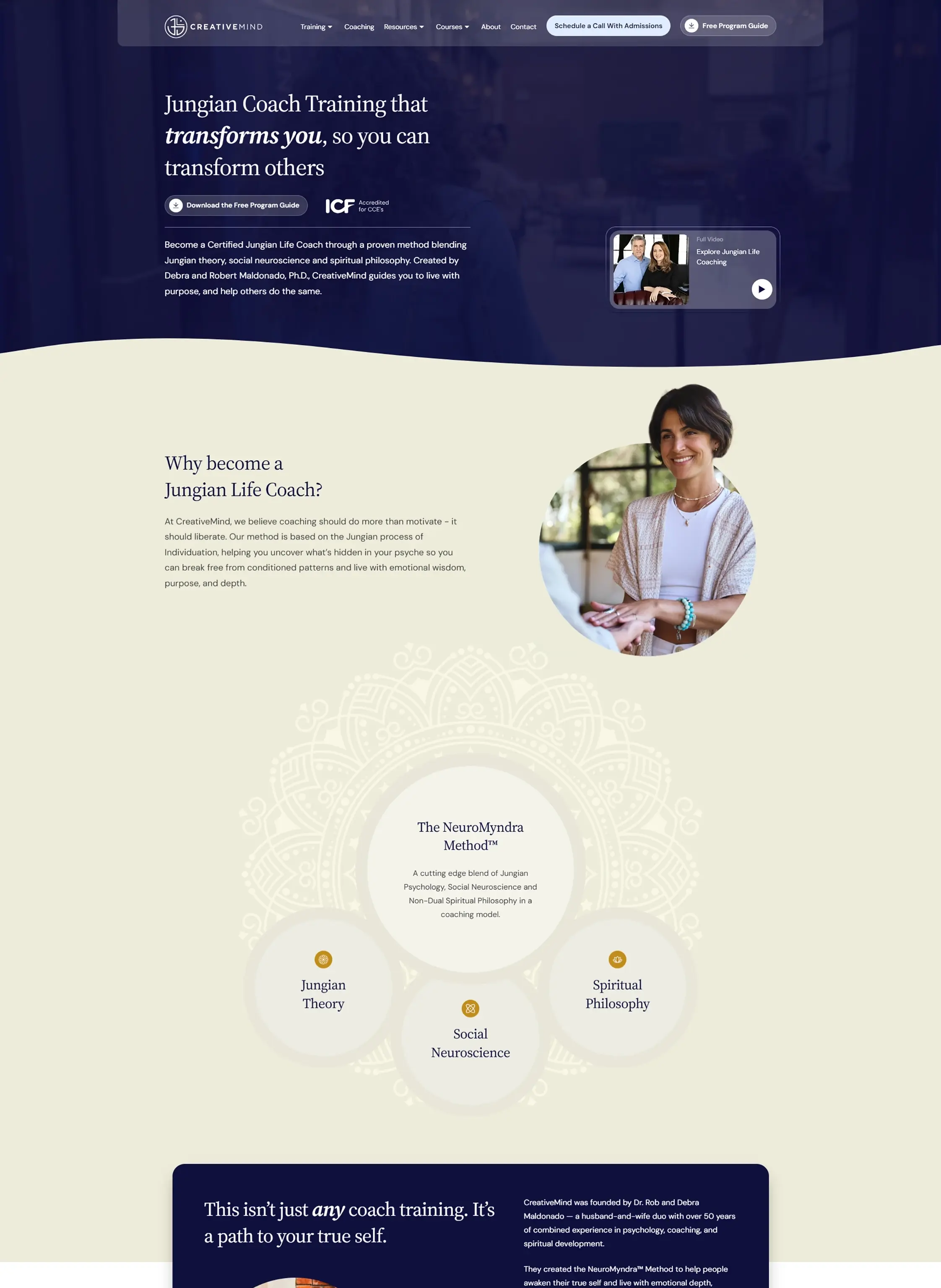
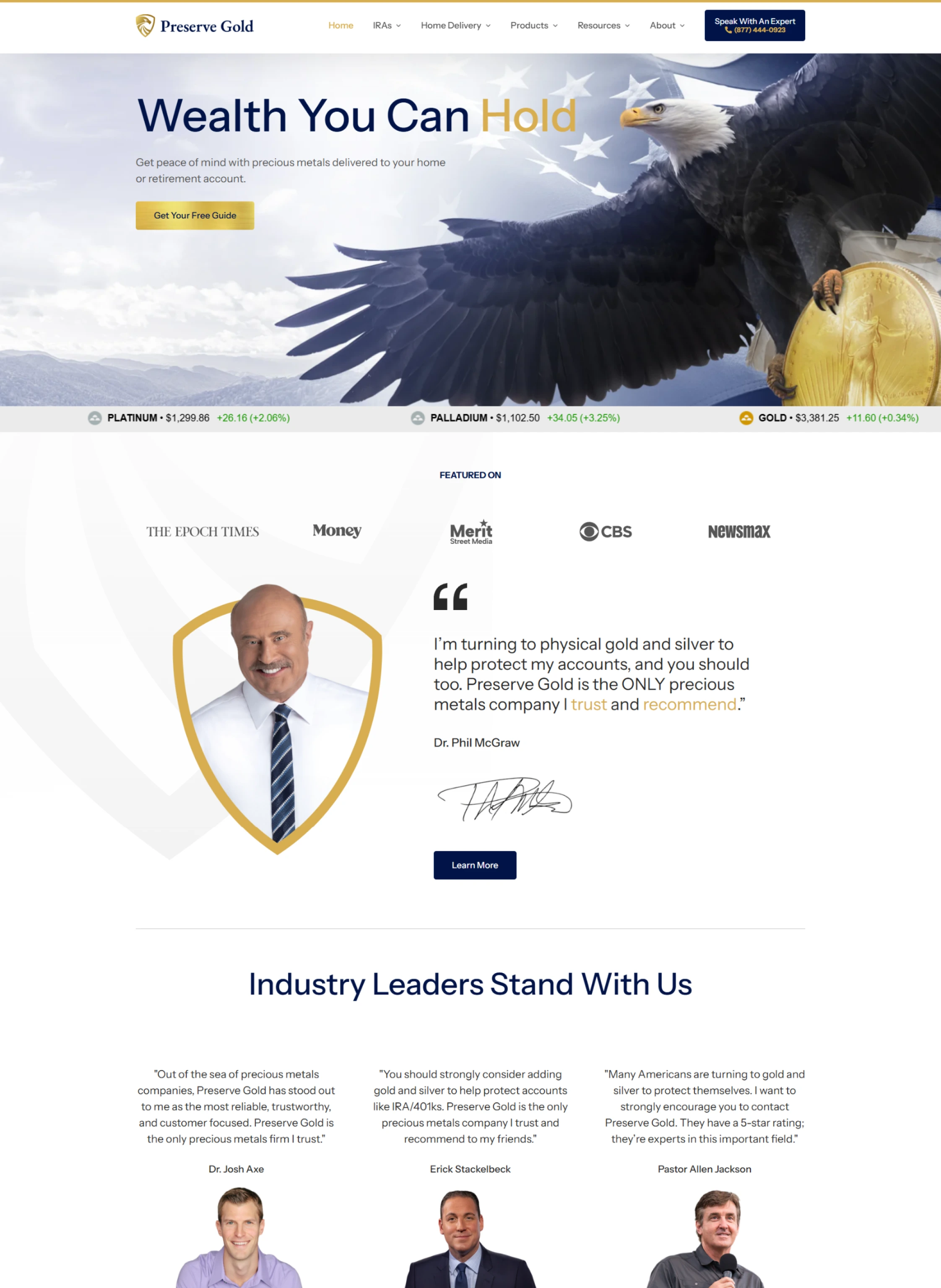
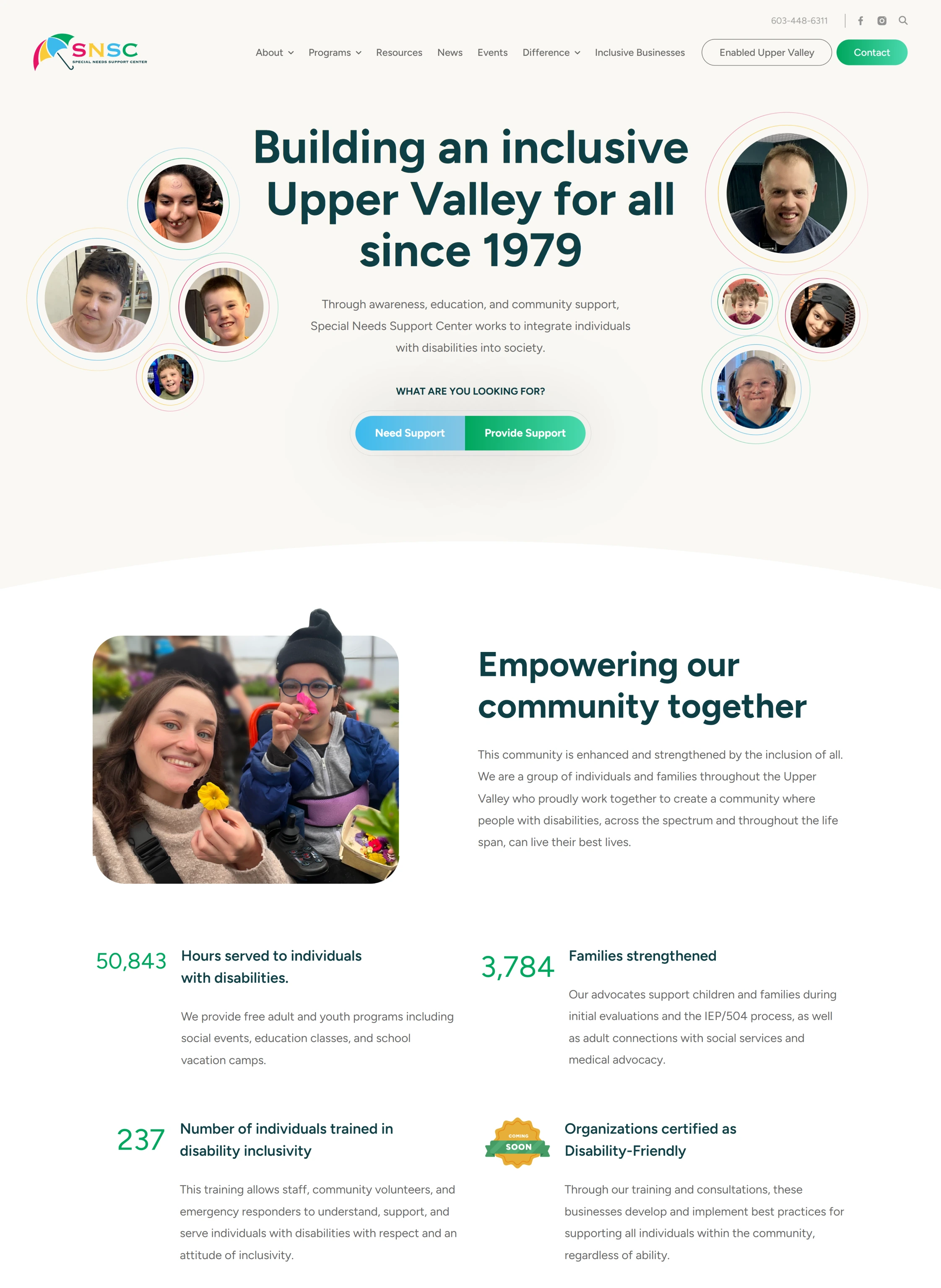
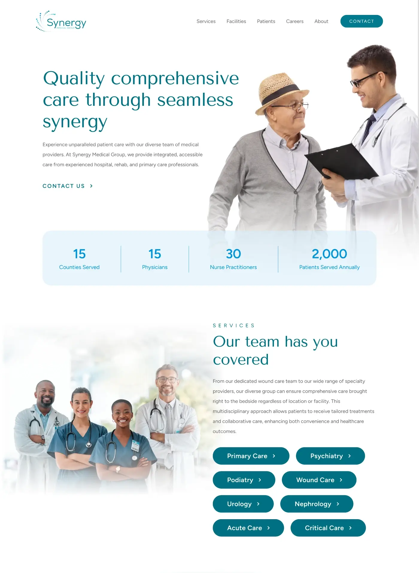
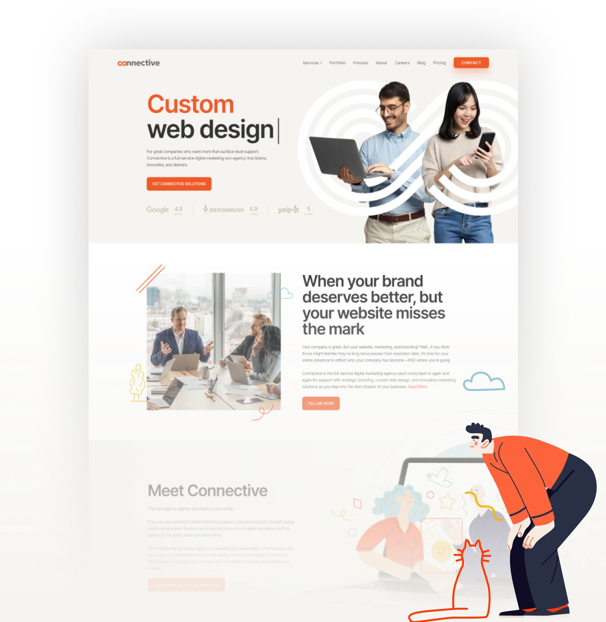
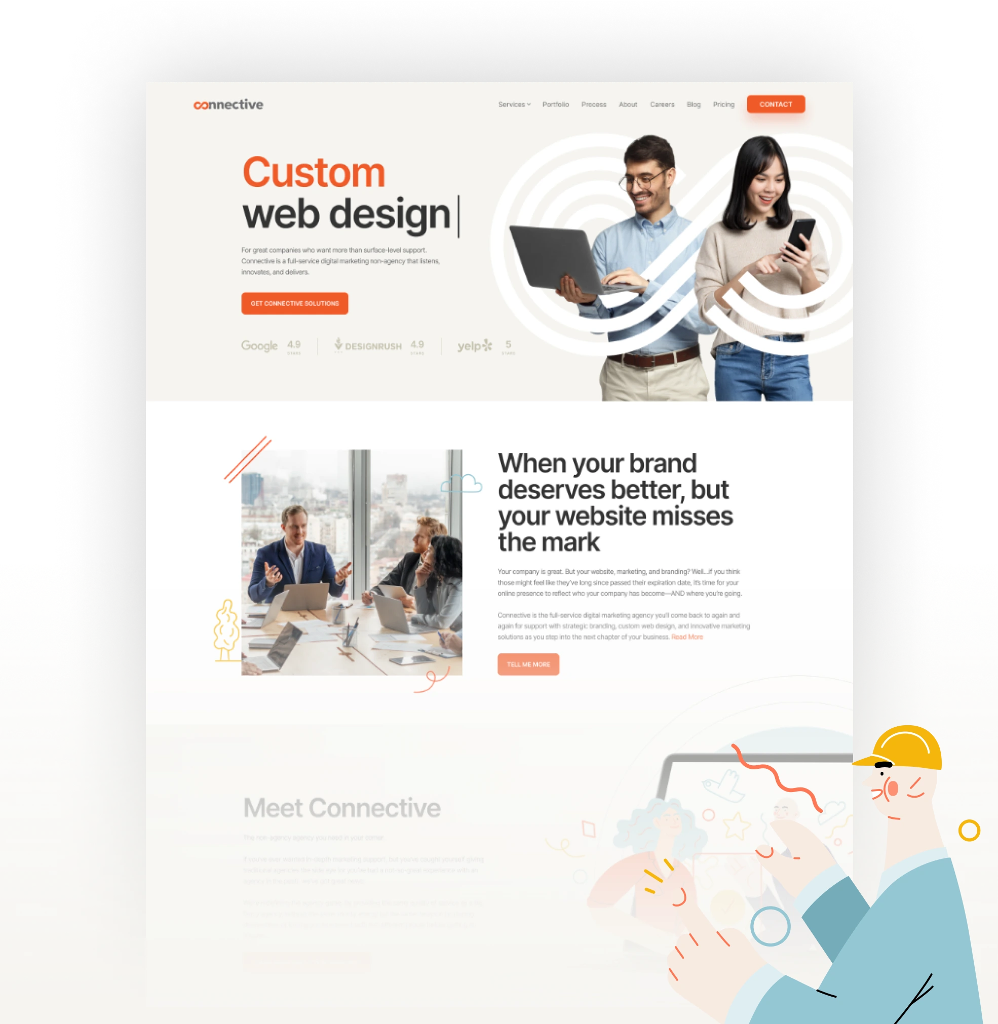
Your company’s website should match the greatness you’ve built within. It’s time you had a custom-designed website that authentically represents your brand and effortlessly attracts your ideal audience.


Everything we do is backed by strategies that will turn website visitors into customers. We don’t even begin designing until we know your brand inside and out.

Get a visibility boost with a website design that’s made to get you noticed by search engines, without sacrificing usability or accessibility.

Your branding will be seamlessly integrated to create a cohesive, memorable digital representation of your brand (and looks like nobody else).

Full custom web design services begin at $15,000. Use our price calculator or inquire now for a custom quote.


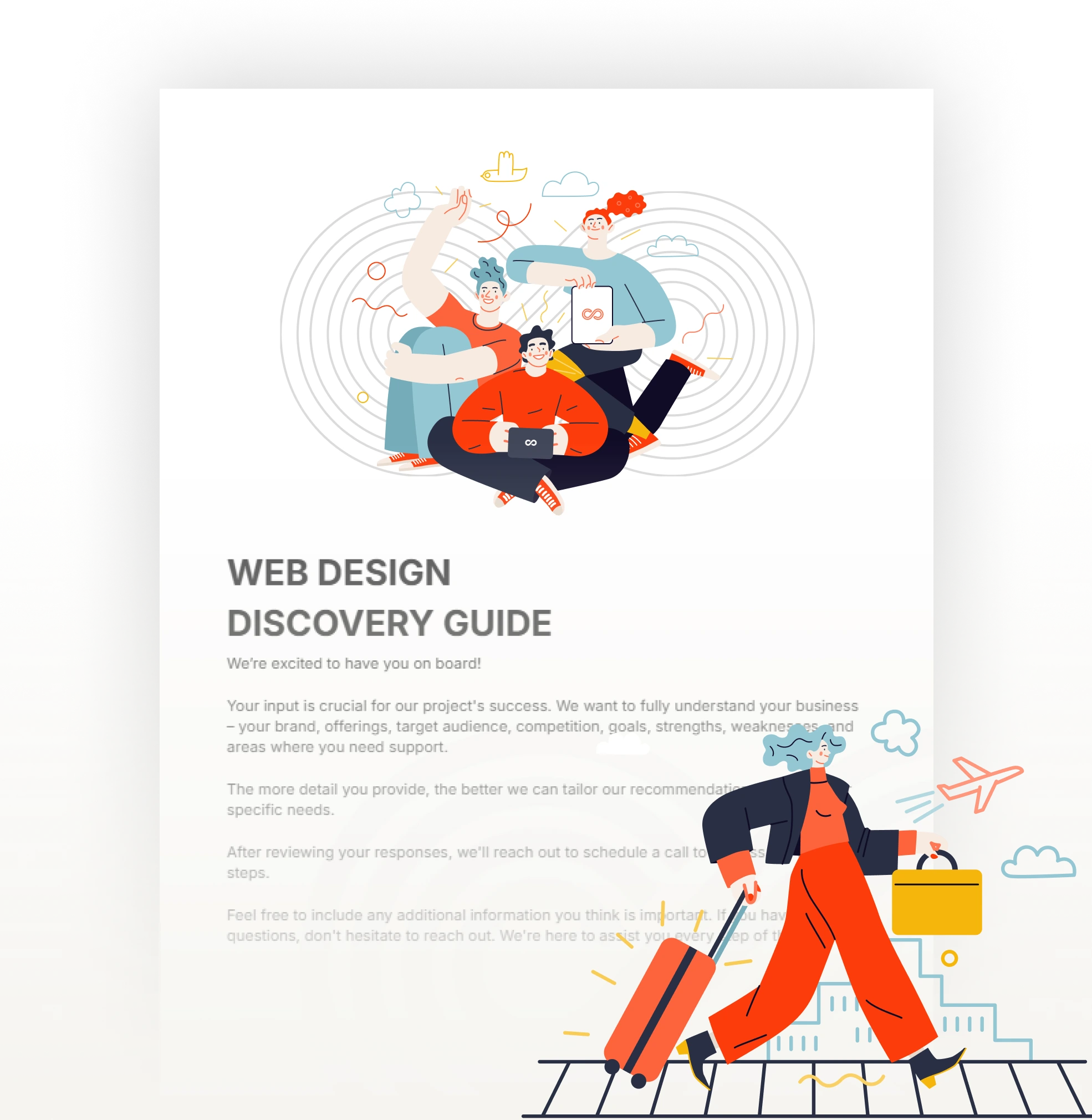
We set up your easy-to-use project management tools and kick things off with a meeting you’ll actually look forward to. The agenda? We’re discussing project details, your custom Discovery Guide, and project goals. And probably pets.
We’ll solidify your website’s sitemap and architecture, create wireframe designs for all templates, and gather website assets. (Already sweating? Don’t worry—we promise to explain every single step.)
Time for another meeting, but no new faces! The team you’re already coming to know and love working with will walk you through the Design Strategy in a [#]-minute call. Then we’ll complete the internal design and review stages, and present you with (drum rolls not required, but always encouraged)… your web page designs!
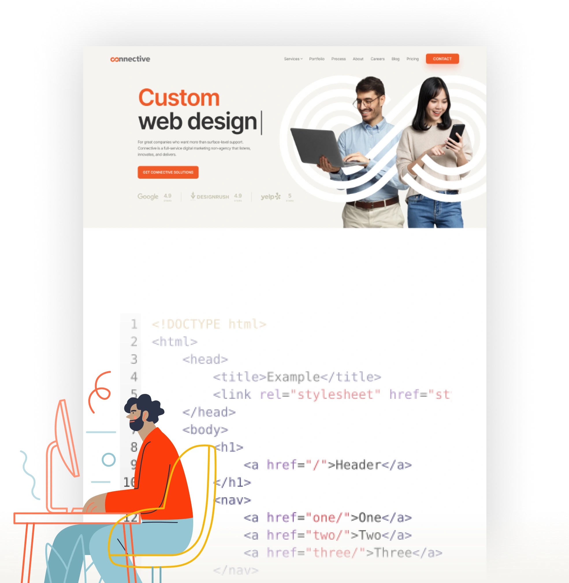
Now, the techy stuff. We’ll work on the back end to install WordPress and necessary plugins, get your design templates implemented, and add all your content (web enhancements included!).
Plus, your website will be optimized for search engines from head to toe (or footer), so you know it will have the best possible foundation needed to crush rankings.We’re also applying our signature technical SEO strategies to set your website up for search engine success from day one.
If “connection” wasn’t already our whole thing, it’d 100% be “quality.” We thoroughly review every aspect of your site with our detailed QA process—including mobile testing!—to make sure it’s error-free and optimized. Then our team reviews the website to ensure we’re hitting every design standard. Quality? Officially assured.
You’re celebrating, we’re celebrating… Your website is launched! We now conduct our final testing and wrap things up by sharing customized training and support on how to use and update your new website—explained in a way even those “allergic to technology” friends can understand, guaranteed.
Leaving you hanging just isn’t our style—that’s why our support doesn’t stop at launch. You can count on us for ongoing maintenance and support for your new website, including updates, backups, security measures, and more. We’re here to make your website something you never have to worry about. (Yes, we heard that huge sigh of relief!)


Establish or refine your brand’s identity
Your brand deserves an aesthetic as strong as your work. We’ll refine your voice, message, and visuals to align with your mission and audience, enhancing your credibility and helping you stand out in the market. Learn more >>

Generate leads, sales, and brand loyalty
Ready for measurable growth? Our customer-focused, data-driven strategies—like SEO, paid ads, social media, and email—will help you drive leads, boost sales, and build brand loyalty beyond your website. Learn more >>

All your needs covered, all under one roof
From print and trade show designs to video production, website security, and ongoing updates, we provide comprehensive solutions. Whatever your goals, we’ll tailor our services to keep your business thriving.
When you work with Connective, you won’t just walk away with a new custom website design. You’ll also gain a trusted partner who knows your business inside and out. (And yes, will absolutely remember your dog’s name.)
Our crew will take the time to understand your needs, goals, and target audience, and craft a website that’ll make sure the world sees your company for what it is: truly singular.
Ready To Upgrade Your Site?