


What is responsive web design, and why is it important?
Technology trends change fast, and it’s important to keep up with the times to stay relevant. Did you know that about 58% of web traffic comes from mobile devices? Websites optimized only for desktop use just don’t cut it anymore.
You could build individual sites for both mobile and desktop users, but trying to manage multiple domains can be stressful and time-consuming. Building a single responsive site can eliminate this hassle and create a better user experience overall.
Responsive web design means the website content automatically adjusts to any type of device, offering beautiful aesthetics and better functionality. At Connective, we’re ready to help you construct a responsive website and bring your business into the modern age.

What makes our responsive websites effective?
Our goal is to create products that increase website traffic, enhance usability, and improve your digital marketing strategy. Using the latest tools and techniques, we can help you stay ahead of the curve.
Friendly to all devices
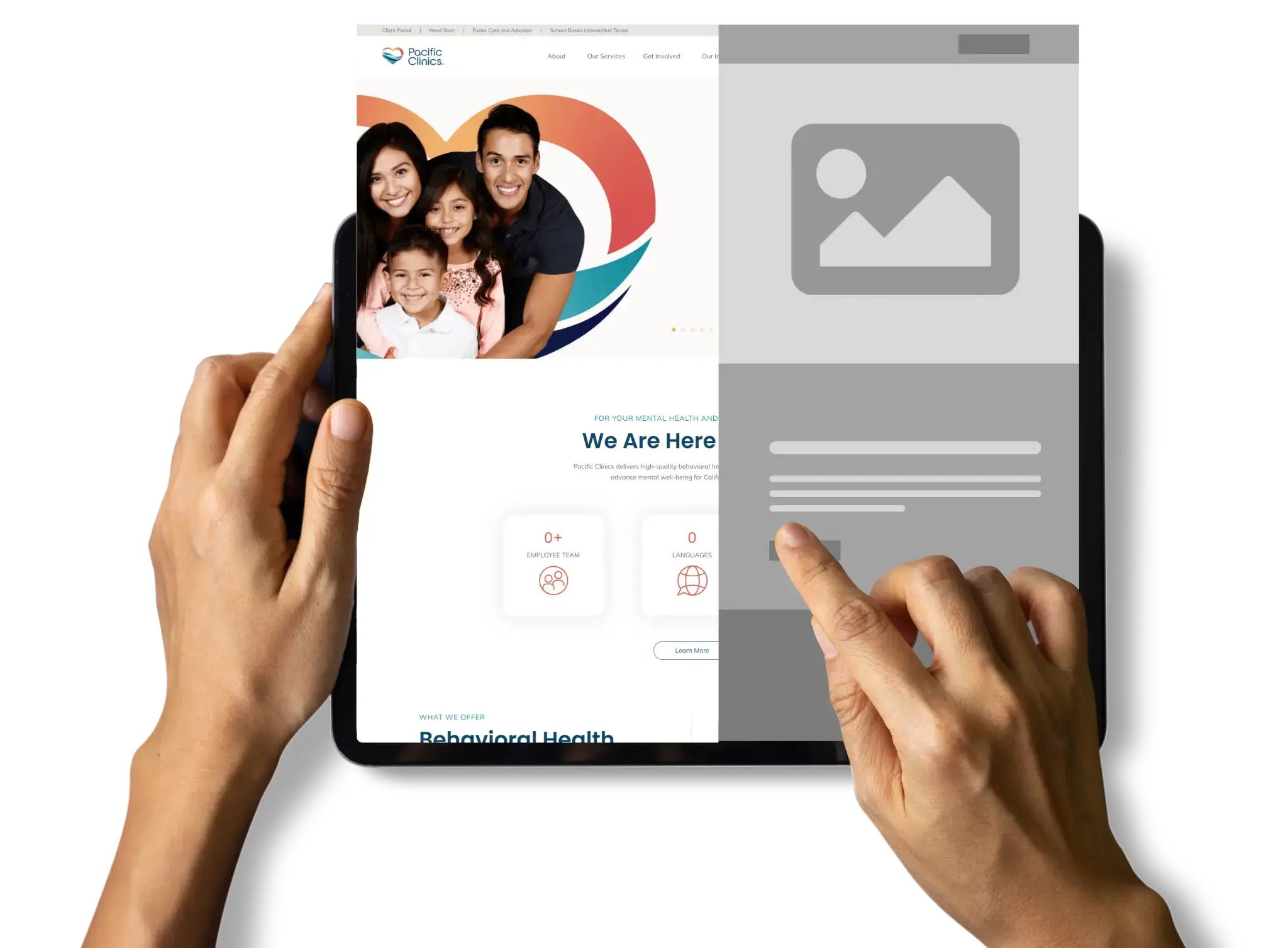
Your site has to look good across every device, whether someone’s browsing from their laptop or their phone. Our responsive designs adjust to match any screen size, creating a fantastic user experience.
Tracking and reporting
Knowing who’s visiting your site — and how they’re interacting with it — is an incredible marketing tool. We use analytics to help you track various metrics, allowing you to improve functionality and better target your audience.
Research-based and data-driven
Each industry requires unique strategies to keep websites competitive. We’ll take a look at other top-ranking sites and use proven strategies to help boost your business to the top.


Search engine optimized
Search engine optimization (SEO) is vital if you want people to find your business. Search engine algorithms love responsive web design, so taking advantage of this will help your site reach the top of the rankings.
Conversion oriented
Your website’s primary goal is to bring in new customers. Our team will craft designs tailored around this idea, crafting engaging layouts to keep clients on your page.
Built for the future
You have to stay on top of modern trends if you want to succeed. We build each of our sites with the latest technology, helping keep your business relevant.
Blazing fast
Faster loading speeds result in better conversion rates! In fact, one study found that a fast site has three times as many conversions as a slow one. Our responsive designs have been optimized for quick loading speed and optimal performance, helping to improve user experience.

Our web design process
We use a tried-and-true process to make sure that you get the most out of our responsive web design services.
1. Onboarding
To build your perfect site, we’ll first need to get to know you better. Your dedicated project manager will send you a questionnaire, which you can use to explain your business’s details. After you’ve finished it, we’ll schedule a meeting to introduce you to your team and discuss your responses and plans for the project as a whole.
2. Architecture
This is where we really begin fleshing out your ideas. Our experts will take your ideas and build a plan for your site, from details on individual pages to the menu layout. While our team’s doing this, you’ll have the opportunity to send over any copy and images you want us to use.
3. Web design
We’ll use everything we built during the architecture phase to create a beautiful web design. You’ll get the opportunity to go over each page individually and make adjustments, so you know you’re getting something tailored to your needs.


4. Web development
After you’ve approved the design, we’ll begin actually developing your site. This involves building out the interface, placing copy and images, and in all other ways bringing your plans to life.
5. QA and pre-launch
Before the site launches, our QA team will comb through every page to address any bugs, interface errors, or other concerns. By doing so, we can ensure optimal functionality once the site goes live.
6. Launch and training
After the QA team approves it, we’ll officially launch the site. Our team will take the time to train you on how WordPress works, giving you the tools you need to make any edits you’d like.
7. Maintenance
After launch, we’ll be a phone call or email away to assist you in making updates to keep your site relevant and responsive as trends change.

Frequently asked questions
Responsive web design is a fantastic tool, but we understand that you may still have questions. Here, we’ve tried to answer some of the most common questions.
How do I optimize my site for all devices?
When optimizing your site, think carefully about text size, image organization, and link placement. For example, if your links are too close together, they might be difficult to open from a mobile device. Responsive website designs can adjust many of these factors automatically.


What are the biggest benefits of responsive web design?
A responsive website is a valuable marketing tool, with increased conversion rates being one of its biggest draws. Non-responsive sites might be unappealing or confusing to navigate on mobile devices, which means potential clients might leave for a competitor. Responsive sites adjust automatically to improve the overall user experience, which means visitors are more likely to stay on your page.
Why should I work with a responsive web design company?
You already have an incredibly busy schedule; you likely don’t have the time to try and figure out the intricacies of proper web design. Getting responsive web design services from Connective means you’ll get a quality site with less hassle — let our expert web designers handle it all!
What is responsive web design and why is it essential?
Responsive web design ensures your website adapts to and looks great on all devices, from desktops to smartphones. This approach is crucial as it enhances user experience, improves SEO rankings, and caters to the growing number of mobile users.
How does connective approach responsive web design?
Connective focuses on creating visually appealing and functional websites across all devices. We use the latest design techniques and technologies to ensure your site is fast, user-friendly, and optimized for search engines.
What benefits does responsive design offer for SEO?
Search engines like Google favor responsive design. It improves your site’s usability, decreases bounce rates, and ensures a consistent user experience – all factors that contribute positively to your SEO rankings.
Can Connective redesign my existing website to be responsive?
Absolutely! We specialize in transforming existing websites into responsive designs, ensuring they look and function seamlessly on every device, thus enhancing your audience’s browsing experience.
How long does it take to create a responsive website?
The timeline for creating a responsive website varies based on complexity and specific client needs. Connective works efficiently to deliver high-quality results within a reasonable timeframe, typically discussed at the project’s onset.