Sans serif fonts are known for their clean and modern appearance, characterized by the absence of the small lines or extensions at the ends of their strokes, commonly found in serif fonts. Their simplicity and readability make them a popular choice for digital interfaces, branding, and a wide range of design projects.
Here are some of the best sans serif fonts available on Google Fonts, offering designers a variety of options to suit different styles and purposes.
Barlow
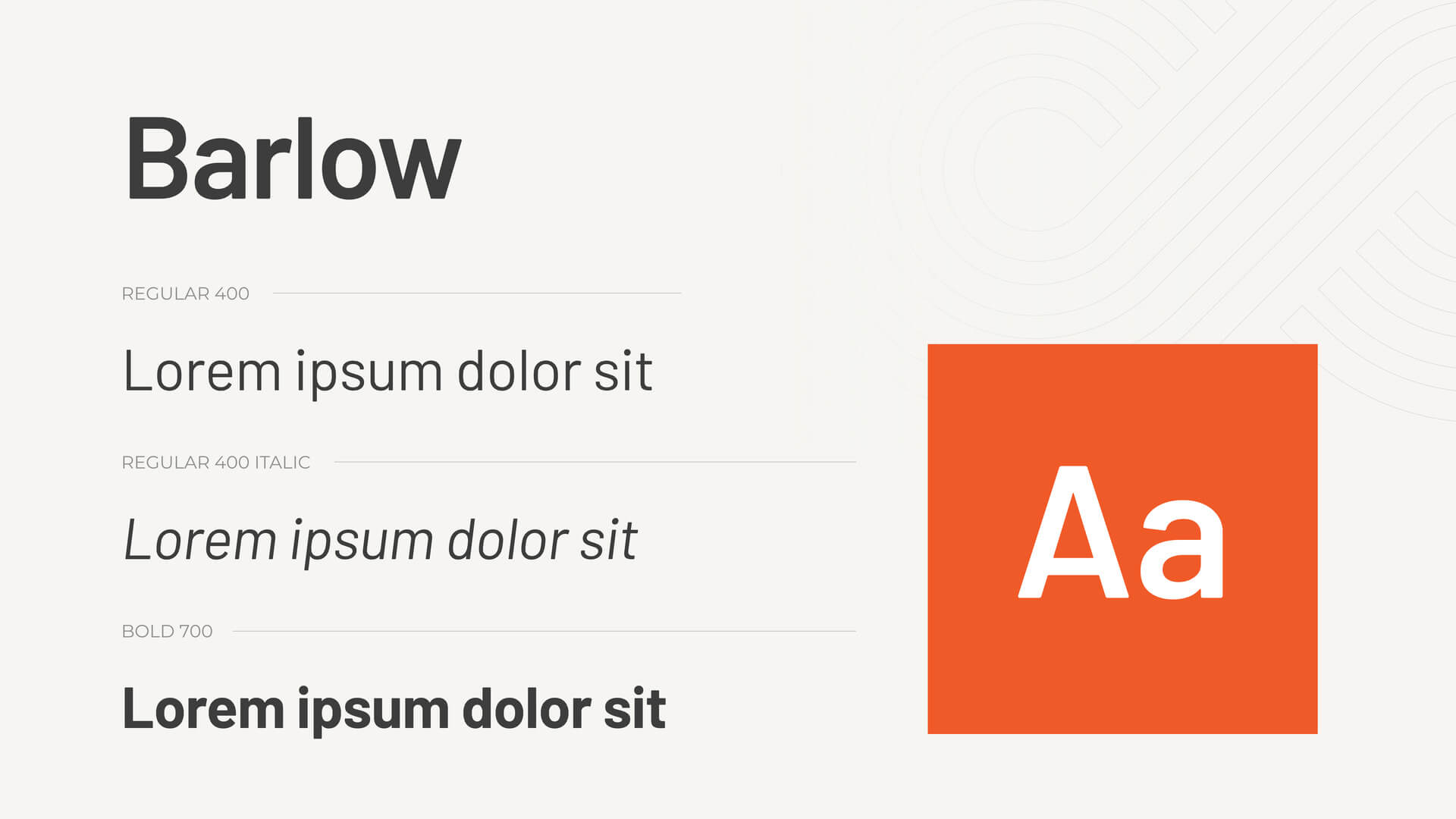
Background: Barlow is a versatile sans serif font designed by Jeremy Tribby. Inspired by the visual style of California public signage, Barlow combines functionality with a modern aesthetic.
Barlow features rounded corners, a large x-height, and wide letterforms, making it highly readable and friendly. The font supports a wide range of weights and styles, making it suitable for various design needs.
Use Cases: Public signage, branding, and digital interfaces.
Suggested Industries: Transportation, Technology, Education.
Pros: Highly readable and approachable, ideal for both digital and print.
Cons: May not convey a formal or traditional tone.
Figtree
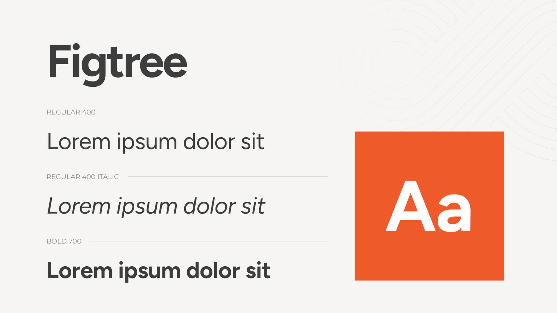
Background: Figtree is a contemporary sans serif font that offers a clean and minimalist design. It is known for its versatility and modern look.
Figtree features balanced proportions, open counters, and a neutral appearance, making it suitable for a wide range of applications. The font supports multiple weights, enhancing its adaptability.
Use Cases: Websites, app interfaces, and corporate branding.
Suggested Industries: Technology, Design, Corporate.
Pros: Clean and versatile, perfect for modern designs.
Cons: May lack the distinctive character for more creative projects.
Inter
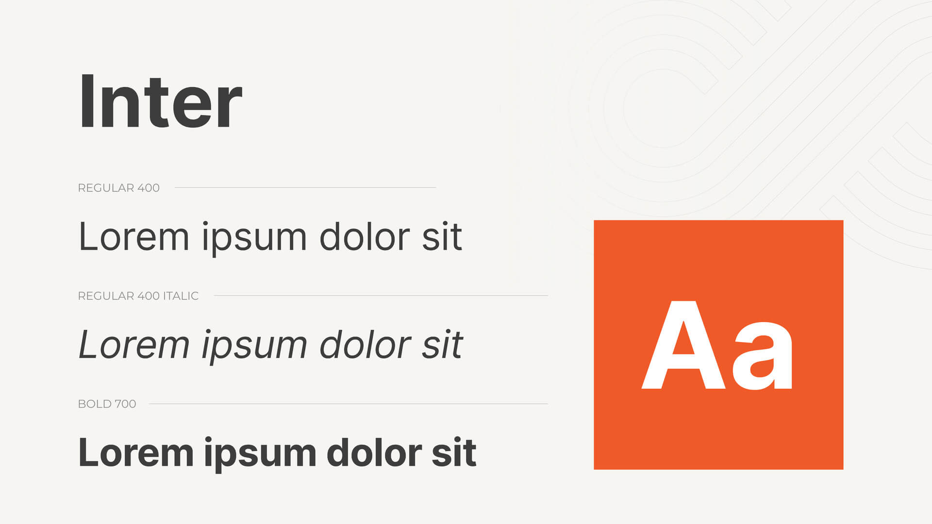
Background: Inter, designed by Rasmus Andersson, is a highly legible sans serif font optimized for screen use. It was created to improve readability on digital devices.
Inter features a large x-height, open counters, and slightly rounded corners, ensuring clarity at small sizes and high resolutions. The font supports extensive language coverage and multiple weights.
Use Cases: Digital interfaces, web design, and mobile apps.
Suggested Industries: Technology, Media, User Experience.
Pros: Extremely readable on screens, ideal for digital content.
Cons: Its utilitarian design may not suit decorative purposes.
Manrope
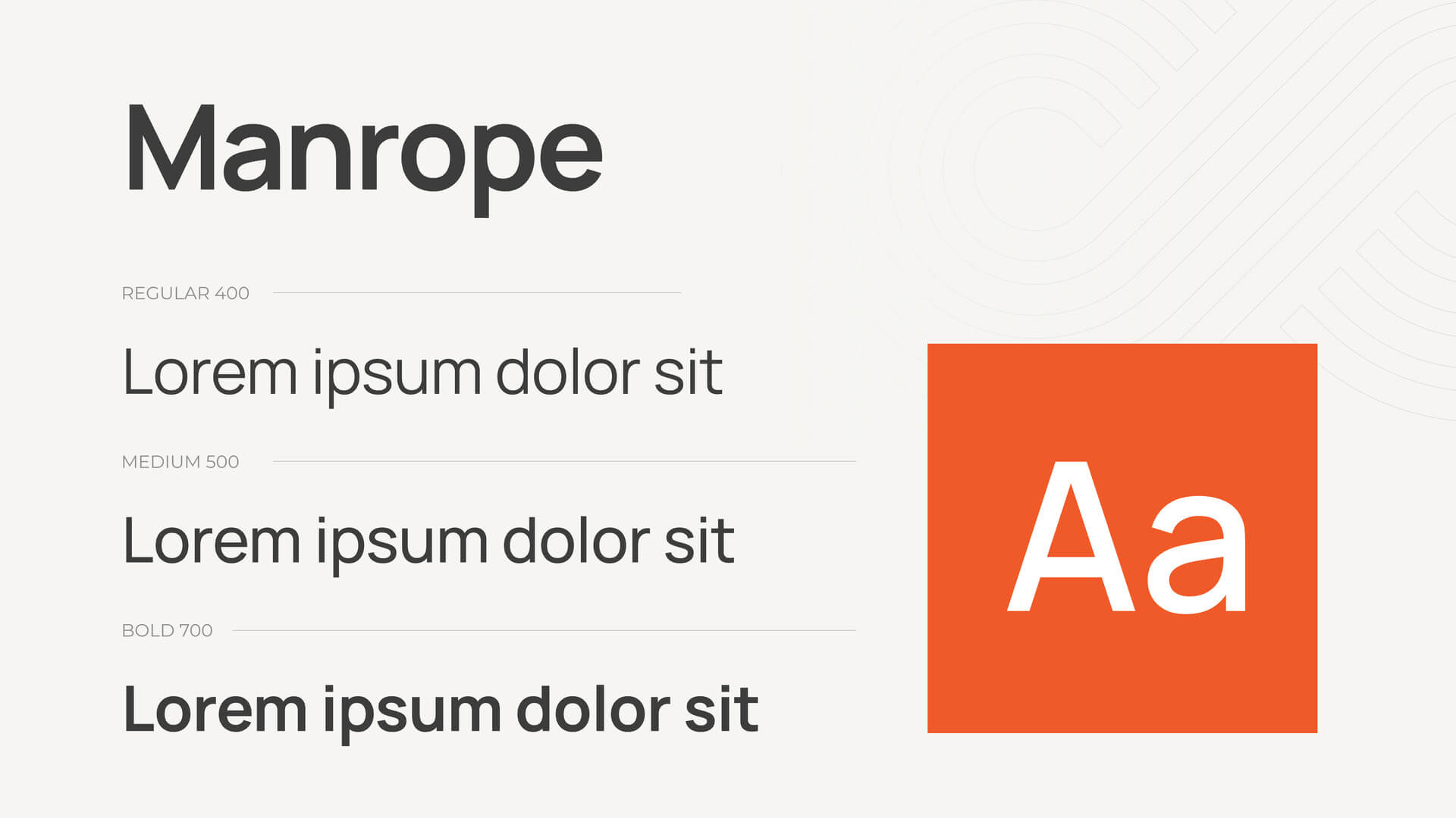
Background: Manrope is a modern geometric sans serif font designed by Mikhail Sharanda. It blends clean lines with a contemporary aesthetic.
Manrope features geometric shapes, open counters, and a balanced structure, making it versatile for various design projects. The font supports multiple weights and extensive language coverage.
Use Cases: Branding, editorial design, and digital interfaces.
Suggested Industries: Design, Technology, Corporate.
Pros: Modern and geometric, suitable for various design needs.
Cons: May feel too minimalist for some traditional applications.
Montserrat
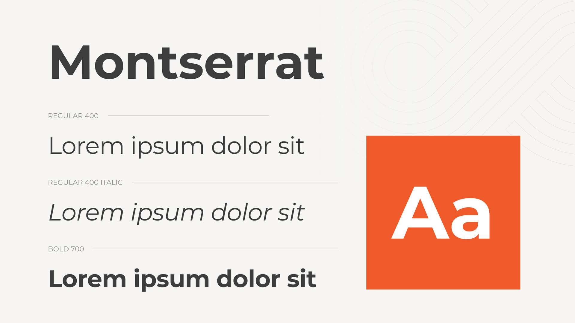
Background: Montserrat, designed by Julieta Ulanovsky, is inspired by the urban typography of the Montserrat neighborhood in Buenos Aires. It offers a modern and dynamic look.
Montserrat features geometric shapes, a large x-height, and wide letterforms, ensuring high readability. The font supports multiple weights and styles, making it highly versatile.
Use Cases: Branding, headlines, and digital interfaces.
Suggested Industries: Media, Design, Fashion.
Pros: Bold and dynamic, perfect for eye-catching designs.
Cons: May feel too bold for body text in lengthy documents.
Nunito Sans

Background: Nunito Sans is a balanced sans serif font designed by Vernon Adams, Jacques Le Bailly, and others. It offers a friendly and modern appearance.
Nunito Sans features rounded terminals, a large x-height, and open counters, ensuring readability and approachability. The font supports a wide range of weights and styles.
Use Cases: Websites, app interfaces, and educational materials.
Suggested Industries: Education, Technology, Health.
Pros: Friendly and readable, ideal for digital and print.
Cons: May lack the formal tone for certain professional contexts.
Open Sans
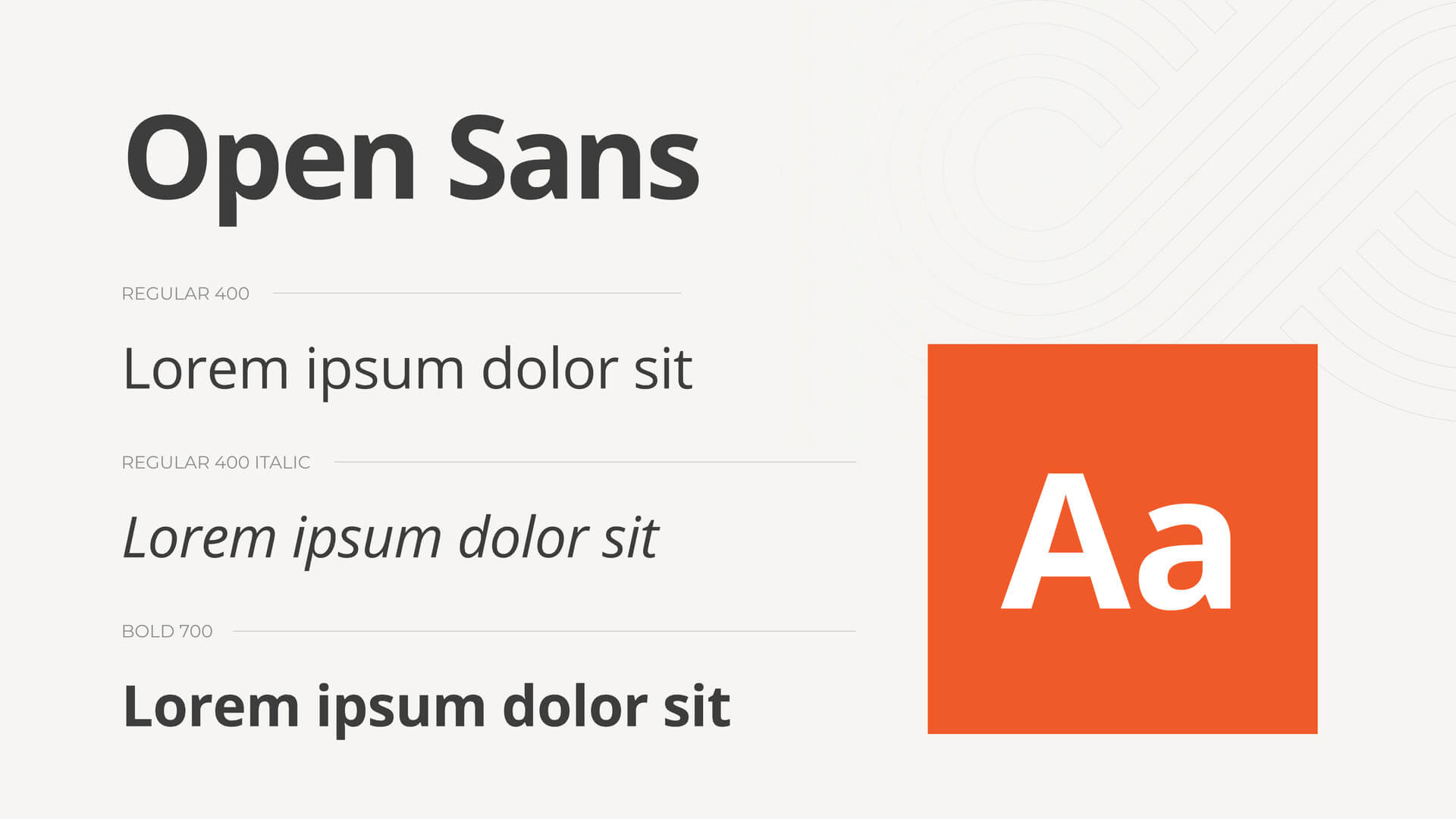
Background: Open Sans, designed by Steve Matteson, is a highly readable sans serif font optimized for both digital and print use. It is known for its neutrality and versatility.
Open Sans features open counters, a large x-height, and neutral design, ensuring clarity and readability. The font supports extensive language coverage and multiple weights.
Use Cases: Websites, user interfaces, and corporate materials.
Suggested Industries: Corporate, Technology, Media.
Pros: Highly versatile and readable, suitable for various applications.
Cons: Its neutral design may feel too generic for some creative projects.
Poppins
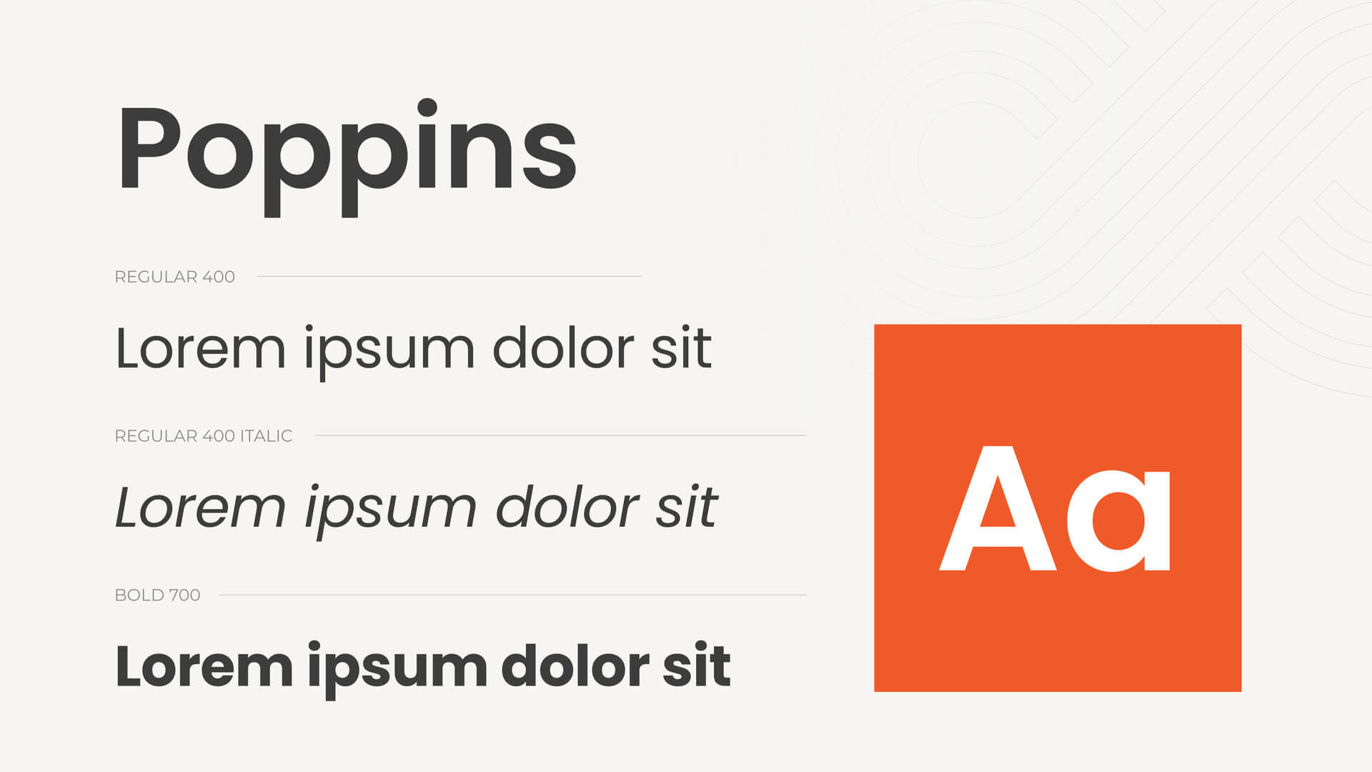
Background: Poppins, designed by Indian Type Foundry, is a geometric sans serif font that offers a modern and clean look. It is known for its versatility and clarity.
Poppins features geometric shapes, a large x-height, and uniform strokes, ensuring readability. The font supports multiple weights and extensive language coverage.
Use Cases: Branding, headlines, and digital interfaces.
Suggested Industries: Design, Media, Technology.
Pros: Modern and clean, perfect for contemporary designs.
Cons: May feel too geometric for more organic or traditional projects.
Raleway
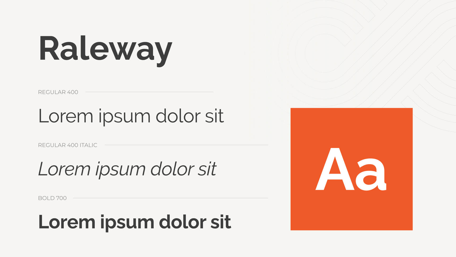
Background: Raleway, designed by Matt McInerney and others, is an elegant sans serif font that offers a sophisticated and modern look. It is known for its stylish design.
Raleway features thin strokes, a large x-height, and elegant proportions, making it suitable for display purposes. The font supports multiple weights and extensive language coverage.
Use Cases: Branding, headlines, and editorial design.
Suggested Industries: Fashion, Media, Design.
Pros: Elegant and stylish, perfect for display use.
Cons: Not ideal for body text due to its thin strokes.
Roboto
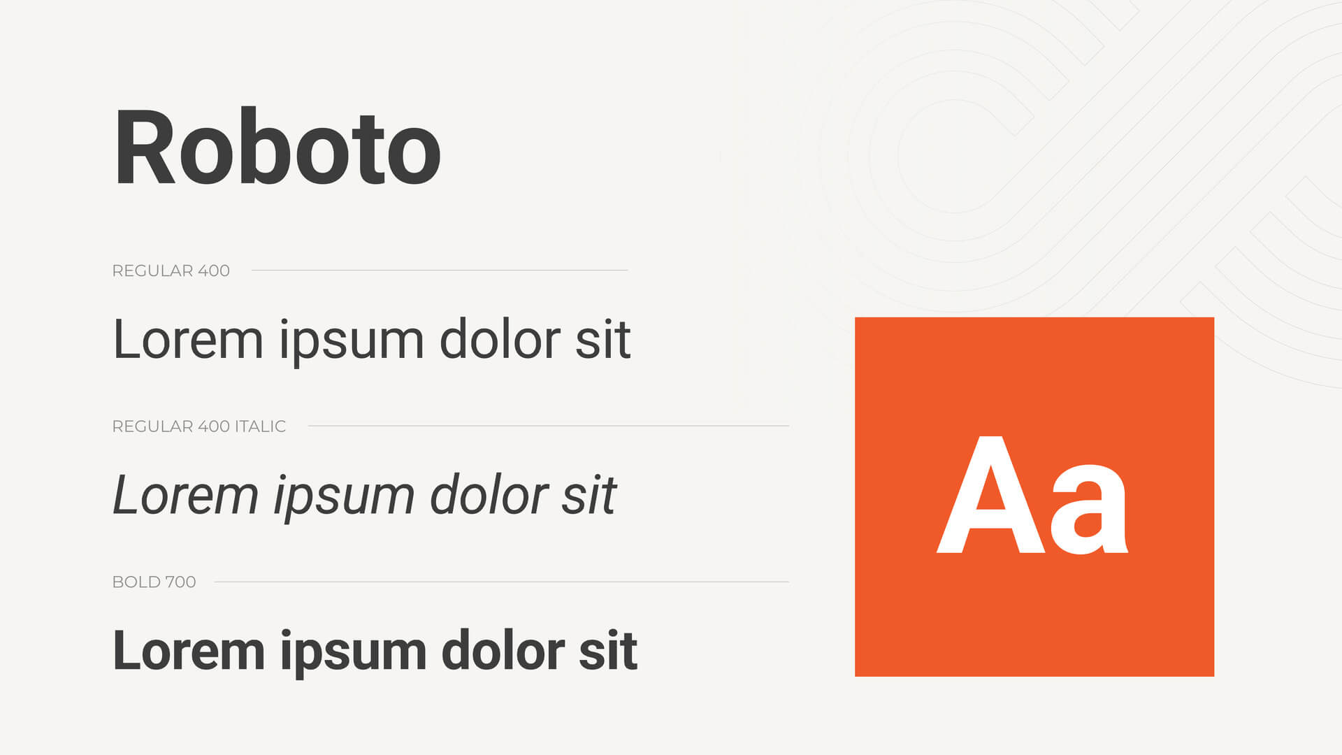
Background: Roboto, designed by Christian Robertson for Google, is a versatile sans serif font known for its modern and clean design. It was originally intended as the default font for Android devices.
Roboto features a large x-height, open counters, and slightly rounded corners, ensuring readability on screens. The font supports multiple weights and extensive language coverage.
Use Cases: Digital interfaces, websites, and branding.
Suggested Industries: Technology, Media, Corporate.
Pros: Highly readable and versatile, ideal for digital content.
Cons: Its ubiquity may make it feel too common for some projects.
Transform your design projects with the crisp and modern elegance of Google Sans Serif fonts, available for free! With a variety of distinctive styles and functionalities, there’s a Sans Serif font perfectly tailored to meet your creative needs. If yo want to know more about Google font combinations that you can mix and match, check this article.


