


You’ve poured heart and soul into building a great company. You know your market, you deliver value, and you’re focused on what’s next. But pause for a second and take an honest look at your website, your latest proposal, even your email signature. Does the way your words actually look on the page truly reflect the quality, expertise, and personality you’ve worked so hard to build?
It’s time to talk about typography – those fonts you use every day – because they’re quietly shaping perceptions and saying more about your business than you might realize.
In the hustle of running your business, it’s tempting to slap on a default font and move on—I get it. But those “small” choices can cost you credibility, clarity, and conversions.
So, we’re not just talking about pretty letters here. Here, I’ll break down why typography is a powerful strategic asset and how you can think about it like a business owner, making choices that strengthen your brand, connect deeply with your audience, and actually help drive results.
Bottom line? The fonts you choose are fundamental. They’re a core piece of your brand strategy that deeply influences how people perceive you and directly impacts your success, from first impressions to final conversions.

The gut feeling: How fonts subconsciously shape brand perception
Ever land on a website or glance at a logo and get an instant feeling about the company – maybe they seem deeply credible, maybe a bit playful, perhaps sleek and modern? You’re not imagining things. Fonts play a huge role in that immediate gut reaction, often before we even consciously register the words themselves. Think of them as the visual equivalent of tone of voice for your brand; they start communicating long before anyone reads a single sentence.
Let’s break down the main typographic styles simply, focusing on the vibes they usually send in a business context:
- Serif fonts: These are the classic fonts with the little “feet” (serifs) on the ends of the letters, like Times New Roman or Garamond. They tend to feel traditional, established, reliable, and trustworthy. You often see them used by law firms, financial institutions, universities, and established brands aiming to convey authority and heritage.
- Sans serif fonts: “Sans” just means “without,” so these fonts (like Arial, Helvetica, or Open Sans) ditch the little feet for a cleaner, more modern look. They typically feel straightforward, efficient, approachable, and contemporary. Think tech companies, startups, healthcare brands, and businesses wanting a fresh, accessible, and often digital-first feel.
- Slab serif fonts: These fonts (like Rockwell or Clarendon) have serifs too, but they’re thicker, blockier, making them feel bold, confident, solid, and sometimes even a bit industrial or quirky. They definitely make a statement and convey sturdiness.
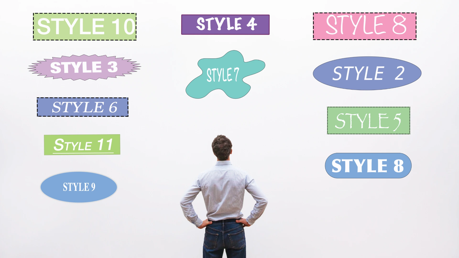
- Script & Display fonts: Script fonts mimic handwriting, ranging from elegant and formal to casual and creative, adding a dose of personality. Display fonts are often unique and decorative – the real showstoppers designed to grab attention in logos or big headlines. Both styles are powerful but usually best used sparingly for impact, as readability can be a challenge in large blocks of text.
Ultimately, these styles aren’t just decoration—they tap into learned associations. Choosing the right one is about intentionally signaling your brand’s personality and credibility from the very first glance.
Connecting fonts to the bottom line: The tangible business impact
Okay, so it’s established that fonts give off a certain vibe and shape perception, but how does that actually help your business achieve its goals? Fair question. This is where strategic typography moves beyond just looking good and starts actively working for you. Let’s connect the dots to the results you can actually see:
- It builds trust and signals professionalism. Think about it: when a brand uses consistent, appropriate, and highly readable typography across its website and materials, it subtly signals care, stability, and attention to detail. It shows you’ve got your act together. In industries where trust is paramount – like finance, law, or healthcare – this subconscious signal can be incredibly valuable. Sloppy or inconsistent fonts? They can, unfortunately, suggest the opposite.
For instance, a financial advisory firm choosing a classic, stable serif font instantly conveys a different level of seriousness and tradition compared to one using a lighthearted script, influencing that initial feeling of trust. - It boosts website engagement and drives conversions. This one’s huge, especially online. If your website text isn’t clear and readable (too small, weird spacing, fussy font choice), people won’t stick around. They’ll get frustrated and leave – that’s a higher bounce rate and a lost opportunity. Clear and readable fonts make your content easy to scan and digest, keeping visitors engaged longer. Plus, when your calls-to-action are crystal clear and highly readable (especially on mobile!), people are simply more likely to click them. Better readability often translates directly to better conversion rates. (Sources: Baymard line length study. WCAG 2.2 contrast minimum. MDN
font-display.) - It strengthens brand recognition and recall. Consistent use of your chosen fonts everywhere makes your brand instantly familiar, helping people quickly identify your ‘visual voice’ amidst the noise. This familiarity builds recognition, and strong visual consistency has been shown to significantly boost audience engagement.
- It helps you stand out from the crowd. Making a thoughtful, strategic typography choice that truly reflects your unique brand personality is a powerful way to differentiate yourself visually. It helps you look distinct and memorable, not like just another lookalike in the market.
Think about how a forward-thinking tech company might use a clean, geometric sans-serif to signal innovation, while a local craft brewery might use a rugged, textured display font to communicate an artisanal, independent spirit – both use typography to carve out their unique space. - It makes your marketing more effective overall. When your typography is cohesive and strategically chosen, all your marketing materials – from a simple social media graphic to a major ad campaign – look more professional, intentional, and instantly recognizable as yours. This reinforces your message and helps every marketing dollar work a bit harder.
Readability guardrails: Aim for 50–75 characters per line for body text, keep normal text at 4.5:1 contrast or higher (3:1 for large text), and ensure text stays visible during webfont load with font-display: swap. These three moves alone improve comprehension and reduce bounce.
Choosing your typographic voice: A practical framework for business leaders
Feeling overwhelmed by the thousands of fonts out there? Don’t be. Choosing the right typography doesn’t have to feel like throwing darts in the dark, hoping you hit something decent. Instead of getting lost scrolling through endless options, approach it strategically. Here’s a practical framework – think of it as a checklist – focused on your business goals, not just fleeting design trends:
- Start with your brand personality: What top 3-5 words describe the core personality you want your brand to project? (e.g., Innovative, Trustworthy, Approachable, Premium?). Look for fonts that visually feel like those specific words to ensure your typography is authentically aligned with who you are.
- Consider your audience: Who are you ultimately trying to connect with? What kind of visual style resonates most effectively with them and signals credibility in their world? A font that works for a tech startup might feel wrong for a financial advisory firm. Always view your choices through your ideal client’s eyes.
- Prioritize clarity above all: This might be the most crucial step, especially online. Can people easily read your text? Test potential fonts in actual paragraphs, checking performance at different sizes and on various screens (desktop vs. mobile!). If your message isn’t effortlessly readable, the font’s style doesn’t matter. Ensuring accessibility isn’t just good practice; it’s good business. Pay special attention to mobile screens! Fonts can render differently, and smaller viewports demand excellent readability. What looks great on a desktop might become cramped or illegible on a phone. Always test your font choices rigorously in real mobile environments to ensure clarity isn’t compromised.
- Aim for versatility: Consider all the places your fonts need to perform – online (website, ads, social), in print (brochures, proposals), and across various marketing materials. Do they function effectively as both large headlines and smaller paragraphs of text? Choosing versatile fonts ensures consistency and saves headaches across different applications.
- Keep it simple and consistent: Resist the urge to use too many different fonts! Most strong brands stick to a limited palette – often just two or three complementary fonts (perhaps one for headlines, one for body text, maybe an accent). This creates a clean, cohesive, professional look. Once chosen, establish clear guidelines on how and where to use them. This limited set of fonts also forms the basis of your content hierarchy – using variations in size, weight (like bolding), and style (like italics or using your headline vs. body font) to guide the reader’s eye. Clear headings, distinct subheadings, and readable body text make your content scannable and easier to understand, ensuring your key messages stand out.
- Don’t forget licensing: Fonts are licensed like software, so always confirm you have the correct commercial use rights for web, marketing, and other applications to avoid legal issues.
Make it official: your brand typography spec
Document these so your team and vendors execute consistently:
- Primary headings family: include weights you’ll use (or variable font range).
- Body family: default size 16–18px, line height 1.5–1.7, line length 50–75ch.
- Type scale: sizes for H1–H6 and paragraph; avoid condensed faces for long text.
- Contrast: at least AA 4.5:1 for body, 3:1 for large text; test dark and light themes.
- States: link, hover, focus, and visited styles documented.
- Performance: use
font-display: swap, preload truly critical fonts only, prefer WOFF2, consider variable fonts to reduce files. - Fallbacks & licensing: define system fallbacks; confirm proper web/desktop licensing.
Further reading:
- Baymard on line length
- WCAG 2.2 contrast
- web.dev font best practices (loading & performance)
- web.dev optimize web fonts
- web.dev on variable fonts


Weaving typography into your brand ecosystem
Okay, you’ve strategically chosen your fonts using the framework above. Now, the crucial part is weaving them consistently throughout your entire brand ecosystem to truly make an impact. Powerful typography doesn’t work in isolation; it needs to show up cohesively everywhere your brand does. Here’s where it plays a key role:
- On your website: Strategic typography here means clear navigation menus, highly readable body text explaining your services, compelling headlines that grab attention, and calls-to-action (CTAs) that stand out effectively. It contributes hugely to that professional feel and creates a user experience that keeps people engaged rather than clicking away in frustration.
- In your marketing materials: Consistency is king here. Whether it’s a digital ad, a printed brochure, a social media graphic, or an email campaign, using your established brand fonts reinforces recognition and professionalism. When everything looks and feels cohesive, it strengthens your message and makes your brand instantly identifiable, no matter where someone encounters it.
- In your logo or wordmark: For many brands, typography is the logo or a central part of it. The chosen font here carries immense weight, setting the tone for the entire brand identity right from the most visible element – it’s your brand’s signature.
- Making it all work together (Where partnership helps): Ensuring your typography works strategically and consistently across all touchpoints often benefits from an expert eye. Integrating thoughtful typography into our branding and web design process, helping make every detail count towards your business goals.
Performance & accessibility essentials: Serve fonts in WOFF2, keep file counts low, and reserve preloading for only the fonts that are truly critical above the fold. Use font-display: swap so text is always visible, then refine fallback metrics to minimize layout shift. Meet WCAG AA contrast and verify with automated checks and a quick manual review.
Further reading:
Want an expert eye to formalize this? See our Branding services and Branding Packages.
Make your visual voice heard
So, this journey has taken us beyond just “pretty fonts.” As you’ve seen, the typography you choose is a genuinely strategic tool for your business. It silently signals how people perceive your brand from the first glance, works to build (or undermine) trust, impacts how effectively your message lands, and ultimately influences your business results. It’s far more than just decoration – it’s a fundamental element of how your brand communicates.
Grab your latest proposal or your website now—does your typography truly reflect the quality and personality you’ve worked so hard to build? Thinking strategically about these visual choices, even the seemingly small ones, is a powerful step towards making stronger, more authentic connections with the audience you want to reach.
Ultimately, getting your typography right means ensuring your brand’s visual voice speaks clearly, consistently, and effectively to the people that matter most to your business. It’s about making that crucial visual first impression count, setting the stage for trust and engagement, every single time.

Frequently asked questions about strategic typography
Q: What is strategic typography?
A: Strategic typography means choosing and using fonts deliberately to support specific business goals—like shaping brand perception, connecting with your target audience, ensuring clarity, and improving conversions—rather than just picking fonts based on looks alone. It’s about making typography work for your brand.
Q: How does typography help build brand trust?
A: Consistent, professional, and appropriate typography signals attention to detail, stability, and credibility. Choosing fonts that are easy to read and align with your brand’s intended personality (e.g., traditional fonts for established institutions) helps create a subconscious feeling of trustworthiness and shows you’ve considered the user experience.
Q: How many fonts should a business typically use?
A: Less is usually more! Most strong brands use a limited palette, often just two or three complementary fonts—perhaps one for headlines, one for body text, and maybe an accent font if needed. This creates a clean, cohesive, and professional look that’s easier for audiences to recognize.
Q: Does typography really affect website conversions?
A: Yes, absolutely. Clear and readable typography directly impacts user experience. If text is easy to read, visitors are more likely to stay engaged with your content and understand your calls-to-action (CTAs). Clear line lengths, AA‑level contrast, and visible text during font load improve readability and reduce bounce, which supports higher conversions.
Q: What’s the first step in choosing strategic brand fonts?
A: Start with your brand personality, not the font library. Define the top 3-5 words that describe the core identity and feeling you want your brand to convey (e.g., modern, trustworthy, playful). Then, look for font styles that visually align with those personality traits.
Q: Why is font consistency important for a brand?
A: Consistency across all touchpoints (website, marketing, documents) makes your brand instantly recognizable and look more professional. It reinforces your brand identity, builds familiarity with your audience, and ensures your message feels cohesive no matter where people encounter it.