Color isn’t just a design choice — it’s an emotional shortcut. Whether you want to build trust, spark energy, or stand out in a crowded market, your brand colors play a big role. In this guide, we’ll break down what different colors communicate and how to use them to shape your brand story in a way that sticks.
Up to 90% of first impressions are based on color alone.
— Emerald Insight
Famous brands like Amazon and IKEA know color meanings matter and use colors as a key element of their branding strategy. The color combinations you choose for your logo design, website, and other marketing materials will contribute significantly to your brand identity.
Color psychology links certain color schemes to sensations like energy, optimism, wealth, and relaxation. By choosing the right colors, you can improve brand recognition, encourage customers to take action, or boost sales.
So what should you know about color meaning, and how do you incorporate it into your brand personality? Find all the information and creative tips you need in the following guide.
What are brand colors?

The term “brand colors” refers to the carefully chosen color palette you use in all the marketing elements that involve your brand’s visual identity, including your logo, website, graphics, videos, product packaging, and more.
Typically, well-known companies with successful branding use one to three core colors and a few more secondary colors to enhance the primary palette or highlight specific branches or products. For example, a children’s fashion brand that offers clothes for both boys and girls may use blue for the boys’ section and a pink color for the girls’ line.
Humans remember colors easily, which is why color plays such a vital role in brand identity. Successful branding creates a powerful connection in your customers’ minds between your brand colors and your business. That’s why, when you’re driving by on a foggy day and notice a blurry yellow and red sign, you think of McDonald’s even before you can make out the large letter M.
Why do you need to understand the meaning of brand colors?

Understanding the feelings color combinations evoke in your brand’s target audience will help you choose a palette that meshes with your brand’s personality, vision, and message.
For example, if you are a therapist who wants to convey a calm, peaceful aura through your logo and brand, you may choose a soothing color scheme with subtle shades of green or purple and steer clear of the bright red associated with clearance sales.
Selecting the right color palette for your brand will help your audience feel the vibe you project as soon as they glimpse your logo or website and even before they read a word of text. That instant when someone sees your colors — maybe it’s a soft blue or a bold black — can be what makes them stop and want to learn more.
So now you know why color matters — but how do you choose the right ones and use them consistently?
Color psychology and use of brand colors

Color psychology plays a major role in branding whether you are establishing a new brand or aiming for a new visual identity with rebranding. The key to using color in brand identity is consistency: the same color scheme should appear in all your company’s visual assets, both physical and digital.
Of course, you may also throw in some theme or seasonal color variations, such as a red and green palette as part of your holiday season advertising. However, as a rule, your brand colors should dominate your:
- Business logo
- Website
- Social media pages
- Videos
- Business cards
- Digital and print ads
- Promotional items (like T-shirts, pens, and mugs)
How does color affect your brand?
Strategic use of color meaning can be a game-changer for your brand. Your colors are an important part of showing the world what your business is about. A smart color combination choice and its consistent use can:
- Help your brand stand out from the competition
- Encourage your target audience to recognize your brand
- Establish affinity and trust toward your brand
- Improve your conversion rate and boost sales
- Foster brand loyalty in your customers
For a typical customer, the first 90 seconds of interacting with your brand will make or break a deal. Color may influence this decision by up to 90%. When so much hinges on color, it pays to gain a deeper understanding of color psychology and how it applies to your brand identity.
With the basics of color psychology covered, let’s look at how brands actually organize their color palettes in the real world.
Types of brand colors

Some popular brands, like Coca-Cola with its bright red logo, use a single color to boost their brand awareness. Many other brands choose a combination of colors that suits their image and enhances their core message.
Brand color choices fall under two categories: primary and secondary.
Primary brand colors
Primary brand colors form the constant, easily recognizable backdrop of the brand’s entire visual features, from website pages to physical signage. The brand’s primary colors often appear in the company’s logo. Brands typically use one to three primary colors.
Secondary brand colors
A secondary brand color may fit a specific marketing aim or product trend, like an eco-conscious angle or an appeal to a slightly different demographic. Secondary colors may also serve as complementary colors to the primary color.
While brands tend to use the same primary color scheme for a long time, the use of a secondary color may shift more frequently to keep up with the brand’s current goals. Most brands use up to five secondary colors.
List of brand colors and their meanings

Color meanings at a glance
Prefer to see it all at once? Here’s a quick-hit chart to help you connect colors with their emotional impact and brand associations.
| Color | Emotion/Meaning | Example Brands |
|---|---|---|
| Red | Energy, passion, urgency | Coca-Cola, Netflix |
| Blue | Trust, calm, intelligence | Facebook, Twitter |
| Green | Growth, balance, eco-friendliness | Starbucks, Spotify |
| Purple | Luxury, creativity, spirituality | Hallmark, Cadbury |
So what sensations do specific colors evoke? It’s important to keep in mind that culture, gender, and context may influence color psychology and how each color affects people.
For example, while most people in the Western culture perceive the color purple as soothing, spiritual, regal, and mysterious, purple is a mourning color in Thailand. The color meaning breakdown below applies to an average person in the U.S. and the rest of the Western world.
Red
Universally associated with excitement, passion, and energy, red is a bright color that makes a bold statement and projects a dominant, striking brand personality.
Many well-known brands like H&M, Netflix, and Puma use red in their logos and imagery. Red is also a popular color with brands in the food industry, like Coca-Cola and Kellogg’s. More conservative brands will typically avoid red.
Red also conveys a sense of urgency, which makes it a great choice for compelling CTA buttons and clearance sale banners.
Orange

The color orange conveys enthusiasm, vitality, confidence, and creativity. While orange is not as dominant as red, it’s still a bold and eye-catching color suitable for CTAs and other attention-grabbing messages. Brands that target children may also use orange in their logo and imagery.
Famous companies with orange in their logos include Fanta, MasterCard, and Nickelodeon.
Yellow
Warm and cheerful, the color yellow symbolizes optimism, friendliness, and positive energy. Yellow also projects affordability, which makes it a great color choice for auto dealerships, HVAC services, and other businesses that want to convey a message of fair value and reliable service.
Yellow pairs well with black, blue, or other warm colors like red. Hertz, DHL, and National Geographic are a few well-known companies that use yellow as a dominant color in their brand imagery.
Green
Soothing, calm, and relaxing, the color green broadcasts a sense of balance and an association with nature. While it lacks the vigor of red and orange, green is an uber-popular color with eco-conscious brands. Like other cool colors, the color green also carries an association with prosperity and wealth, so banks and other financial institutions often adopt green as their primary brand color.
Companies that use a green logo include Spotify, WhatsApp, and, of course, Starbucks.
Blue

The color blue inspires calm, trust, respectability, and healing. According to the color theory, different shades of blue project different meanings: while dark blue conveys knowledge, power, and integrity, light blue represents health and tranquility. Numerous surveys show that blue is the world’s most popular color.
A blue color scheme is a classic choice for both medical brands and financial institutions. The social media giants Facebook and Twitter also use blue in their logos.
Purple
In color psychology, purple represents quality, sophistication, authenticity, and calm. Companies that use purple in their branding colors often focus on high-end products and want to emphasize their exclusivity. In contrast, purple isn’t the best choice for sales and products with a wide appeal.
Well-known companies that chose a purple logo include Yahoo!, Hallmark, and Cadbury.
Pink
Feminine and romantic, the pink color projects love, warmth, and positive energy. Many global brands that cater to a female audience choose the color pink for their logo, packaging, and other visuals.
Pink has an association with youth, which makes it an extremely common color choice for young girls’ toys, fashion, and beauty brands. However, as Victoria’s Secret’s website shows, pink can convey sexuality too.
Lyft, the popular ridesharing company, also chose a pink logo as a part of its female-friendly strategy.
Brown
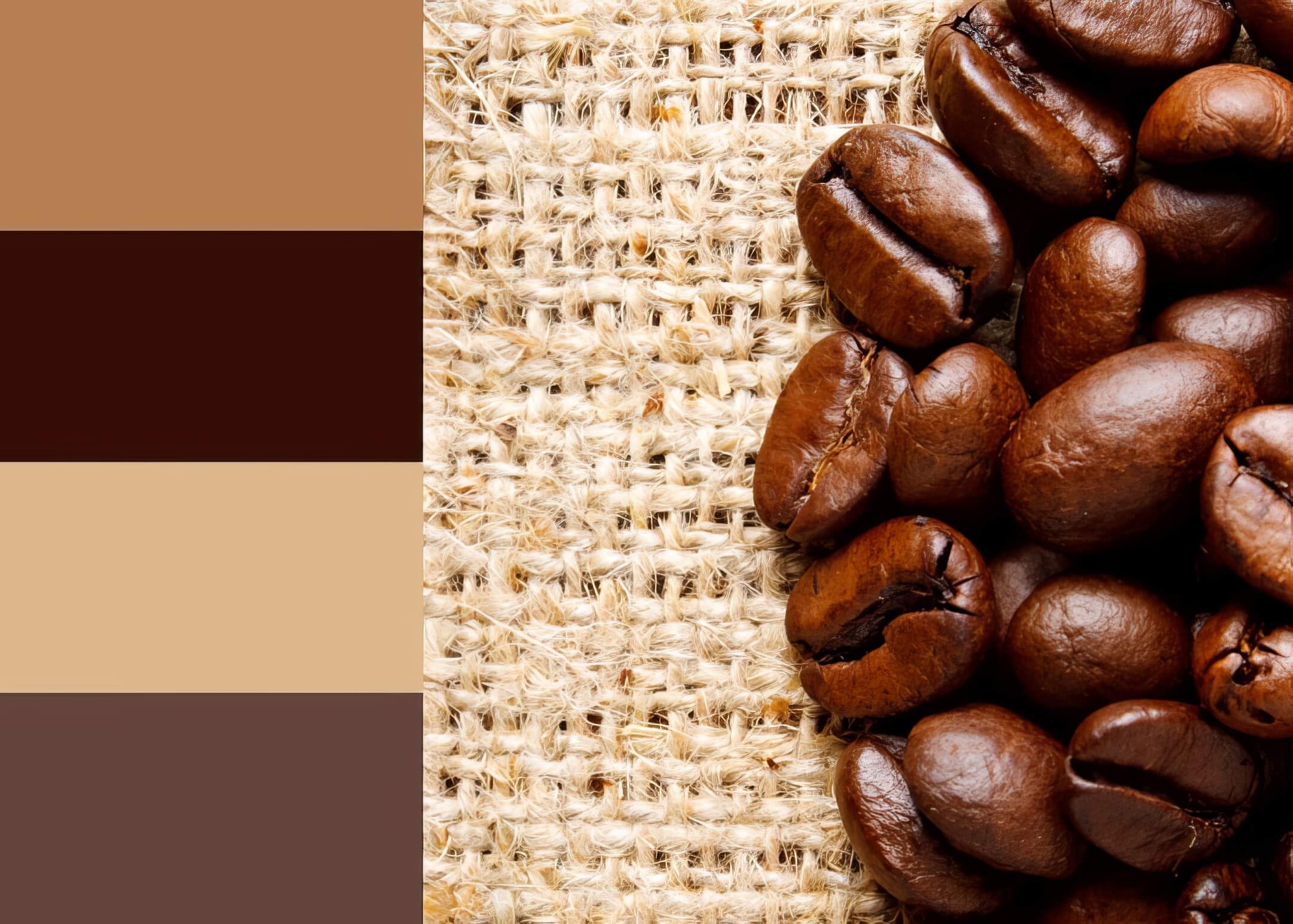
The color brown inspires support, reliability, and security. Like green, this down-to-earth color has a deep association with nature and works well for eco-friendly and organic brands.
Like other neutral colors, brown is extremely versatile. Both construction companies and chocolate brands, such as M&M’s and Hershey’s, often choose shades of brown as their branding colors.
Black
Black is a common color branding choice for businesses that aim to project professionalism, power, authority, and elegance.
As a font color, black offers optimum readability. A black background can provide contrast to other colors and underscore the message the company means to convey through its color scheme. Adidas, Puma, and many other fashion brands use a black logo.
Gray

Gray is a cool neutral color that creates a clean, balanced look. Thanks to its associations of sophistication and elegance, it works well as a primary branding color for Apple and automotive giants like Mercedes, Nissan, and Toyota.
Gray may convey feelings of depression and sadness, so brands often combine gray with other colors to counterbalance this effect.
White
White represents purity, mental clarity, and efficiency. A white background enhances font readability and goes well with virtually any other color. Brands that promote minimalism often use a lot of white in their websites and digital marketing.
White, often contrasting with black, stars in the logos of companies like Chanel and Nike.
Not sure how this applies to your brand yet? Try this quick exercise to put color psychology in motion.
Test your brand colors: A quick exercise
Picture two brands:
- A wellness coach who wants to promote peace and empowerment
- A direct-to-consumer supplement brand targeting fitness enthusiasts
Now imagine these palettes:
- Palette A: Deep blue, soft lavender, muted cream
- Palette B: Black, electric green, metallic silver
Which one feels like the right fit for each brand — and why? That’s the power of color at work.
How to make a brand color scheme

Choosing your brand colors is part strategy, part creative instinct. You want your palette to reflect who you are — and spark the right feelings in your audience. At the same time, your color choices should align with what people expect from brands in your space.
Brands need attractive color schemes and symbols that are unique enough to stand out, but also conventional enough to conform to the market in which they are located in. For example, a construction company or retailer that sells outdoor and camping equipment probably wouldn’t go for a red rose as their brand’s logo.
Depending on their message and vision, brands may choose:
- Monochromatic palettes, which include multiple shades and tints of a single color
- Analogous palettes, featuring colors that are neighbors on the color wheel, like pink and purple or green and blue
- Complementary palettes, with multiple colors that oppose each other on the color wheel, like blue & orange
If you’re going for dimension and balance, you may choose a complementary color palette, with a color from one group acting as an accent color for the other. However, a monochromatic palette may work well for a brand that projects minimalism, while an analogous palette may be right if your brand wants to convey a pleasing, harmonious vibe.
Additionally, contrast helps catch the viewer’s eye and prevents your website and other visuals from appearing too bland. All color schemes, whether monochromatic, analogous, or complementary, need to combine light and dark shades.
Choosing the right color for your brand identity

To choose the right branding colors, you need a clear perception of your brand personality, vision, and core message. Ask yourself:
- Who are we? What type of feeling do we want to project? Do we want to come across as serious, playful, trustworthy, optimistic, adventurous, or romantic?
- Who is our ideal customer? What are they looking for? To visualize your audience, it helps to create a fictional customer persona, for example, “Cathy, 32. Cathy lives in California, makes $80,000 a year, just got engaged, and is looking for a reliable mortgage lender.”
- What colors do our competitors use? While blindly copying your competition’s choices is a bad idea, it helps to see what colors successful brands in your industry use. Analyze how these choices influence branding and help successful companies stand out in a competitive field.
Your most secure method for choosing the right branding colors is working with a professional branding service and designer who will help you use color psychology to promote your brand’s goals. A brand and logo designer will work with you to create materials that stamp a strong, easily recognizable visual identity for your business.
For example, if you’re a landscaper, using green for your logo and website is almost inevitable. A clever designer can help you incorporate green into your brand’s color scheme without getting lost among the countless other landscapers in your area.
Want to see these ideas in action? Let’s look at some top brands that use color meaning strategically — and what you can take away from their approach.
Examples of popular brands with effective brand color combinations
Finally, let’s look at some top brands that successfully use color meanings to achieve their branding strategy.
IKEA
IKEA’s blue-and-yellow logo doesn’t just nod to its Swedish heritage — it sends a message. Yellow evokes affordability and warmth, while blue signals trust. Together, they tell shoppers: you’re in good hands, and you’re getting a deal.
Starbucks
Starbucks pairs a clean white mermaid with a rich green backdrop. The effect is fresh and calming — a perfect visual echo of their plant-based, feel-good products. Green signals growth, nature, and a moment of calm in a busy day.
UPS
The UPS logo combines bright yellow and solid, down-to-earth brown. Brown evokes honesty and dependability, while yellow adds a warm and positive tone. Both colors chime in with the qualities that have helped the United Parcel Service stay in business for over a century.
Google’s bright, playful primary colors aren’t random — they channel a sense of curiosity, approachability, and limitless possibility. Like building blocks, each color contributes to a brand identity that says: explore, search, create.
Connective branding and web design: Fuel your brand image with the right color meaning
At Connective, we provide robust full-scale branding services, from choosing the perfect color combination for your brand identity to enhancing your visibility through brand-conscious digital marketing.
Build a powerful brand that helps you stand out among the competition and connects you with your customers. Contact us online to learn more about our brand kit.


