


Your website can look incredible and still fail at its only job: advancing your mission.
Most nonprofits ship beauty without strategy. An effective nonprofit website strategy requires both.
The rest of this guide shows you how to make design serve donations.
The foundation work nobody wants to do
Before we talk about design or conversion optimization, let’s address the elephant in the room: you can’t build effective strategy on assumptions.
Garbage in, garbage out.
Most nonprofits guess who visits their site. They assume what donors want. They think they know why people give. But when you actually dig into the data? The reality is usually completely different.
This foundation work isn’t sexy. It’s spreadsheets and analytics and user interviews. It’s testing your assumptions and often being wrong. It takes serious time that nobody wants to invest.
But here’s what I’ve learned: the organizations that do this work upfront save themselves years of expensive mistakes. The ones that skip it? They’re still guessing why their beautiful website doesn’t convert.
Build on rock, not sand. Even if it takes longer than you’d like.

What a strategic nonprofit website looks like
Before diving deeper, here’s your checklist. Screenshot this. Share it with your board. Use it to audit your current site:
✓ Clarity above the fold
One-line value proposition. Single primary CTA. Supporting image that creates emotional connection. No carousels.
✓ Three-screen donation flow (mobile)
Screen 1: amount. Screen 2: donor info. Screen 3: payment. Clear progress indicator. No distracting exits.
✓ The 6-field rule
Maximum six fields for new donors. Guest checkout allowed. Optional fields hidden. Real-time validation with clear errors.
✓ Monthly giving by default
Monthly preselected with easy toggle. Suggested amounts anchored slightly higher. Impact labels tied to amounts.
✓ One-tap payments visible
Apple Pay, Google Pay, PayPal, cards. Digital wallets shown above the fold on mobile. Autofill enabled.
✓ Speed as a feature
LCP ≤ 2.5s. CLS ≤ 0.1. INP ≤ 200ms (replaced FID). Page weight under 2MB on mobile. Lazy loading and CDN in place.
✓ Accessibility baseline
WCAG AA color contrast. Keyboard navigation with visible focus. Descriptive alt text. Labeled fields and error hints. Skip link present.
✓ Trust and transparency
Impact proof near donation form. Recognizable security cues. Link to financials or impact report. Concise testimonial visible.
✓ SEO and discoverability
Descriptive H1 and title. Clean URLs. Internal links to donate and impact pages. Schema markup for Organization, FAQ, and donations.
✓ Measurement and attribution
GA4 events for view donate, start checkout, complete donation. UTMs captured on forms. Dashboard tracking conversion rate by source.
The award-winner paradox
Awards judge aesthetics and novelty, not donation rates. Strategic design puts conversion first without giving up beauty. Do both.
What heatmap tools reveal about donor behavior
We love heatmap tools at Connective. If you’re not using Hotjar or Clarity on your non-profit site, start today.
I’ve watched session recordings where donors rage-click on beautiful images thinking they’re buttons. Where they abandon forms because we asked for too much too soon.
These aren’t design failures. They’re strategy failures dressed up in beautiful clothes.
Your design should make the journey obvious. Not necessarily easy, but obvious.
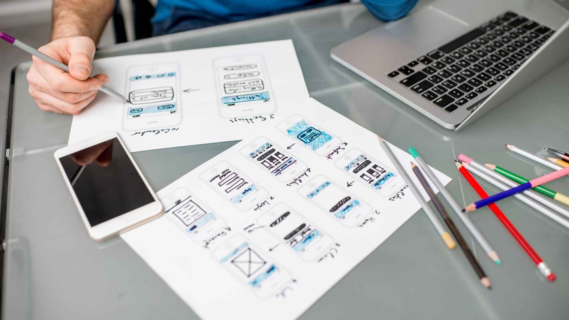

The mobile experience that separates winners from losers
Pull out your phone right now. Go to your website. Try to make a donation.
How’d that go? Be honest.
Award-winning designs often fall apart on mobile. The beautiful desktop experience becomes a frustrating maze of tiny buttons and hidden navigation. Clean designs can be so minimal that crucial actions become invisible.
We consistently see this pattern: nonprofit sites requiring 10, 12, even 14 different interactions to complete a mobile donation. Every extra tap loses donors.
And before you say “but our donors use desktop” – check your analytics. I bet you’ll be surprised. Most non-profits are shocked to find over half their traffic is mobile. Older donors on iPads. Young donors on phones. Board members checking the site during meetings.
Mobile isn’t the future. It’s right now.
Here’s what actually works:
Progressive disclosure done right. Show only what’s needed at each step. Amount first. Email second. Payment last. Each screen designed to reduce cognitive load while maintaining visual elegance. We learned this the hard way after watching donors abandon 15-field forms.
Touch-optimized interfaces. Buttons sized for thumbs, not mouse cursors. Forms that adapt to mobile keyboards. Payment options that work with one hand. Sounds obvious, but I still see tiny tap targets everywhere.
Speed as a feature. Beautiful imagery that loads instantly through intelligent compression and lazy loading. Rich interactions that don’t sacrifice performance. Every second of load time costs you donors. We’ve measured it.
Mobile-first optimization can dramatically improve conversion rates. The difference between a desktop-designed form squeezed onto mobile and a truly mobile-optimized experience? It’s measurable in lost donations. Real money left on the table.
Content that builds trust, not just awareness
Most nonprofits publish content for themselves. Newsletter archives. Board meeting minutes. Press releases nobody reads.
Stop it. Publish for donors and beneficiaries first, then everyone else.
I get it – your board wants to see their names on the website. Your program directors want their initiatives featured. Everyone has an opinion about what should be published.
But here’s the reality: your content should serve your audience, not your ego.
Premium non-profit brands create content that reinforces their value:
For beneficiaries: Tools and resources that actually improve lives. Not PDFs buried in your site, but interactive experiences that provide immediate value.
For donors: Impact calculators showing exactly what their money achieves. Behind-the-scenes content that makes them feel like insiders. Clear paths to deeper involvement beyond just giving.
For partners: Research and data they can cite. Collaboration opportunities that benefit both organizations. Thought leadership that advances the entire sector.
When non-profits elevate their content from basic news updates to magazine-quality storytelling with professional photography and interactive visualizations, something interesting happens. Major donors start sharing it. Board members forward it to their networks. The content becomes a source of pride, not just information.
But this takes work. Real work. The kind most organizations aren’t willing to do.
The trust signals that convert visitors into supporters
Charity Navigator ratings matter. But you know what really builds trust?
Sophisticated transparency.
The most effective nonprofit websites obsess over presenting information beautifully:
- Interactive impact maps showing precise locations of work
- Data visualizations that make statistics compelling
- Professional photography that respects beneficiary dignity
- Annual reports that feel like coffee table books
- Real-time dashboards showing exactly where money goes
People give to organizations that feel professional and competent. Every design choice reinforces that perception. When nonprofits add real-time impact dashboards with elegant visualizations showing exactly where money goes, donations typically increase. Donors want transparency delivered beautifully.
That’s the foundation of effective non-profit website strategy.

The technology principles that drive results
Let’s talk tech stack. But first, a confession: we’ve made every mistake in the book. We’ve chased shiny tools. We’ve overcomplicated simple sites. We’ve learned the hard way what actually matters.
Instead of chasing specific tools, focus on these core capabilities:
Managed hosting with security hardening Automatic backups, intrusion prevention, and instant scaling when you go viral. Your site stays up when it matters most.
Full-page caching with global delivery Sub-2-second loads worldwide, even with rich media. Speed directly impacts donation completion rates.
Smart forms with attribution tracking Know exactly where donors come from and what motivates them. Track the complete journey from first touch to conversion.
SEO that captures featured snippets Structured data and semantic markup that helps you win the top of search results. Be the answer when people search for causes to support.
Enterprise-grade security Professional protection that blocks thousands of attacks monthly without you knowing. One breach can destroy donor trust forever.
Analytics configured for nonprofits Track what matters: donor lifetime value, campaign attribution, and actual impact metrics. Not just pageviews.
Email automation that nurtures relationships Beautiful templates and behavioral triggers that turn one-time donors into lifetime supporters.
The tools themselves matter less than having these capabilities. But don’t cheap out. I’ve seen too many non-profits lose thousands trying to save hundreds.
Note: Our preferred stack includes WP Engine or Kinsta hosting, WP Rocket + Cloudflare CDN, Gravity Forms + AFL-UTM Tracker, RankMath Pro, Wordfence Pro, Google Analytics 4 + Tag Manager, and Kit (formerly ConvertKit). But the principles matter more than the specific tools.
The donation page optimization formula that actually works
Based on our experience and a lot of expensive mistakes, here’s the conversion strategy that consistently works:
Above the fold essentials:
- Suggested amounts that anchor expectations upward (but be realistic – don’t insult people)
- Monthly giving positioned as the default option (controversial but effective)
- Security indicators integrated into design, not slapped on as badges
- Multiple payment methods including digital wallets (yes, even for older donors)
Form optimization that respects donors:
- Maximum 6 fields for new donors (name, email, amount, payment – what else do you really need?)
- Guest checkout without forced registration (stop making people create accounts to give you money)
- Smart defaults based on visitor behavior (but don’t be creepy about it)
- Real-time validation that prevents frustration (tell them the CVV is on the back of the card)
Social proof that builds confidence:
- Recent donation activity if you have volume (privacy-conscious – no full names)
- Campaign progress visualizations (but only if you’re actually making progress)
- Matching gift callouts when applicable (these really work)
- Impact statements tied to specific amounts (“$50 feeds 10 families” beats “every dollar helps”)
Technical requirements:
- Page load under 2 seconds (test this monthly – it creeps up)
- Perfect mobile responsiveness (not just “it works” but “it’s delightful”)
- Accessibility without compromise (screen readers matter)
- Recovery for abandoned donations (email them once, maybe twice, then stop)
These aren’t suggestions. They’re requirements for modern nonprofit website conversion rate optimization. And yes, implementing all of this is harder than it looks.
The email journey everyone forgets
Your donation confirmation email is not a receipt. It’s the beginning of a relationship.
Most non-profits send: “Thank you for your donation of $50.”
Premium organizations create journeys:
- Immediate – Gorgeous confirmation with specific impact statement
- Day 3 – Story of someone helped, with professional photography
- Week 1 – Invitation to exclusive donor experiences
- Month 1 – Beautiful impact report showing collective achievement
- Month 2 – Sophisticated invitation to sustained giving
When properly automated, personalized, and tracked end-to-end, every touchpoint reinforces that supporting you is a premium decision.


The measurement framework that proves ROI
Here’s what nobody tells you about analytics: most nonprofits are drowning in meaningless data.
Page views? Who cares. Time on site? Means nothing if they don’t convert. Bounce rate? Depends entirely on the page purpose.
Track these five metrics religiously instead:
Conversion rate by source.
Email visitors convert differently than social media visitors. Once you know this, you’ll invest differently.
Speed to first gift.
The faster someone donates after discovering you, the more likely they’ll give again. This metric predicts lifetime value better than anything else.
Engagement depth.
Create a simple score: pages visited, content downloaded, videos watched. High engagement predicts future giving. It’s not perfect, but it’s directional.
Mission impact per visitor.
Connect digital metrics to real outcomes. Volunteer signups per thousand visitors. Program enrollments per campaign. This is what your board actually cares about.
Total cost of digital ownership.
Include everything: hosting, tools, content creation, staff time. Compare to total value generated. Be honest about the math.
Perfect data doesn’t exist. I still struggle with attribution. But something measured poorly beats nothing measured at all.
Your 30-day website optimization roadmap
I’m going to give you a 30-day plan. But first, let me be honest: this is just the beginning. Real optimization takes months, not weeks. But you have to start somewhere.
- Week 1 (Monday, 2 hours): Install behavior tracking. Set up Hotjar or Clarity. Watch real people use your site. Prepare to be humbled. I still cringe watching sessions sometimes.
- Week 1 (Wednesday, 2 hours): Audit your mobile donation flow. Screenshot every step. Time the process. Document every friction point. Share it with someone who’s never seen your site before. Their confusion is your roadmap.
- Week 2 (Monday, 3 hours): Optimize your donation form. Reduce fields. Add payment options. Improve error messages. Test it yourself ten times. Then test it again.
- Week 2 (Thursday, 2 hours): Design your email journey. Map the first 60 days after donation. Create templates that match your site’s sophistication. But start simple. You can always improve later.
- Week 3 (Tuesday, 3 hours): Create impact visualizations. Transform statistics into compelling graphics. Show exactly what donations achieve. This is harder than it sounds. Budget extra time.
- Week 3 (Friday, 2 hours): Configure proper analytics. Set up conversion tracking. Create donor segments. Build a dashboard you’ll actually use. Most people skip this. Don’t be most people.
- Week 4 (Monday, 2 hours): Launch your first A/B test. Test one element. Just one. Measure results. Learn what works for YOUR donors. Resist the urge to test everything at once.
- Week 4 (Thursday, 2 hours): Document and plan. What improved? What’s next? Create your ongoing optimization calendar. This is where most organizations quit. Push through.
Total investment: 18 hours over 30 days.
But here’s the truth: those 18 hours are just the start. Real strategy takes hundreds of hours. The question is whether you’re willing to invest them.
The strategic patterns of successful nonprofits
After working with non-profits for years, I’ve noticed the ones that consistently grow share these behaviors:
They test everything but maintain design standards. A/B testing doesn’t mean choosing between good and bad design. It means testing two excellent options. This is harder than it sounds.
They prioritize ruthlessly. Mobile before desktop because that’s where most donors are now. Donation flow before blog because that’s what drives revenue. Core functionality before nice-to-haves because resources are limited.
They measure what matters. Donor lifetime value over one-time gifts. Sustained engagement over viral moments. Actual impact over vanity metrics.
They respect their donors’ time and intelligence. Fast loads. Clear communication. No guilt. No gimmicks. No emotional manipulation.
And here’s the hardest part: they stick with it. When the board pushes for a redesign because they’re bored, they show the data. When staff wants to add features, they test first. When everyone has opinions, they let results decide.
This isn’t easy. Internal politics are real. But the organizations that push through? They’re the ones raising serious money online.
The competitive advantage hiding in plain sight
While everyone obsesses over social media, websites quietly drive most online donations.
The organizations winning understand this. They invest in continuous optimization, not just periodic redesigns. They test weekly. They measure everything. They improve constantly.
Most nonprofits redesign every three years and forget about their website in between.
That’s the opportunity.
By the time competitors notice you’re pulling ahead, you’ll have months of optimization behind you. Compound improvements that can’t be quickly copied.

The decision that changes everything
Your website is either a cost center or a revenue generator. There’s no middle ground.
I learned this the hard way. Cost centers get budgets cut during tough times. Revenue generators get investment for growth.
Cost centers get updated annually. Revenue generators get optimized weekly.
Cost centers serve internal stakeholders. Revenue generators serve the mission.
The shift isn’t about technology. It’s about mindset.
When you see your website as core to mission delivery, not just mission communication, everything changes. Suddenly that donation form abandon rate matters. That volunteer signup friction costs real impact. That confusing navigation prevents real people from getting help.
But changing mindset is harder than changing technology. It requires buy-in from leadership. It requires budget for ongoing optimization. It requires admitting that your beautiful website might not be working.
Most organizations aren’t ready for that conversation. Are you?
What high-performing nonprofit website strategies actually deliver
They don’t just inform. They transform interest into action.
They don’t just tell stories. They make donors the hero of those stories.
They don’t just look professional. They perform professionally.
They don’t chase trends. They chase impact.
Every design decision has a strategic purpose. Every interaction moves toward conversion. Every element earns its place through strategy, not assumption.
The uncomfortable truth about your current site
Let’s be real for a minute.
If you’re honest, your website probably isn’t working as hard as it should be.
Maybe it wins compliments but not donations. Maybe it serves your board but not your mission. Maybe it looks like a non-profit website when it should work like a fundraising machine.
That’s okay. Every organization starts here. We did too.
What matters is what you do next.
But here’s what I need you to understand: fixing this isn’t a one-time project. It’s not a redesign every three years. It’s ongoing work that never really ends.
The organizations that succeed commit to continuous improvement. Weekly tests. Monthly optimizations. Quarterly strategy reviews.
Is that exhausting? Sometimes. Is it worth it? Absolutely.

Your next action
Look, I could tell you to start with one test, one measurement, one improvement. And you should.
But let me be really honest here: most of you won’t.
Not because you don’t care. Not because you don’t see the value. But because you’re already overwhelmed. Because your board needs that annual report. Because the gala is coming up. Because there’s always something more urgent.
I get it. I really do.
So here’s my actual advice: pick the thing that’s been bothering you most about your website. The thing that makes you cringe every time you see it. Fix that first.
Maybe it’s your donation form that takes forever. Maybe it’s your mobile experience that’s embarrassing. Maybe it’s the fact that you have no idea if your website actually drives donations.
Start there. Fix that one thing. Feel the momentum. Then fix the next thing.
Your mission deserves a website that advances it every single day. Beautiful design that converts. Sophisticated experiences that perform. A comprehensive strategy that turns visitors into supporters.
But it won’t happen overnight. It won’t happen without real work. And it definitely won’t happen if you keep waiting for the perfect time to start.
The best nonprofit organizations don’t choose between form and function. They master both through strategic thinking and relentless iteration.
Time to join them. Or don’t. But stop pretending your beautiful website is enough.
Frequently asked questions
What is a good nonprofit website conversion rate?
A good nonprofit website conversion rate typically ranges from 1% to 4% for general traffic, with email traffic often converting at 5% to 15%. If you’re below 1%, you have significant room for improvement. Above 4% puts you in the top tier. But remember: conversion rate varies dramatically by traffic source, so always segment your data.
How many fields should a donation form have?
Six fields maximum for new donors: name, email address, donation amount, and payment information. Every additional field reduces completion rates. You can ask for more information after the donation is complete, but not before. Guest checkout should always be an option – forcing account creation kills conversions.
What should be above the fold on a donation page?
Above the fold on a donation page, you need: suggested donation amounts with the most popular pre-selected, a toggle between one-time and monthly giving (with monthly as default), visible payment method options including digital wallets, one clear headline stating your value proposition, and trust indicators like security badges integrated into the design. No carousels, no videos, no distractions.
How do we measure donor lifetime value from our website?
Track donor lifetime value by connecting your website analytics to your CRM. Tag every donor with their acquisition source (organic search, email, social, etc.) and track their giving over time. Calculate LTV by adding up all donations from a donor and averaging by acquisition channel. Most nonprofits find email-acquired donors have 2-3x higher lifetime value than social media donors.
What is a healthy monthly donor percentage?
A practical target is 20% to 30% of gifts as monthly on core campaigns when monthly is the default and wallets are enabled. Track this monthly and by source. Email-driven campaigns often achieve higher monthly percentages than social or organic traffic. If you’re below 20%, test making monthly giving the default option with an easy toggle to one-time.
Should we prioritize mobile or desktop optimization?
Mobile first, always. Over 50% of nonprofit website traffic is mobile, and this percentage continues growing. But here’s the key: a truly mobile-optimized site works beautifully on desktop too. The reverse isn’t true. Start with mobile, then enhance for desktop – not the other way around.