


The best wireframes come from a room where multiple disciplines are fighting for the same goal through different lenses. A strategist thinking about user intent. An art director thinking about visual language. A copywriter thinking about voice. A UX/UI designer thinking about flow. An account manager who knows things about the client that don’t exist in any document. When all of those perspectives collide on the same problem at the same time, the result is inevitably better than anything one person produces alone.
The problem is that most wireframe workflows don’t let that happen. Instead, they run in sequence: account manager writes a brief, strategist sets a direction, designer builds the wireframe in isolation, sends it for review, gets notes, revises, sends it back again. Each handoff takes a day or two, not because the work is slow, but because people have other things on their calendar.
Every handoff is a lossy compression. Strategic context gets thinner with each pass.
That sequential process works. We use it. But we wanted to test a different question on a recent client project: what happens when AI compresses execution fast enough that all of those people can stay in the room for the entire cycle? Not replacing anyone. Just closing the gap between “we decided this” and “here’s what that looks like” from days to minutes.
It was an experiment. This is what it actually looked like.
What made the session work before it started

The session itself was about two and a half hours, including prep and post-session refinement. But the reason it worked had almost nothing to do with what happened during those hours. It had everything to do with what was already loaded into the Claude project before anyone opened their laptop.
We’d been working with this client, a healthcare IT company, for months. During that time, we’d conducted interviews with their department heads. We’d built their brand DNA and voice guidelines. We’d run competitive analysis. Their project manager had organized a discovery guide, target personas, and a complete sitemap with page counts and template definitions. All of it was sitting inside a Claude project, organized and ready.
AI wireframe tools only produce output as good as what you feed them. When execution is this fast, there’s no buffer to course-correct weak inputs mid-session. If the discovery is thin, the output will be thin. Whether that foundation gets built over three months of ongoing client work or an intensive three-week discovery sprint, the rigor is what matters. Skip it, and the AI will happily generate a polished wireframe that says nothing useful.
The strategic brainstorm that shaped everything
The room included an account manager embedded with the client for months, a strategist driving the Claude project live, an art director, a copywriter, and a UX/UI designer.
The first thing we did wasn’t open Figma. It wasn’t talk about layout. It was talk about what this homepage actually needs to do for this specific client.
The account manager explained something that reshaped the entire project direction: this client doesn’t get most of their business through search. They’re a preferred vendor with major platform partners in the healthcare space. People hear their name through a referral, then go to the website to see if the reputation holds up. The CEO had actually raised a concern in a previous meeting that an over-emphasis on SEO could pull the site away from its real purpose: validating trust for people who already know the name.
That single insight changed the framing for the whole site. The art director started calling it a “credibility engine,” a site whose primary job is to validate what referred prospects already heard, rather than trying to generate new discovery from scratch. The account manager pushed back slightly: discovery still matters long-term. They don’t want to rely entirely on referrals forever. So the site needs to be built in a way that supports discoverability without sacrificing the credibility-first mission.
That tension, credibility engine versus discovery engine, became the strategic spine of the homepage. And it emerged from a conversation between people who know this client deeply. AI didn’t generate that insight. It couldn’t have.
What AI did was process the conversation in real time. While the team talked, we recorded segments using Loom, pulled the transcripts, and fed them directly into the Claude project. This gave Claude something it couldn’t get from static documents alone: the strategic reasoning behind decisions, the disagreements, the nuances that never make it into a formal brief. Claude processed all of it and generated a brain dump document capturing every insight and decision point. Within minutes, the team had structured output to react to instead of trying to hold all of that complexity in their heads.
Designing a system, not just a page

This step is one of the most important things we did, and it’s the one most teams skip.
A website isn’t a collection of pages that happen to share a navigation bar. It’s an interconnected system where every template, every section, and every page plays a specific role in guiding different user types toward brand-aligned goals. If the handoffs between pages don’t make strategic sense, the site fails no matter how good any individual page looks.
Before we touched a single homepage section, we defined every template on the site through what we call a template purpose document. For each template: what’s the job? Which pages use it? What’s the section flow? What’s the user’s mental state when they arrive? How does this template connect to every other template? We fed Claude the sitemap and strategic context, and it drafted the full document within minutes. The team reviewed it, debated it, and aligned on the system-level architecture before a single pixel was discussed.
When you look at a homepage in isolation, you’re designing a page. When you define the template purpose document first, you’re designing a system. You’re confronting questions like: if a referred prospect clicks from the homepage to a service page, does the messaging build or does it restart? Those questions only surface when you map the whole system, not just the page you’re wireframing today.
How the team shaped the homepage, section by section
With the template system defined, we focused on the homepage. Claude generated a section-by-section strategic brief: what each section needs to accomplish, what the user’s mental state is as they scroll, what content elements are required.
This is where the real collaborative work happened. The team didn’t just accept what Claude produced. They interrogated it.
The account manager flagged that the client is HITRUST certified, which in healthcare IT is a non-negotiable trust signal. “They’ll fire us if that’s not prominent!” It went into the trust signal bar.
The art director questioned whether a dedicated testimonial section was necessary. The homepage was getting long, and the client’s brand identity is white-space heavy. The team decided to weave testimonials into content blocks instead of giving them their own section. That’s an editorial judgment call that came from understanding the brand’s visual language, not from optimizing content structure.
Someone suggested a competitor comparison section. The team debated whether to name competitors or keep it general, and landed on a nuanced position: frame it as a decision support tool, not a combative comparison. Prospects are already asking AI to compare providers for them. “It’s either we control that narrative or AI does it for them,” the art director said.
The copywriter questioned whether FAQs belonged on the homepage. The strategist made the case that they address mental-state objections specific to each page. The team decided to leave them in but keep them tight.
After the team aligned on a direction, we fed the entire discussion back into Claude and asked a direct question: what do you agree with, what do you disagree with, and why?
Claude pushed back. It had opinions about section ordering. It argued for keeping certain sections the team had considered cutting. The team reviewed Claude’s pushback, agreed with some of it, overruled other parts, and updated the plan. It didn’t always win the argument. But its pushback forced the team to articulate why they disagreed, which made the final decisions sharper.
The prompt is a deliverable, not an afterthought

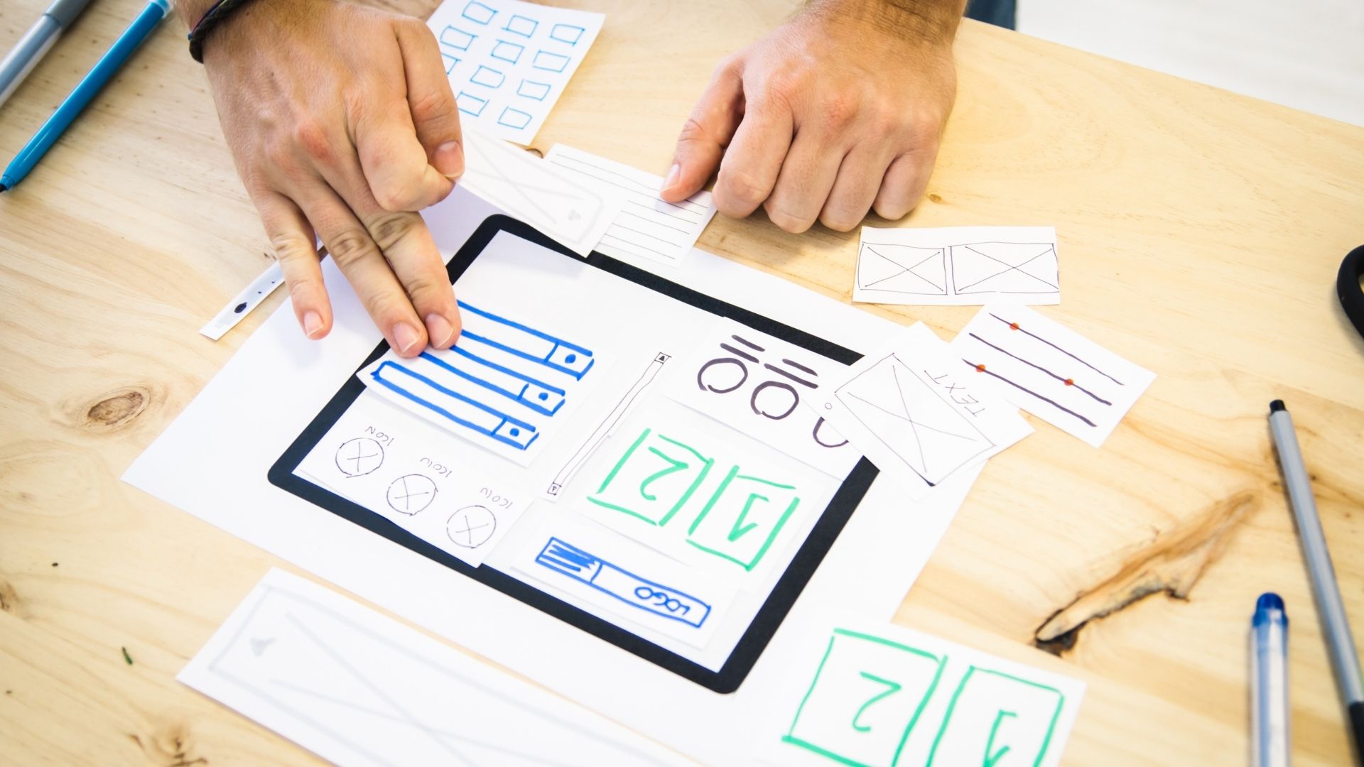
Once the team aligned on sections, Claude generated a detailed prompt to bring into Figma Make, Figma’s AI-powered tool that turns prompts and existing designs into functional, interactive prototypes.
The team reviewed this prompt like they’d review any strategic document. They added wireframe style references (black and white only, gray placeholder images, no color). They specified design constraints. They included brand-aligned placeholder copy so the wireframe would read directionally, not just look structural.
One important workflow choice: we crafted the prompt in Claude using Opus, the most capable model available, rather than writing it directly in Figma Make. Figma Make runs on a different model with a different context window and different strengths. Doing the strategic thinking in the environment optimized for deep reasoning, then packaging it as a prompt, produced significantly better first-draft output.
The specific tools here will change. Figma Make might get replaced by something better next month. The durable insight is the pattern: do your strategic thinking in the most capable AI environment you have access to, then package the output as a prompt for whatever execution tool you’re using.
The first wireframe hit the screen while everyone was still in the room
In a traditional workflow, the team would have finished their brainstorm, gone back to their desks, and waited days to see a wireframe. In this session, the prompt went into Figma Make, and a first-draft wireframe appeared in Figma while the entire team was still on the call.
The designer looked at it and said, “nice sorcery.” Then immediately started spotting problems.
Within thirty seconds, the team had flagged multiple issues from multiple angles. Not vague opinions. Specific, informed catches that each required a different kind of expertise to notice. The team captured the feedback, fed it back into Claude, iterated the prompt, and pushed a revised wireframe through Figma Make. The second version was meaningfully better.
That cycle, from first draft to informed feedback to revised output, happened in minutes. In a traditional process, it would have happened across days of calendar time, with each round of notes losing context along the way.
What AI did well and where humans overrode it
The question of what AI can and can’t do in UX design is usually answered with opinions. This session produced actual evidence.
AI was exceptional at processing large volumes of input and producing structured output quickly. It generated template definitions, strategic briefs, and wireframe prompts that were directionally strong on the first pass. The initial section flow it proposed (hero, trust signals, problem/empathy, services overview, case studies, FAQ, final CTA) was solid and didn’t require major restructuring.
Where AI needed human override was everywhere that required context it couldn’t have.
The most consequential example: AI framed the entire homepage as an acquisition tool. That’s a reasonable default. Most homepages are acquisition tools. But the art director had spent months understanding this client’s business and knew the site’s primary job was validating referrals, not generating new traffic. The reframe to “credibility engine” reshaped every section that followed.
The account manager caught something AI never could have. The wireframe’s CTA said “Schedule a Consultation,” a perfectly safe, common pattern. But on every landing page and sales asset the team had already built for this client, the language was “Let’s Talk” or “Start the Conversation.” AI defaulted to a convention. The person who’d been on every client call knew the actual voice.
Then there were the design judgment calls. AI generated three consecutive sections using identical box layouts because boxes are a clean, logical wireframe pattern. The designer spotted the visual monotony in seconds. And under “What We Do,” AI listed a fourth service category that appeared in the discovery materials but isn’t how the client actually organizes their core offerings. Only someone who’d done the brand work would catch that distinction.
And then there was the leadership context from earlier meetings about avoiding an SEO-heavy approach. That kind of strategic nuance doesn’t live in any document. It lives in the account manager’s head.
Each of these overrides took seconds because the person with the right knowledge was in the room when the output appeared. In a traditional process, each one would have been discovered in a review cycle days later, explained in a comment, interpreted by someone who wasn’t in the original conversation, and revised. That cycle, multiplied across every section of a homepage, is where weeks disappear.
The math on timelines


The session consumed a significant chunk of the total hours budgeted for the homepage wireframe. Multiple team members for two and a half hours adds up. On paper, this process didn’t save hours compared to one designer working independently with review cycles.
But calendar time compressed from one to two weeks of scheduling gaps down to a focused session with refinement over the following few days. The team left the room roughly 90% of the way there: aligned on sections, directionally strong on copy, grounded in real strategic decisions.
That last 10% matters, and it’s not something you should try to finish in the same session. After that level of intensity, the right move is to walk away. Let the UX/UI designer come back with fresh eyes. Let the copywriter refine with distance. The wireframe presentation was ready for the client by the end of that week.
The account manager put it well: “The conversation of us all together has been super helpful. Just framing the project.” That framing stayed intact because it was captured, processed, and turned into output while the people who created it were still in the room.
Why this still takes a room full of people
This was an experiment. We’d tested pieces of this process on our own site, but this was the first time we ran it for a client project. It was messy in the ways any first run is messy.
And we’d do it again tomorrow.
Mid-session, the account manager asked: “Should there be a list of documents we need to create a project with?” The team was already thinking about making this repeatable while still running it for the first time. The template purpose document we created will inform every subsequent page on this project. The wireframe patterns that worked will carry forward. The prep checklist that didn’t exist before this session is already forming.
We never set out to use AI to reduce headcount. We used it to make a session dramatically more productive. AI is the fastest collaborator in the room, not the smartest. It processes and structures faster than any human. But it can’t reframe a homepage around a business model it doesn’t fully understand, catch CTA language that doesn’t match a client’s voice, or feel the visual rhythm of three identical layouts in a row. Those calls came from people with specific experience, made in seconds, because they were in the room when the output appeared.
The companies that will struggle with AI adoption are the ones trying to slide AI into processes built for a pre-AI world. The gains we saw came from recognizing that when execution is nearly instant, the bottleneck shifts to the quality of your strategic inputs and the expertise of the people evaluating the output.
It’s tempting to look at a process like this and think the takeaway is “AI makes wireframes now.” The actual takeaway is that AI compresses execution fast enough to keep strategic context alive across the entire creative process. The experienced people in the room are what make that context worth preserving.
Ready to explore what this kind of process looks like for your project? Let’s talk.