

The challenge they faced
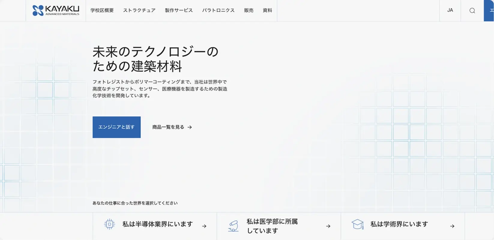
Kayaku Advanced Materials makes the materials that make modern technology possible. Photoresists, polymer coatings, dielectrics, and adhesion layers used inside semiconductors, medical devices, microfluidic chips, sensors for AR and VR, and packaging for the next generation of electronics. Their products are not the things you see. They are the things that make the things you see work.
Three sub-brands sit under the parent organization. StructSure for the structural photoresist line that semiconductor manufacturers depend on. Design Fabrication Services for the microfluidics and life sciences side, where biocompatible patternable coatings enable lab-on-a-chip diagnostics. Paratronix for the emerging-tech and defense side, including dielectrics and protective coatings for sensors and flexible electronics. The company also distributes complementary products from partners like DuPont (rebranded as Qnity during the project) to give customers a more complete materials offering in one place.
The reputation in the industry was strong. The website needed to start matching it.
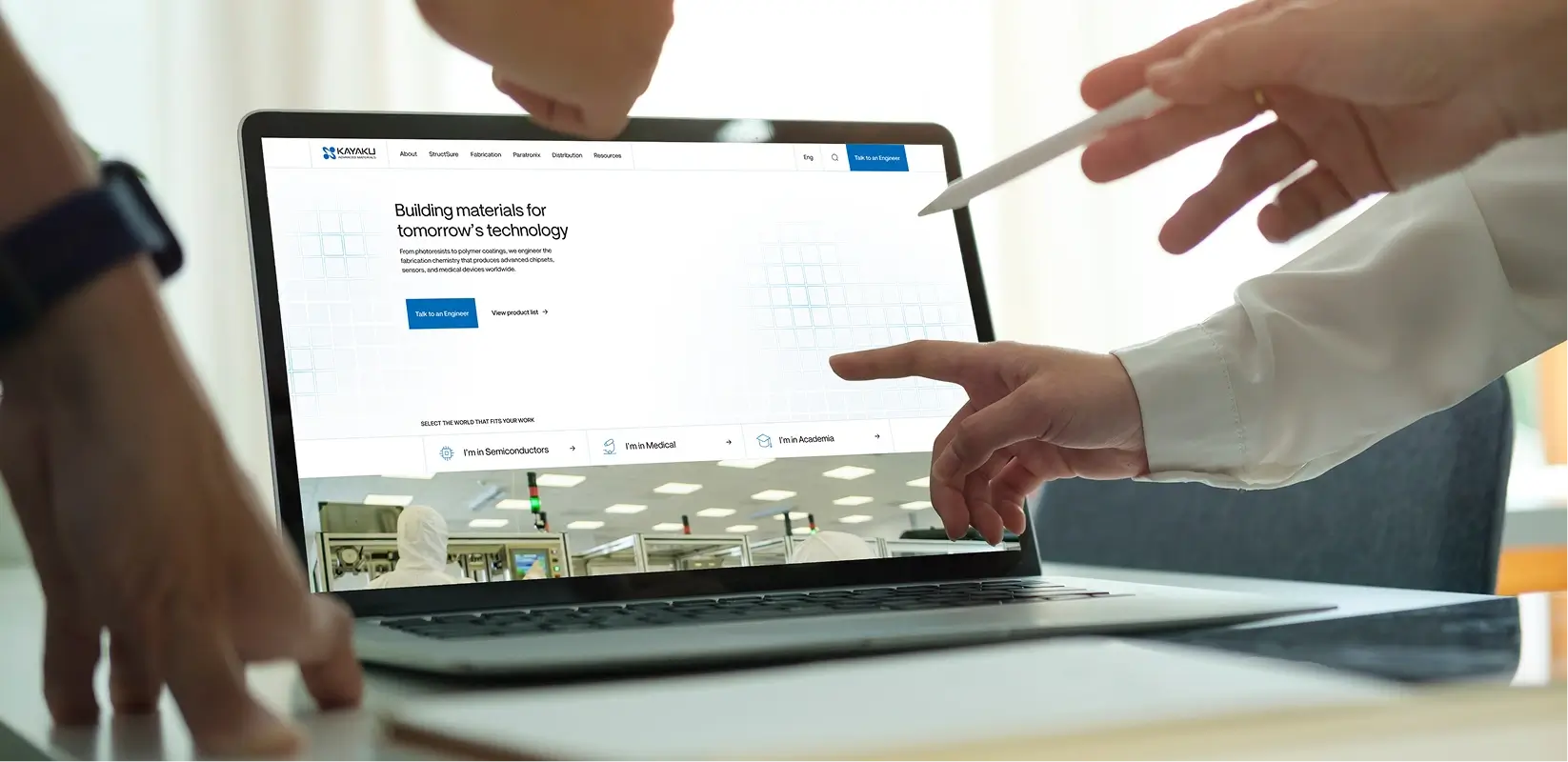
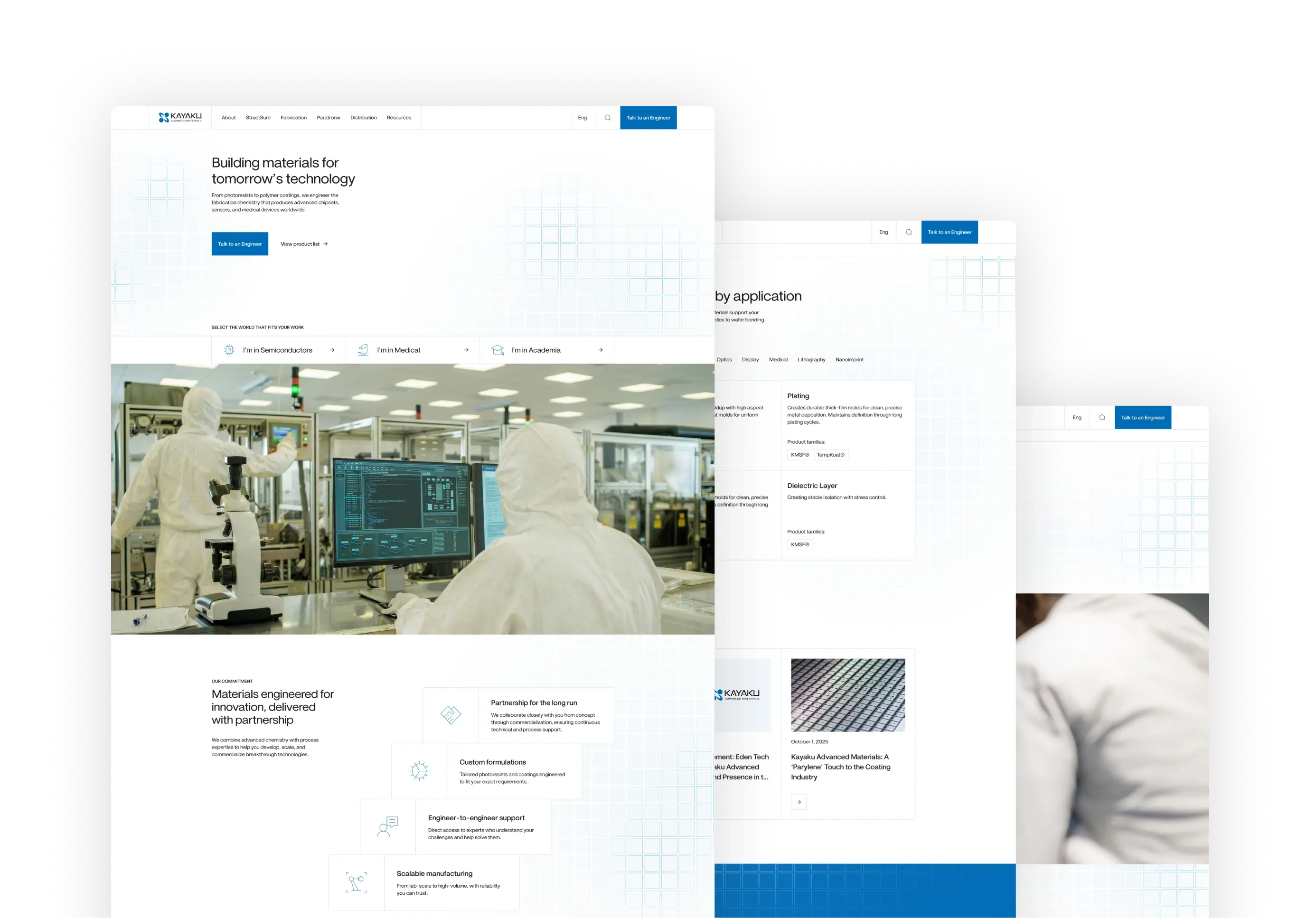
In the client’s own words from discovery: “The current website was built with the intention of being a guide to academia audience. The current site feels outdated and doesn’t clearly communicate our capabilities, technical expertise, or the industries we serve.”
In practical terms, here is what the new site needed to start doing.
The three sub-brands had to come together. They had been built at different times, lived on different properties, and never connected as one experience. A visitor researching photoresists for a semiconductor application would land in one place. A visitor researching coatings for a medical device would land in another. Bringing the sub-brands together while letting each one keep its own identity was the structural challenge underneath everything else.
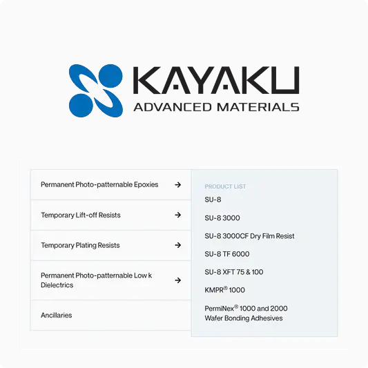
The product hierarchy had to make manufacturer authority visible. Kayaku designs and produces the bulk of what they sell and distributes complementary products from partners. The structure itself had to communicate that distinction before a visitor read a single word.
The product catalog needed reorganization around how customers actually search. The previous structure organized products by SKU and model number, so an engineer searching for a coating that fit a specific application or industry had to already know the Kayaku product code. Application-led navigation barely existed.
Two distinct audiences pulled the site in different directions. The legacy academic audience, who had been ordering 500ml bottles of SU-8 for graduate research projects for years, made up a meaningful share of current traffic. The industry audience the company wanted to grow into (mid-to-large semiconductor manufacturers, medical device companies, and emerging-tech innovators) needed an entirely different conversation about manufacturing scale, supply chain readiness, and partnership capacity. Serving both without forcing one through the other’s experience was the design challenge.
And the deadline could not move. The launch had to land before the end of the fiscal year.
For a company that had built genuine differentiation since 1992 and was actively repositioning itself for industry growth, this was a foundational moment. The website was the surface where the next chapter of the company’s positioning had to start.
How we approached it
What discovery revealed
We started with research. Stakeholder interviews across the Kayaku leadership team. Competitive analysis across direct competitors (JSR, TOK, Merck, DuPont, MicroChemicals) and adjacent providers (DJ MicroLaminates, SCS, HZO). An audit of the existing properties and content. Mapping of how the two audience types actually moved through the site.
Three insights shaped everything that followed.
The category itself was the wrong place to differentiate on technical authority alone. Every competitor in this space leads with technical authority. The category visual default is also remarkably consistent: dark backgrounds, futuristic aesthetics, abstract circuitry imagery, clinical photography. The differentiation opportunity was not more authority. It was more humanity.
Manufacturer authority needed structural separation, not just messaging. Telling visitors Kayaku is a manufacturer in the copy was not going to do the work if the site continued to mix manufactured and distributed products in the same visual hierarchy. The fix had to be architectural.
The two audiences needed different paths through the same site. The academic researcher who knows they need SU-8 and just wants to reorder it has nothing in common with the procurement manager at a semiconductor manufacturer evaluating long-term supply partnerships. One audience needs to get to a quick reorder. The other is in a longer conversation about which materials fit their development process. Two paths, surfaced without forcing either audience through the wrong one.
How services integrated
This is where integrated work matters. The project touched strategy, UX, design, development, custom illustration, content, AI implementation, and CRM. If any of those disciplines had treated their part as a separate handoff, the project would have fractured. The chatbot would not have matched the brand. The quote system would not have reflected the product strategy. The deadline would have been harder to protect.
Seventeen people on our side touched the work at various points. The mitigation against fragmentation was making sure everyone consumed the same discovery materials, the same competitive analysis, the same audience research. Not filtered briefs. The actual research. When designers developed visual concepts, they understood why warmth was the differentiation play. When developers built the quote request system, they understood why ancillary products needed to behave a certain way. When the AI chatbot got trained, the persona reflected the brand voice already established for the rest of the site.
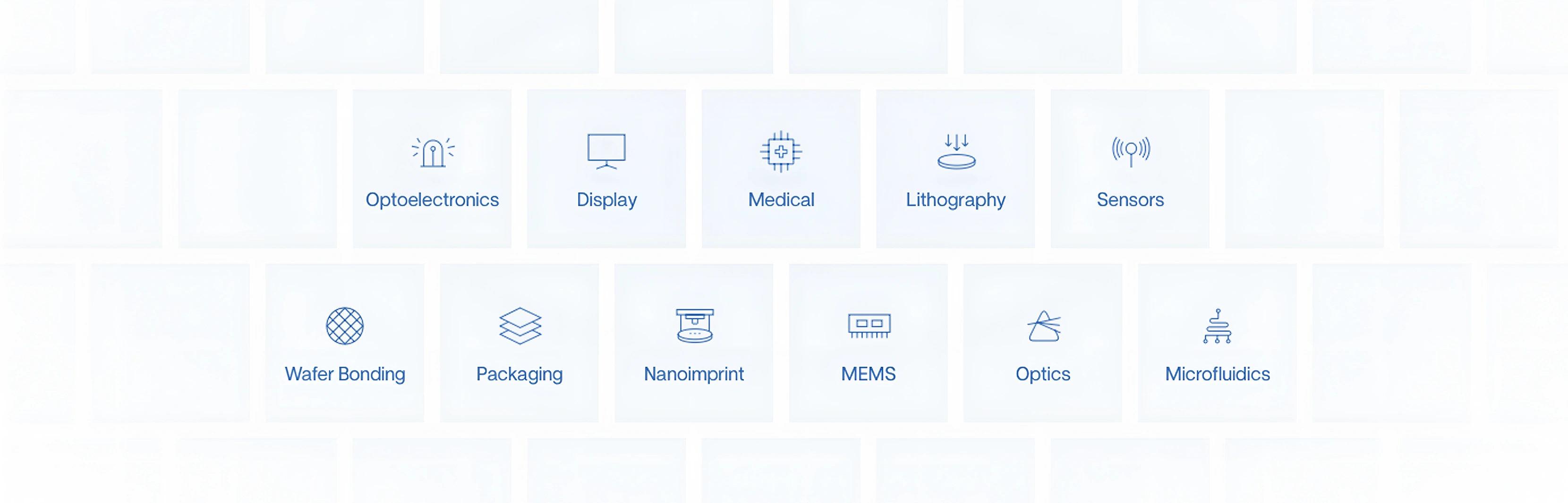
That shared foundation also made it possible to absorb scope evolution without losing the deadline. The mascot was not in the original scope. The chatbot moved from a Phase 2 nice-to-have to a launch-day deliverable. The interactive city map emerged from the work. Fifty-plus custom icons replaced generic stock iconography. None of it moved the launch.
The mascot story is worth pausing on, because it shaped more of the project than any other single addition. It started as an illustration problem. The client had existing 2D “clean room dudes” that did not match the new visual direction. They were flat, cartoony, and inconsistent with the warmth and modernity we were aiming for. Our designer took inspiration from the Dexter’s Laboratory aesthetic and developed 3D renderings that carried the warmth of the original idea into a more polished, ownable character system. The result landed. But that surfaced a question: if Kayaku has this mascot, what does the mascot do? Custom 3D illustration across every page was not realistic at scale, so we proposed building out the mascot as a full character package the client could use across the site and other materials. The client agreed. Then a separate conversation about the chatbot started, and the question came up: what if the mascot is the chatbot? Suddenly Dex Litho had a job description that made the whole investment compound on itself.