


The challenge they faced
Didi Hirsch Mental Health Services has been serving the Los Angeles community since 1942. They’re home to the nation’s first and largest Suicide Prevention Center. They operate the 988 Suicide & Crisis Lifeline in their region, run Teen Line (a peer-to-peer support hotline), and provide comprehensive mental health and substance use treatment to over 270,000 people annually.
Their reputation in the community was strong. The problem was their digital presence.
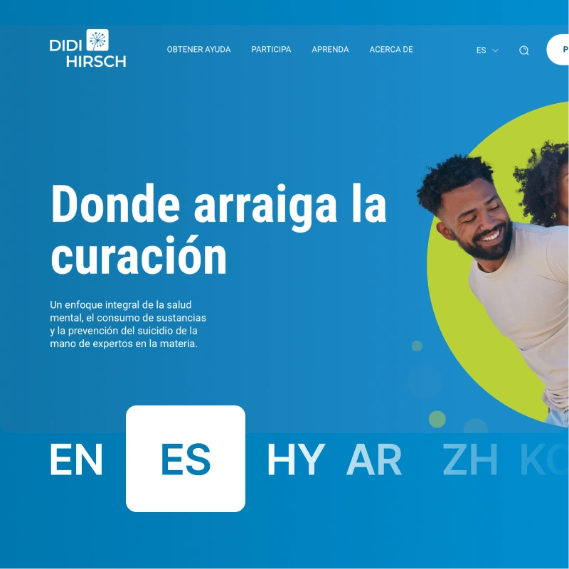
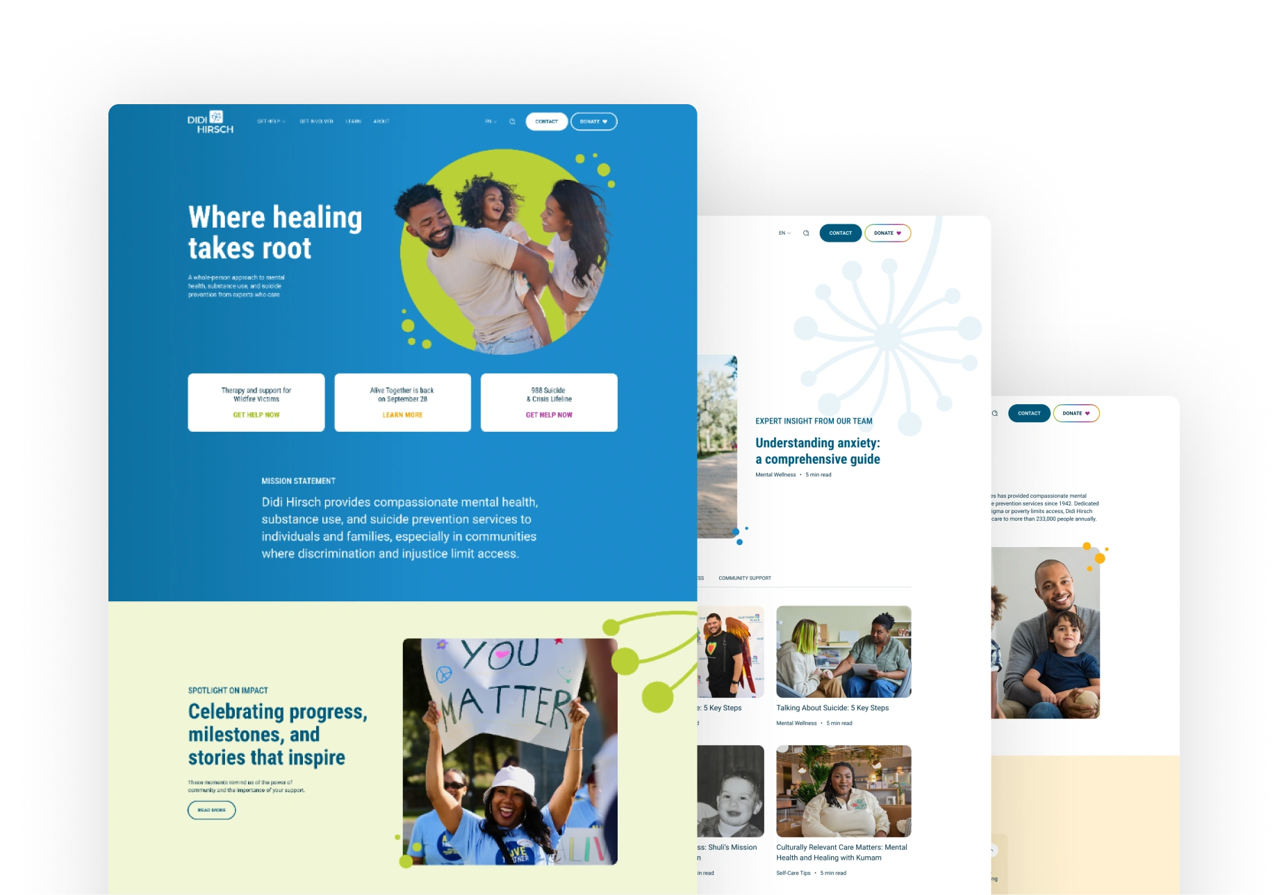
Over years of growth and acquisitions, Didi Hirsch had accumulated multiple web properties: the main organization site, Teen Line, crisis services, a youth wellness center called Our Third Place, and a training academy. Each had been built separately, looked different, and required visitors to know exactly which URL to type for which service.
What that looked like in practice:
- Teen Line lived on its own domain with no obvious connection to broader Didi Hirsch resources
- “Get help” content was scattered across properties with inconsistent naming and navigation
- The main site over-indexed on careers and organizational pages while service pages stayed buried
- Sub-brands like Our Third Place had no visible relationship to the parent organization
For someone in crisis, or a family member trying to find help for a loved one, this fragmentation created real barriers. A teenager searching for peer support might never discover that Teen Line was connected to the broader resources Didi Hirsch offered. A parent looking for youth services might not realize the organization also provided family therapy. The digital experience made Didi Hirsch look like five different organizations when it was actually one comprehensive system of care.
The analytics told the same story. Traffic concentrated on the homepage and careers section while mission-critical service pages remained largely invisible. People were finding the organization but struggling to find the specific help they needed.
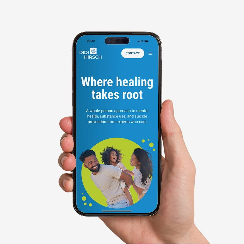
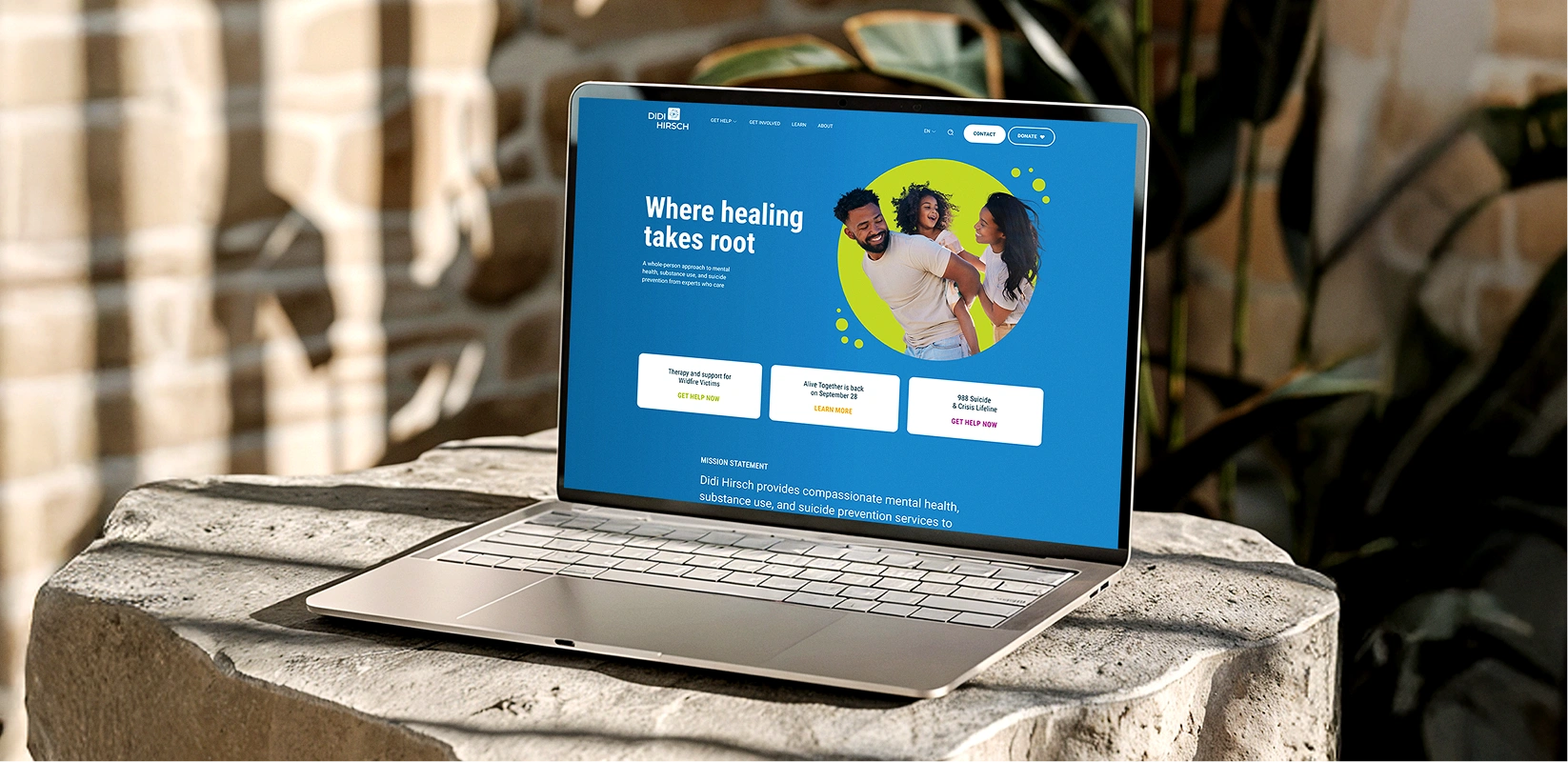
There was a subtler problem too. Many of Didi Hirsch’s clients come from communities with complicated histories with healthcare and government systems. A website that felt cold, clinical, or institutional could reinforce exactly the distrust the organization worked so hard to overcome in person. The digital presence needed to feel as welcoming as the actual experience of walking through their doors.
How we approached it
What discovery revealed
We started with research. Months of GA4 and Ahrefs analysis, stakeholder interviews, competitive review, and detailed mapping of how different audiences actually used (or failed to use) the existing sites.
Three insights shaped everything that followed:
- The organization served fundamentally different audiences with different needs and emotional states. County health administrators evaluating partnership opportunities. Donors considering where to direct their philanthropy. And most importantly, individuals in crisis, teenagers feeling overwhelmed, family members searching for help. A single website needed to serve all of them without sacrificing clarity for any.
- Trust was the central design challenge. For someone considering calling a crisis line, the website needed to feel safe before they’d take that step. Clinical design language, stock healthcare photography, anything that reminded visitors of systems that had let them down before would work against the mission.
- The existing traffic patterns weren’t just a website problem. They reflected information architecture that buried services while surfacing careers and generic organizational content. The structure itself needed rethinking.
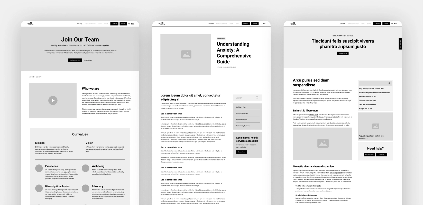
Before wireframing a single page, we mapped detailed journeys for nine distinct personas. A county contracts manager evaluating a grant opportunity moves through a site very differently than a teenager deciding whether to call a peer support line at 2am. These weren’t checkbox exercises. They directly informed navigation decisions, content hierarchy, and the emotional tone of different sections.
How services integrated
This project required strategy, design, development, and content to work from the same foundation. Decisions in one area rippled through every other.
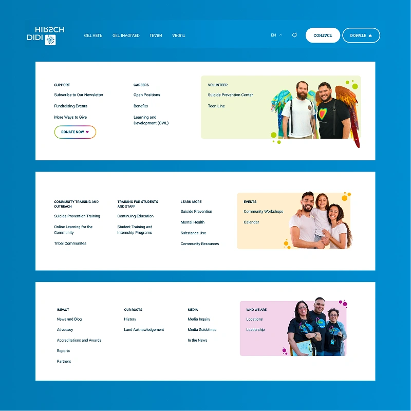
Information architecture shaped SEO strategy. We couldn’t just consolidate pages. We needed to restructure around how different audiences naturally searched and what they expected to find. Navigation design reflected the user journey mapping. Content strategy informed both the words on the page and the visual hierarchy around them.
Every team member who touched the project consumed the same discovery materials. Not filtered briefs. The actual research. When our developer made decisions about page templates, they understood the emotional stakes. When our content strategist wrote service descriptions, they knew which misconceptions needed addressing.